
You are using an out of date browser. It may not display this or other websites correctly.
You should upgrade or use an alternative browser.
You should upgrade or use an alternative browser.
The sketch thread!
- Thread starter dadevvtsvre
- Start date
badmonur":3c4vyrj5 said:
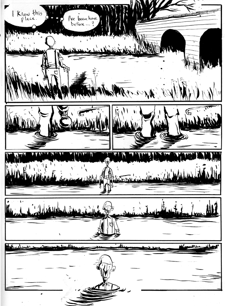
it looks very much cool. Clean stuff and whatnot. However, it feels sorta blank- although since it is in comic form, the reader goes to the next panela fter getting a grasp on the picture, so having blankish things could work. A second look reveals the pic is really barren though.
dadevvtsvre
Sponsor
it looks great. perfect use of blank space to convey mood and tone. it doesn't need anything else there.
reminds me a lot of the style jeff lemire uses for essex county, actually.

reminds me a lot of the style jeff lemire uses for essex county, actually.

okay that's pretty excellent. time to follow it up with some shit!

Couldn't find the pencil I usually use for rough sketches and stuff so I tried the different higher-density ones that came with the des 135 kit. I got really sloppy toward the end! those trolls sure are upset about it
I wasn't sure what they were emoting about so here have some context (twenty-seven minutes in)
@dev
post more of that little otter guy or any of the cartoons really! i can't get over your expressions and in fact i'm pretty jealous :I
@bacon
it honestly took me months before i could really use my tablet, and i got discouraged and quit a LOT - don't let that happen to you! power through it, draw new and different things at every opportunity, look at everything with the *artist's eye* rather than just looking, and draw what you see (hope that makes sense!)
@mawk
mawk-troll's left forearm seems quite a bit longer than his right and dev-troll has some backwards-shoulder going on his left arm, but i really like their posture and overall design
they are very cute! (and do not look like voldemort yay)
alright one of my resolutions this year is to spend at least 10 mins drawing whatever in the morning every day so i don't get rusty

some mornings its really obvious i spent a few minutes on it :blush:
i'll post some stuff thats not shit once i get my scanner back, i've been doing a lot of figure drawing and think i may have improved (!!!! :O???) some

some mornings its really obvious i spent a few minutes on it :blush:
i'll post some stuff thats not shit once i get my scanner back, i've been doing a lot of figure drawing and think i may have improved (!!!! :O???) some
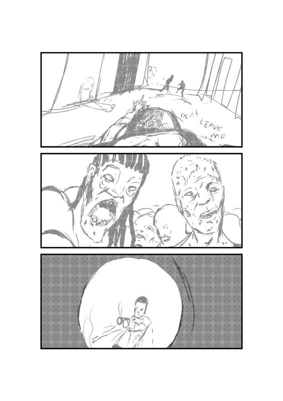
badmonur, I really love the style you have there. the way things are sort of loose and angled makes for a really interesting aesthetic. the way the dude is posed in the last panel is kind of weird, like he's still looking ahead with that expression instead of at the monster beside(?) him, but I could be misreading it.
Moxie goddamn you have a talent for faces! you two are a really tough act to follow it's sort of embarrassing
Moxie goddamn you have a talent for faces! you two are a really tough act to follow it's sort of embarrassing
I couldn't sleep so I drew a thing. I should move onto other trolls soon but I guess I'm a fictionepotist!

goddamn the left foot is janky. I'd say I'm pretty proud of the hands, but the're mostly covered up by the spike knuckle things so vOv

goddamn the left foot is janky. I'd say I'm pretty proud of the hands, but the're mostly covered up by the spike knuckle things so vOv
yo mawk you should try something bolder man. i think you could pull off things with different perspectives.. try doing this same dude, with the same pose, but then from a point of view that's pretty close, and near the floor, so you look up at him.

perspective on the connected bookshelvethings is all fucked up, but i had only three hours to make this so..

detail
also badmonur, how much time do you spend on drawing daily?
and moxie i really like the right-most face, which is defined by the hair that's flowing out of nothing, cool stuff overall!
man i wish i could make stuff like this: http://www.behance.net/gallery/Work-2008-2009/561438

perspective on the connected bookshelvethings is all fucked up, but i had only three hours to make this so..

detail
and moxie i really like the right-most face, which is defined by the hair that's flowing out of nothing, cool stuff overall!
man i wish i could make stuff like this: http://www.behance.net/gallery/Work-2008-2009/561438
dadevvtsvre
Sponsor
mawk i'm not sure if you're doing this intentionally or not but trollmawk's got some crazy proportions going on. it's probably a stylistic thing you're doing but his arms are longer than his legs and it's kind of freaking me out
anyway. i haven't done painting of any kind in over a year and have been having the itch to get back into it lately. since i don't have any good oil paints or brushes at the moment i thought i'd take a crack at painting digitally for the first time!
it mostly looks like crap but i think i've finally got the hang of using the alt-click blending method now.


(wanted to make the shadow a little darker but oh well)
i like working digitally because you don't have all the constraints of real life painting but getting over that lack of tangible paint and physically manipulating the canvas is a little tough.
anyway. i haven't done painting of any kind in over a year and have been having the itch to get back into it lately. since i don't have any good oil paints or brushes at the moment i thought i'd take a crack at painting digitally for the first time!
it mostly looks like crap but i think i've finally got the hang of using the alt-click blending method now.


(wanted to make the shadow a little darker but oh well)
i like working digitally because you don't have all the constraints of real life painting but getting over that lack of tangible paint and physically manipulating the canvas is a little tough.
ugh yeah I always go overboard when I draw people wearing tall tees or whatever. I forget that the point of a tall tee is to be taller than the torso and so I move the hips waaay down near the hem where you'd expect them to be on a normal t-shirt! he's supposed to be kind of lanky, but I'd say it's like 30% stylistic and 70% accidental bullshit. it was like 2AM so I wasn't at my most discerning, if that's any defense vOv
also that looks pretty cool, thanks for reminding me that I should pick up photoshop sometime.
tomas I will give it a shot but I make no promises as to whether or not it will turn out a non-euclidean nightmare
also that looks pretty cool, thanks for reminding me that I should pick up photoshop sometime.
tomas I will give it a shot but I make no promises as to whether or not it will turn out a non-euclidean nightmare
alrighty, this is for bacon (or anyone that can make sense of it really) since i told him i would sketch up some examples of skeleton outlines and whatnot for him - when i tried to scan 'em in today i came to the wonderful realization that my printer had quietly decided to stop working as well :/
when you're doing faces, generally you're going to start with a basic shape - circle, oval, square, pretty much anything depending on how cartoony it is going to be. you'll want to draw a line going straight up and down and curving up at the top to show where your features are going to be. if the line is in the middle, the view will be straight-on, if it's on the side, it's going to be a profile shot, etc.
you do this to help keep your facial features where they need to be as you draw the face. when you don't do it, all kinds of things can happen. it can end up skewed, bodyparts can be on entirely wrong angles of the face, eyes can go drifting off into nowhere, etc.
here's a musculature that ven did of my dude to help me correct his weird anatomy. you probably won't want to worry about going that indepth with muscles and the like until you're a little more comfortable with basic outlining and anatomy in general, but you can see the basic shapes & lines under there
i hope this helps :/ i'm super tired and probably incoherent right now
also also also sorry if you already know this, but when you are working digitally it helps a BUNCH to do your skeletons and outlining in a lighter color on one layer, and then when you're ready to start your actual picture working on another layer in whatever color you want
that way you can just make the outline layer invisible when you want to work on the actual picture, or you can revisit it if things start to look wonky
that way you can just make the outline layer invisible when you want to work on the actual picture, or you can revisit it if things start to look wonky
Thank you for viewing
HBGames is a leading amateur video game development forum and Discord server open to all ability levels. Feel free to have a nosey around!
Discord
Join our growing and active Discord server to discuss all aspects of game making in a relaxed environment.
Join Us


