

You are using an out of date browser. It may not display this or other websites correctly.
You should upgrade or use an alternative browser.
You should upgrade or use an alternative browser.
The sketch thread!
- Thread starter dadevvtsvre
- Start date
Pokémaniac
Awesome Bro
Is fringe really an Australian thing?
OOOOOOOhhhh bangs. Yeah thats what they're called over here!
Well I don't know if fear was what I was going for exactly. Just trying out different styles. There is no real connection between the two except the artist? The second one is from something I found in my sketchbook from 2008 :p
I don't think I'll finish it though. I'm not liking where its going. And coming up with gun designs was possibly the hardest thing to do. :/
Backgrounds are an easy thing to learn alot easier than anatomy, you just need a few refrences and give it a shot eventually you'll notice a pattern when you make Backgrounds thus making that your B.g Drawing style lol I jst recently started drawing some BGs myself ill prolly post some on here when I get home..
I am getting used to a tablet so please bear with me:
This is a shitty dump of shit

anime-ish and shoulder in odd place

doing skeletal stuff still rather terrible

playing around with lines

banned for pointy chin

oh dear
everything I do looks anime-ish oh dear
(ps I cant draw males any better than females)
:c
This is a shitty dump of shit

anime-ish and shoulder in odd place

doing skeletal stuff still rather terrible

playing around with lines

banned for pointy chin

oh dear
everything I do looks anime-ish oh dear
(ps I cant draw males any better than females)
:c
dadevvtsvre
Sponsor
bacon, your stuff is coming along really nicely! just watch your proportions, make sure you're comparing it to real anatomy and stuff to get limb lengths and widths nice. but seriously, you're doing a lot better than i did when i started with a tablet.
don't worry if you think the facial features come off as anime-ish. get the basics down and you can nail style afterwards, just don't let it concern you now.
one thing though, and i'll let the anatomy experts elaborate, but your chins are looking very pointy. have you tried drawing actual skulls? i did this for a while and it really helped me out, just getting a solid understanding of how the human head is shaped.
on paper my heads are less pointy-ish but still they are somewhat pointy.
And you are wrong and I am the master drawer.
In all seriousness though, Ill actually try to do that. Do you kn0ow any good resources/tuts for this. Head shape is something I struggle with. Actually, the head shape determines what type of pose I am going to do, and thats not super efficient. x:
I actually noticed this as well. My heads go inward and I sort of forget the cheek and to balance it I think I make long chins.
I also think this is why I struggle with side shots.
I struggle with legs as well but most of the time people dont see that.
Hands, i always try to do open hands but end up doing side hands for a safety net sort of thing. :c
dadevvtsvre
Sponsor
yeah, you really have to do all sorts of perspectives to get a true mastery of anatomy. a lot of people get good at only one point of view (3/4 especially) and think they're pretty good, only to realize when they draw something from a different view that it looks terrible. it's too easy to fall into that rut.
there's no one place i like to go for references, i usually just scour the web for poses and stock photos and stuff. as far as tutorials go, andrew loomis' books are very popular and you can find .pdf's pretty easily, although they can be very daunting for beginners and are quite large as well. conceptart.org has a lot of tutorials, such as these ones, that are worth checking out.
there's no one place i like to go for references, i usually just scour the web for poses and stock photos and stuff. as far as tutorials go, andrew loomis' books are very popular and you can find .pdf's pretty easily, although they can be very daunting for beginners and are quite large as well. conceptart.org has a lot of tutorials, such as these ones, that are worth checking out.
dadevvtsvre
Sponsor
DOODLE DUMP 2: THE DUMPING
some stupid/dumb stuff i draw in class when i am running on three hours of sleep and am completely braindead
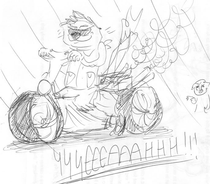
the legs are total shit, woop woop
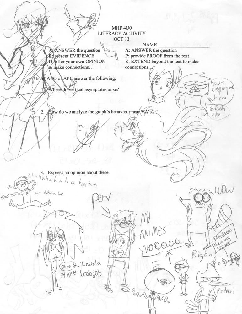
this one is actually a collaboration between me and an asian guy! he drew all the anime stuff and i kept defacing it
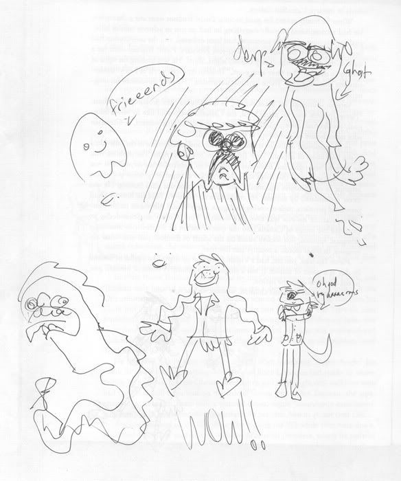
WOW
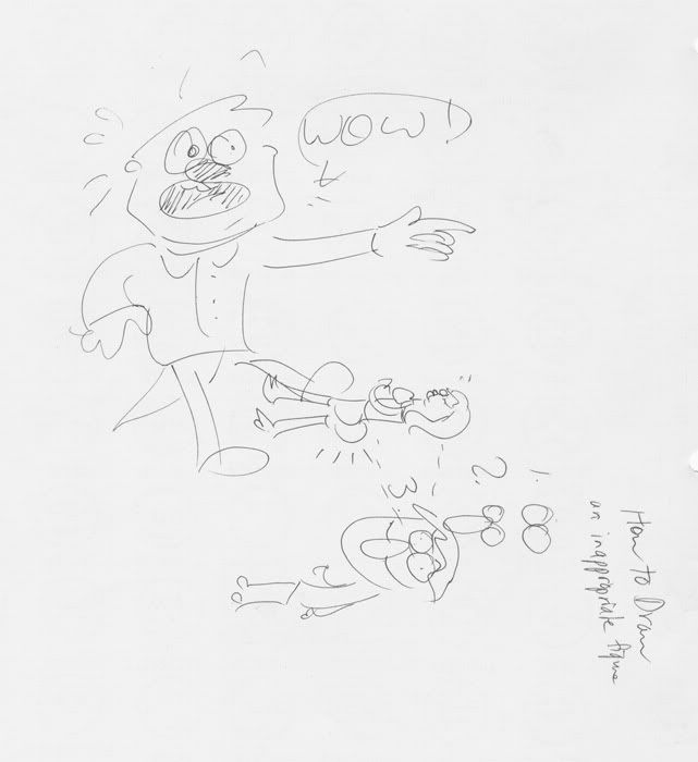
WOW II: to WOW or not to WOW
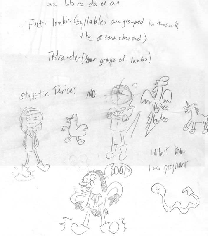
booties! also had yogurt spilled on it, OOPS
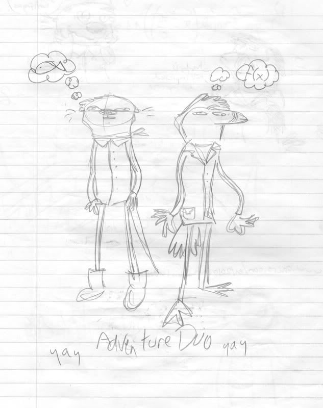
these two crazy characters again??? my oh my it is a bona fide veritable southern-fried miracle
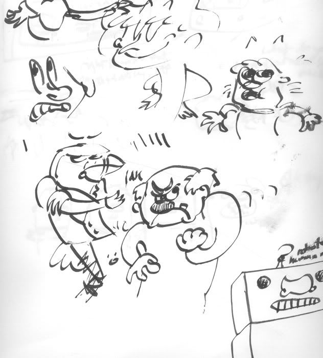
stuff with a calligraphy pen. ergh.[/spoiler
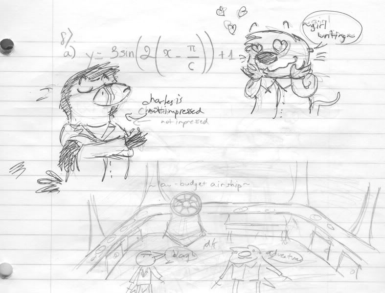
hahahaaha, i suck at perspective so much you guys, so much
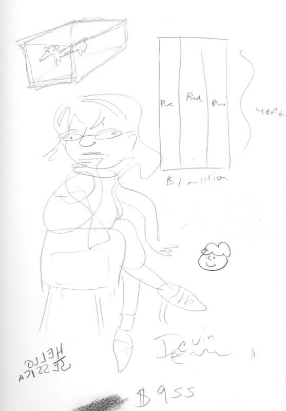
i drew my girlfriend in a post-modernist style with homage to picasso and the abstract movement of the early 20th century. if you look clsoely you can see subtle references to the work of 18th century romanticists such asaosifjaisudgnsd
some stupid/dumb stuff i draw in class when i am running on three hours of sleep and am completely braindead

the legs are total shit, woop woop

this one is actually a collaboration between me and an asian guy! he drew all the anime stuff and i kept defacing it

WOW

WOW II: to WOW or not to WOW

booties! also had yogurt spilled on it, OOPS

these two crazy characters again??? my oh my it is a bona fide veritable southern-fried miracle

stuff with a calligraphy pen. ergh.[/spoiler

hahahaaha, i suck at perspective so much you guys, so much

i drew my girlfriend in a post-modernist style with homage to picasso and the abstract movement of the early 20th century. if you look clsoely you can see subtle references to the work of 18th century romanticists such asaosifjaisudgnsd
Perihelion
Sponsor
Devvy, your stuff is rough, but I gotta say I love your style.
LiquidMetal91
Sponsor
Yeah, but more fun if you can read it ;D
Thank you for viewing
HBGames is a leading amateur video game development forum and Discord server open to all ability levels. Feel free to have a nosey around!
Discord
Join our growing and active Discord server to discuss all aspects of game making in a relaxed environment.
Join Us


