Envision, Create, Share

Welcome to HBGames, a leading amateur game development forum and Discord server. All are welcome, and amongst our ranks you will find experts in their field from all aspects of video game design and development.

The sketch thread!

Unfortunately he has no chin either! Which there are people like that BUT! It'd be best to break the face down Daxis into simple shapes. I notice that the head is somewhat unbalanced. It might just be his left shoulder is a low though. I'm not to sure. Its got a unique style no doubt but the eyes give it a way creepy factor. I believe the right one is smaller than the left one. Which a lazy eye is no problem because I have one myself in real life but in drawings it looks odd. Its a good attempt but mixing the two styles has never really worked in anyones favor...has it?
 
I dont have a scanner ;-;

IMG_0137.PNG
porportion, sorry its so blurry ):

IMG_0138.png

I dont like hands ):

IMG_0139.png
or feet ):

IMG_0141.png
look at those hands, they are awful

IMG_0144.png
and then we come to faces, oh dear god ;-;

IMG_0145.png
its like WW2 all over again

IMG_0143.png
I like doing environments much better o:

IMG_0151.png
though Im still not perfect or great

IMG_0160.png
please dont judge me ;-;
 
I was so about to report you devy. hehehehehe.

I rather envy your ability to do environments; those pictures showed a lot of things thought out, like the paper tree leaves and whatnot. That's good detail.

Hands were average. Could have been done better, but eh, whacha gonna do, almost everyon sucks shit at that.

Meh. Not much to say. Work on body and figures, I guess, but you seem to have detail of environment somewhat figured out- try 3d and different angles of environment next.

So you used a camera or what?
 
Alright, I'll bite. First of all, if you ever try and draw in a lined paper notebook again, I WILL murder you. Get yourself a sketchbook and some better pencils and improvement will come.

I think you're doing well proportion-wise but you have some issues with anatomy and depth. If I were you, I'd forget about trying to nail anatomy and proportion for now and focus on the basics. If you want to get a good grasp of the 3D form then it would be extremely helpful to draw basic shapes (including shading, so pencils with difference leads are an asset) until you nail the 3D form. If you're interested in drawing portraits then maybe getting some photos to draw form as a reference because there's no way you can accurately draw the human face as a beginner without a reference, be it from life, a photo, or anything.

You might find it helpful as well to draw the individual parts of the face (eyes, nose, ears, mouth, etc) separately, and for a couple of days really focus on nailing that part of the face. Then slowly piece it together (draw the nose and mouth together, then the nose and mouth and eyes, etc) until you have what is eventually a full portrait. Once you get a good idea of the form and shapes of the parts of the face, as well as how light works on it, then you will be able to qutie easily piece together a full portrait.

There, I'm helpful. >:|
 
Daxis: Im using a camera D:

Devy: Im to poor to afford all this stuff. Im just a poor boy following my passion of doodling. But thanks, ill try practicing individual pieces and stuff. Your advise helped me a lot :D

And I am a composition notebook kind of guy o:

IMG_0159.png
its a pod monster O:

IMG_0154.png
and a poorly taken picture of a mech monster O:

IMG_0153.png
o:

IMG_0152.png
damn the legs D:

IMG_01471.png
i messed up the right foot ;-;

IMG_0149.png
evil wheel monster D:

IMG_0146.png
a concept I never finished
 
Bacon":151566d2 said:
Devy: Im to poor to afford all this stuff. Im just a poor boy following my passion of doodling. But thanks, ill try practicing individual pieces and stuff. Your advise helped me a lot :D
you can probably get a sketchbook and a decent set of pencils for about $15-$20 which is very cheap but alright :V
 
yo tomas

I rather like most of them. All the lines are generally clean or smooth, unless it's something of a sketch. I like them cause there's lots of technical ability to it- there's only a few amount of lines used to make that first tree sketch, and you can clearly feel and know that it is definitely a skill.

The second sketch has the same feeling as the first, but it's much more sketchy- the lines are a lot thinner, so one can see it's not as finished, or at least that's how I view it. However, it's hard to make out what it is- are you seeing a candle up front and close in front of a firepalce? Where the candle is situated makes this picture look very weird. However, the background I really like due to its simplicity of detail.

The 3rd picture is a bit unclear, although I'm quite certain it's a picture of a hawk/eagle/bird flying high up on the clouds. There's a lot less definitive strokes here concerning the eagle, so it takes a moment to figure out. The 2nd picture, by the small flame of the candle, makes it easy to distinguish. The clouds are easy enough to ascertain, but I swear the head of the eagle and the wingspan makes me see a mountain and a mountain range.

last little sprout is nice, although I don't really know what the extra squiggles before and after sprout are for.
 
yo, thanks.

yeah actually the three top sketches were done in one session, starting with the tree, and then the room, and then the eagle, and you can see the lines becoming more sketchy, and the strokes less determined. The eagle is more of a composition sketch, and i should redo it with more visually appealing lines.

the last one is actually a logo, also done somewhere inbetween, because someone asked me to. The two squiggles are supposed to represent ground level btw.

also i cant see the mountain range :(
 

zchin

Sponsor

I draw decently for a kid, so i thought I might post something up here, it was random cause i was bored and I definitely see that I need something to improve in it... Probably more then one thing, or 5 things actually... She, it is a she, looks anarexic...
scan0002ls.jpg
big image, I don't know why though...
 
If you really want to improve your art a good start would be to stop drawing generic anime. Have you tried drawing realism before? It's the only way to get a good, solid foundation for drawing humans, no matter what the style.
 

Star

Sponsor

Dadevster":1yp3frlm said:
If you really want to improve your art a good start would be to stop drawing generic anime. Have you tried drawing realism before? It's the only way to get a good, solid foundation for drawing humans, no matter what the style.
I hear this a lot, but I don't believe it. Generic anime get's it's style from realism to begin with, so therefor the body size and shapes should be fine, unless you're talking about chibi crap.

I mean I used to draw crappy.. Just check this out

03-10-2005043812PM.jpg

This is a more recent drawing.

NokoDisplay.png

I thinks I've gotten a lot better, wouldn't you say? I have drawn realism, but very little. I'm only good at that cause I draw in the anime style
 
Well, if you only ever want to draw anime then yeah, I guess keep drawing it. But as far as broadening your horizons, getting a basis in realism is the way to go. In my opinion, restricting yourself to one style is an insult to creativity, but that's just me. It really depends on your goals, I guess.
 
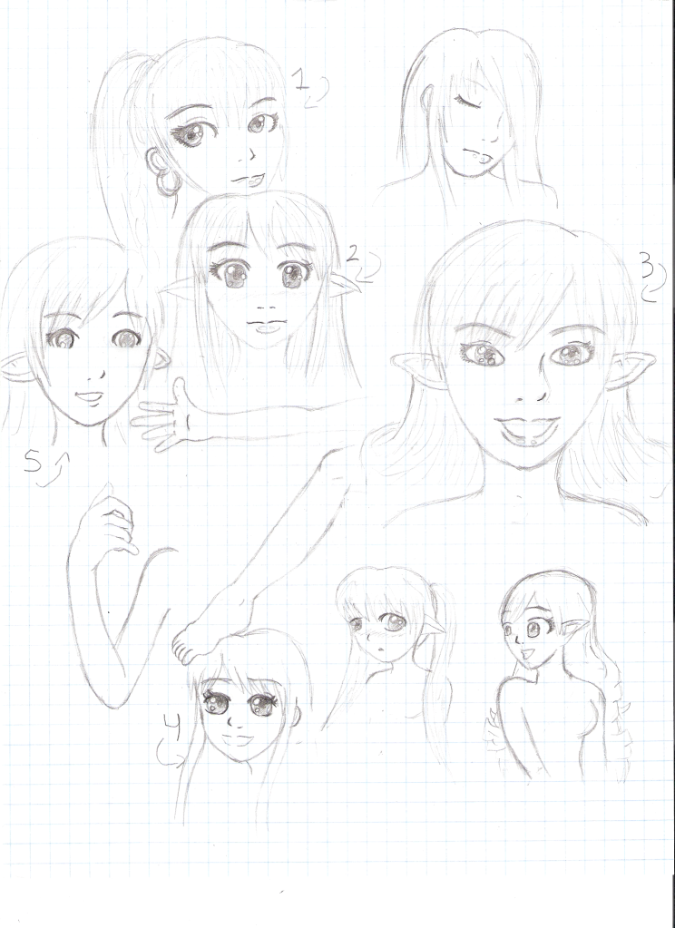
So like, I used this graph paper to doodle the most random of things. You can see my hand practice and feet, too! O.O I dunno. You can also see like several different styles. I know I should be practicing with only realism, but sometimes I get off track and find other styles that are cute. I like cute things. ^_^;;;I think I used the body parts and one or two faces from realism and the rest from various art styles I found appealing.

Doodles.png

The numbers are there for people to decide on their favorite style - or which ever they think I draw the best (which isn't anything, but oh wells). XD I love doodling! :3
 
5! The best there, I'll say.
But it still looks like you've gotta work on proportions. Especially with 4 and those next to it.
But other than that, you're improving, and I think 5 is the best direction to go. I believe it was a semi-realistic-cute you were going for, and that one fits. But it's also up to you.

Here's two sketches of mine
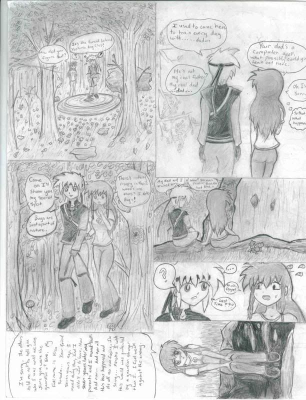
naruto%20comix.png
I in no way support Naruto or yaoi. It just was the best idea for a comic I've ever had.


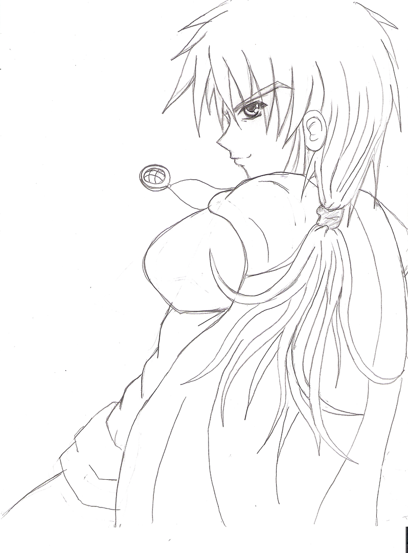
asea-sketch.png
And this one is not even a complete sketch, I guess. I just wanted to share and get some feedback.
 
Yeah, I totally messed up on those two. To be honest, I always get scared when I get to the body part. XD

So far 5 is winning, by the way. That's probably what I'll stick with. ^_^ I'll still use realism for references though, of course (when I find the good poses).

Yeah, I don't watch Naruto and I'm actually not a Yaoi fangirl, so I don't know what to say about it. It was kind of cute, but I don't get it. ^_^;;

I like the second one. I can't really critique it since I'm not that great, mystelf. :3
 
something i sketched during school yesterday

it's suppoed to be some sort of fictional city that's french, apparently!
metropoli2.jpg

and one i just started today. i suck at drawing bodies ;-;
metropolis1.jpg

i guess they were both subconsciously testing my skills with perspective or something :O
 

Thank you for viewing

HBGames is a leading amateur video game development forum and Discord server open to all ability levels. Feel free to have a nosey around!

Discord

Join our growing and active Discord server to discuss all aspects of game making in a relaxed environment. Join Us

Content

  • Our Games
  • Games in Development
  • Emoji by Twemoji.
    Top