
You are using an out of date browser. It may not display this or other websites correctly.
You should upgrade or use an alternative browser.
You should upgrade or use an alternative browser.
The sketch thread!
- Thread starter dadevvtsvre
- Start date
coyotecraft
Sponsor
StrawberrySmiles
Sponsor
@Coyotecraft
I like the look of that. Seriously. XD I can't critique it, 'cause I don't think I'm a good artist. :3
 I accidentally drew her head on the big side. T.T Maybe it helps show she's a teenager, but still. I'm trying to avoid big heads. ^_^;
Once I find good photo references of people for different age groups, I'll try drawing realism again.... XD
I like the look of that. Seriously. XD I can't critique it, 'cause I don't think I'm a good artist. :3

Once I find good photo references of people for different age groups, I'll try drawing realism again.... XD
silver wind
Member
new monsters:
I'm going for a more creepy feel.
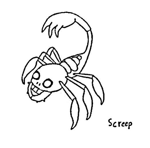
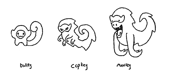
Shadow and Ghost respectively.
Here's one monster in my usual cute style. Solump :
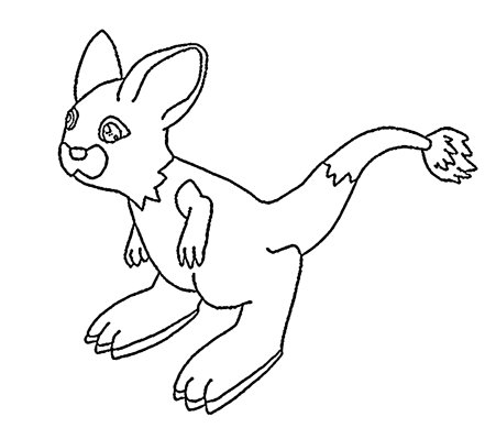
Solar type Jerboa with a glowing tail ^^
@FireDragon_IceWolf
Nice hair, mouth is too low on the face.
@kira
The first one.
@coyotecraft
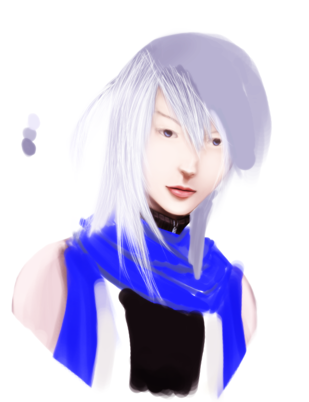
Looks pretty good. The mouth is a bit too wide, the nose should be closer to the mouth, and the shape of the hair doesn't fit the head, I'd expect it to be thicker behind the ear, also the hair on the left side should start below the bandanna or be thinner like on the right side.
@Strawberry
The head is too big on the top compared to the chin, other than that it looks nice.
I'm going for a more creepy feel.


Shadow and Ghost respectively.
Here's one monster in my usual cute style. Solump :
Solar type Jerboa with a glowing tail ^^

@FireDragon_IceWolf
Nice hair, mouth is too low on the face.
@kira
The first one.
@coyotecraft
Looks pretty good. The mouth is a bit too wide, the nose should be closer to the mouth, and the shape of the hair doesn't fit the head, I'd expect it to be thicker behind the ear, also the hair on the left side should start below the bandanna or be thinner like on the right side.
@Strawberry
The head is too big on the top compared to the chin, other than that it looks nice.
i like the first one more in that it's more clean cut, and you can make things out in the picture easier, even though overall there's less things there(just a picture of a guy, as far as i can tell, maybe with mountains...?)
The second one, however, seems to have more substance overall, a whole bunch of symbolistic shit, although I rather feels like it sorta like a newspaper in the way the text is designed, and the face is slightly harder to make out. It's also a tad harder to notice your signature in it(not the giant t in the circle), as we're focusing on the other things.
The second one, however, seems to have more substance overall, a whole bunch of symbolistic shit, although I rather feels like it sorta like a newspaper in the way the text is designed, and the face is slightly harder to make out. It's also a tad harder to notice your signature in it(not the giant t in the circle), as we're focusing on the other things.
StrawberrySmiles
Sponsor

I drew this chick out of boredom, and now I want to name her - but I have no idea what to call her. O.O
jarp jarp
haven;t drawn very much at all recently (no time!!!!) but here are scraps.

you never see female minotaurs, here is one (the horns are meant to be like a viking helmet)
yeah yeah neck is janky, hand is posed dumb idk thats why i scrapped

ooh la la this pose is so bland it deserved scrapping

thinking about some species with bone-like facial plating
looked too much like that emo looking fellow from bleach; scrapped

thought that looked a lot cooler!!!! but idk got bored/scrapped
i need to art more often but so busy
haven;t drawn very much at all recently (no time!!!!) but here are scraps.
you never see female minotaurs, here is one (the horns are meant to be like a viking helmet)
yeah yeah neck is janky, hand is posed dumb idk thats why i scrapped
ooh la la this pose is so bland it deserved scrapping
thinking about some species with bone-like facial plating
looked too much like that emo looking fellow from bleach; scrapped
thought that looked a lot cooler!!!! but idk got bored/scrapped
i need to art more often but so busy
StrawberrySmiles
Sponsor
I love your artwork, as well! It makes me envious to point where I must practice harder and harder! :3
EDIT:

EDIT:

Watching your progress throughout the thread has been great, StrawberryFlower. Practicing has really paid off for you. One thing thing that really helps when you're drawing, especially heads and the like, is to lightly block out the shapes before you fill in the details, that way you'll have guidelines to go by and it's harder to end up with wonky anatomy and/or perspective.
I'd given up on drawing for a little while because I'm having a hard time adapting to the tablet, but y'all inspired me to pick it up and start trying again.

Ignore the facelessness and wonky claw hands and whatnot for now - I'm basically just trying to figure out what I want this character's outfit to look like. I'm pretty bored with it. Thinking of changing the vest to pink, but that might be going a bit overboard with the bright, obnoxious colors.
I'd given up on drawing for a little while because I'm having a hard time adapting to the tablet, but y'all inspired me to pick it up and start trying again.

Ignore the facelessness and wonky claw hands and whatnot for now - I'm basically just trying to figure out what I want this character's outfit to look like. I'm pretty bored with it. Thinking of changing the vest to pink, but that might be going a bit overboard with the bright, obnoxious colors.
wow hey nice ;o
it really does take a while to tablet-adapt but it's totally worth it imo.
your semi-gesture there is pretty nice except watch the neck, no one likes floating head syndrome ;o
also when you block full anatomy, block your skeleton first. your limbs will all end up the same size that way.
it really does take a while to tablet-adapt but it's totally worth it imo.
your semi-gesture there is pretty nice except watch the neck, no one likes floating head syndrome ;o
also when you block full anatomy, block your skeleton first. your limbs will all end up the same size that way.
Venetia":2iorhhpz said:no one likes floating head syndrome ;o
the head might, but eventually it'd probably get lonely :sad:

My anatomy is pretty fucked though, s'probably what I get for learning to draw via Disney as a kid. I've tried life drawing, but I guess it has yet to click. Any suggestions for good books and the like? I've already got all of Andrew Loomis', I just need to get around to thoroughly reading them.
When I was first starting out I did a lot of cartoon animals, myself. Actually I would draw animals with bulging-out "WOWZAH" eyes a lot in the vein of ren from the ren & stimpy opener. Not entirely sure why.
Anyway when I moved onto ppl I read this cover to cover:
Art Students' Anatomy by Edmond J Farris
It is quite possibly the driest and most boring read you will ever endure. But it teaches you every damn thing you will ever need to know about skeletal structure and musculature. Also it is chock full of naked 70's people with full bushes. If you're into that sort of thing.
Oh oh
If you're interested in drawing cartoons, and speaking of ren & stimpy, have you ever seen John K's blog? He dissects what makes cartoons organic and stylized. He is rather full of himself but christ! It's John K. In any case he makes one super important pointer: tracing is not a bad thing!!! By tracing certain things over and over, your hand develops a "memory" of what strokes to use it what contexts. Using that "memory" you can make up your own poses by manipulating your learned stroke movements.
dadevvtsvre
Sponsor
the only thing about john k is that he is still bitter about getting kicked off ren & stimpy 20 years later
if you can get past that though it's all good!
if you can get past that though it's all good!
Thank you for viewing
HBGames is a leading amateur video game development forum and Discord server open to all ability levels. Feel free to have a nosey around!
Discord
Join our growing and active Discord server to discuss all aspects of game making in a relaxed environment.
Join Us


