Envision, Create, Share

Welcome to HBGames, a leading amateur game development forum and Discord server. All are welcome, and amongst our ranks you will find experts in their field from all aspects of video game design and development.

The sketch thread!

@V: Gawd damn I want your brush settings and your artistic ability. :( Thats pretty damn amazing just to be a sketch. :p That full-blown game concept art.
 
Okay... So, ummm...

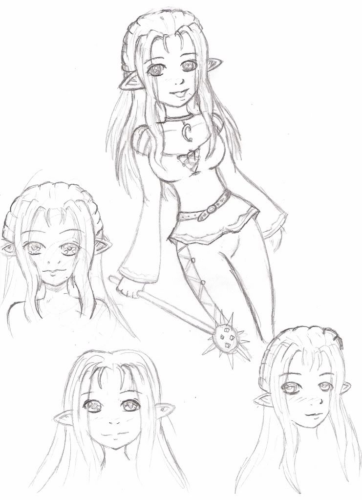
I don't think I'm a good drawer, but I'm trying to get better. I want to try different styles, but that is soooo hard to do... :(

I kind of like her smiling face with the body, but I chose the wrong angle... :/ I don't really like the way I did the other faces surrounding it... They kind of suck. >.> Oh wells! Must get better! :3

AmaraDoodles.jpg
 
Hey - not bad!
(those are exceptionally large breasts, in proportion)

The first sketch is fine, but the ears appear different sizes. Same with the breasts... and the shoulders... you may want to practice more at foreshortening, and such, if you are drawing 3/4

The other sketches look incomplete; any critique on it would be hollow.

You're improving! You might want to look into physically colouring, since you don't have a tablet, and digital colouring might not work so well without it... Copics, airbrushes, even watercolours if you can get a hang of it.

-abreaction
 
Eh, I used to do coloring like that, and it sucked really bad. :/

I did mention that the angle sucked, 'cause I know I didn't do it right. It was an accident angle. Like one of those things you start drawing, and then later realize its not good, but you finish anyway. I think I was doing it for the clothes... O.o

Oh wells! Gotta practice more! ^_^
 
canada: damn man, that was scary as crap.

Anyways, I recently got a scanner one or two weeks ago, and I'd been practicing messing around with it. It turns out I suck at understanding industry level design programs. This is one of my first real sketches, and it's the best I can refine it- I don't know how to do line art

MAde with bamboo fun CTE-450S
Manga studio 3x 4.0
Resizing/editing on Paint dot net
Figure is sitting down on some high platform or something- forgot to draw the background


mawk

Sponsor

tomas I'm not sure what that is but I am sure it's frightening

ven goddamnit stop making me jealous! your grasp of hands is especially infuriating.

canada I am imagining that instead of lips that is a tiny grinning crocodile in profile. it is amazing.

daxis I'm not sure how you are outside of tablet stuff but I think you could really benefit from more practice with posing and anatomy. like, start with a stickfigure skeleton to get the placement and proportions down and work from there. you should probably focus on the basics of the human body before trying something as stylized as that; this has been said a million times, but that's because it's true.
 
Yeah, I have real problems with trying to pose my figures- I usually have the idea of what I want, but no way to express it. I've found that if I can see something, I can copy it, but very bad at thinking it up(even worse, I can barely trace it...)

On the other hand, where are the most prominent problems with the anatomy/posing of the figure? I'm pretty sure the left leg(the figure's sense of left/right) is a bit weird, and the right leg is a bit big, and I missed the left arm, but besides that, is there any subtle offness in it? I specifically chose this posing because it's looking straight forward and various ways I could hide my inability for posing.
 

mawk

Sponsor

the anatomy isn't wrong so much as amorphous; you seem to have the right idea, but need a little practice depicting it. the biggest bit is the raised knee; it's easy to see it as his leg simply being shorter than the other. I think the major reason for this is that the clothes don't really suggest the structures beneath them; look at your own legs while wearing pants and you'll see that the thigh and shin are quite different. the big thing that throws it off is how the pants fold at the crotch; his right leg just keeps going over to his left side, making it look like the left leg (the raised one) is in the background, somehow.

the face is also sort of awkward, but I'm guessing that's just because it was a fast job. the only real advice I have is the nose; the standard anime checkmark never really works for straight-on views of the face. try experimenting with using the nostrils and whatever shadow there is underneath or beside the nose.

I'm not an amazing artist myself so that was probably mostly garbage as critique goes, but I hope some of it was useful.
 
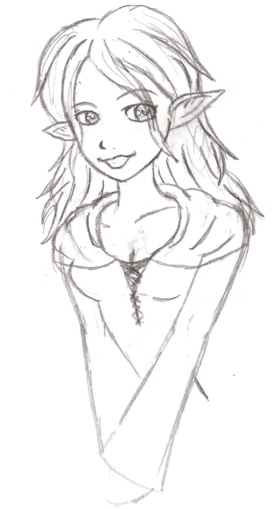
I've been trying to get into drawing again and still finding a style.... O.o

This one was a simple doodle of a friend's character. :3 I like the way I did her face and hair, but I gave up on the body about halfway.
EidenDoodle.png
 
@Strawberry Flower: Be bold. Refusing to draw part of the human figure because you aren't good at it does nothing more but limit you. Practice, practice, practice, and most importantly, sleep with me tonight practice.

From what I can see with your drawing, I think you need to start recognizing planes as oppose to only exterior features. Think of the arm as a cylinder as oppose to just a flat... Thing for lack of a better word. Once you get into clothing, you'll also find that it tends to "wrap" around those 3-dimensional parts as well.

Another thing you could do is to avoid creating tangents. This happens when a line seems to "merge in" to another line... Or for a more clear example is the left strand of your character's hair on the face. The line representing the edge of the strand also is in place with the line of the left side of the face. Tangents result in a lack of depth, and it's not good design.

This thread is awesome by the way. I need to scan most of my recent stuff to show to y'all, however.
 
That was very confusing. I got the tangent thing, but not the planes thing. Which is okay, because I think I can only get better and not worse. :3 The tangent thing is a result of me just scribbling, not really erasing my lines. O.oa I did draw a figure actually for another drawing, but several people elsewhere pointed out the issues - so I need not for them to be repeated. ^_^;

P.S. By your crossed-out-sentence, you must've guessed that I'm chick. YAY! Cookie for you! :3
 
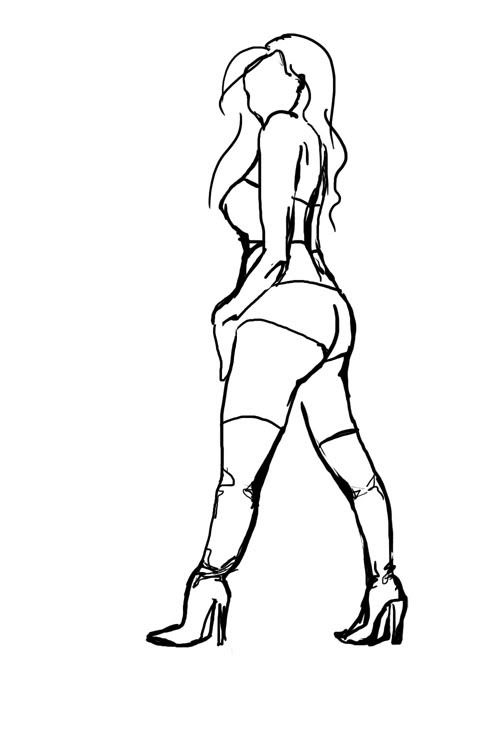
Haven't drawn anything in a while, so did something simple in a few minutes. The ass is weird, but whatever, it was an exercise more in trying to capture stance and attitude than making the anatomy perfect. Still have a long way to go. :V

playboy-1.jpg

Ref:
wonder%20woman.jpg


High heels are oddly fun to draw.
 
she turned out quite a bit stockier than the real thing, but what you made there can be considered a gesture.
Where, in few strokes and spotty planning, you capture the essence of a scene or depiction of something.
 
Might as well post something. I've been neglecting my tablet as of late. :/

Anyways this is something I'm widdling away at. I'm getting sick of looking at it but I need to actually try to FINISH something
shiranui.jpg

I should've resized this thing. :( +1 for the upload image bar on the side though!

I swear I've posted this image before....Anyways

@Peri: Asses always give me trouble. No matter how hard or long I stare at them. I can make like the fattest ass look like a sidewalk. :/ The head looks a little off to me though (I know its just practice) But it seems like its too forward?
 

Thank you for viewing

HBGames is a leading amateur video game development forum and Discord server open to all ability levels. Feel free to have a nosey around!

Discord

Join our growing and active Discord server to discuss all aspects of game making in a relaxed environment. Join Us

Content

  • Our Games
  • Games in Development
  • Emoji by Twemoji.
    Top