Envision, Create, Share

Welcome to HBGames, a leading amateur game development forum and Discord server. All are welcome, and amongst our ranks you will find experts in their field from all aspects of video game design and development.

The sketch thread!

that one looks alot cuter/cartoonish, and I like it
only thing is how the breasts are outlined.. it looks kinda silly
having a dress on, you should do something that hints it more than it shows it


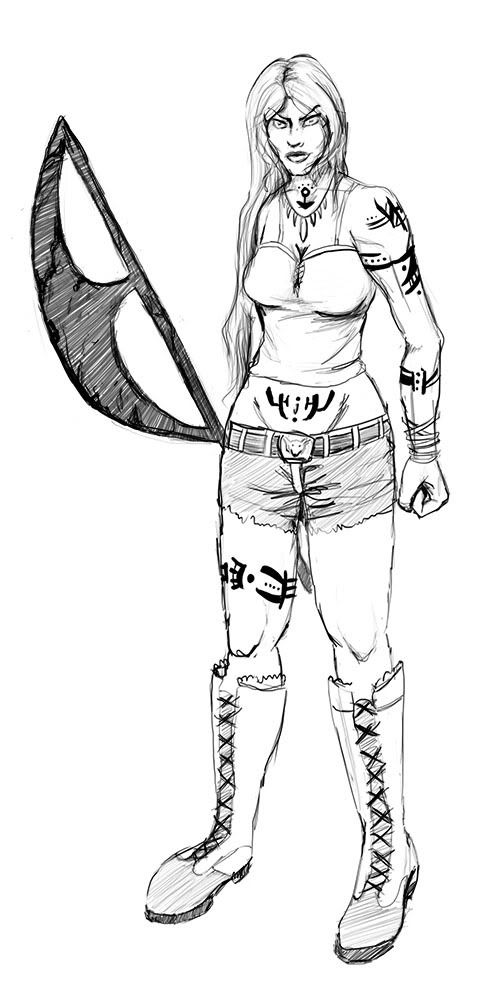
also, a sketch of the main character in my game (sorry some parts are blurry, i'm scanning from a big sketchbook and the scanner doesn't close/it's skewed)
asea.jpg

also practicing poses
 

mawk

Sponsor

Are you sketching out a stick figure for posing beforehand? The details are very well done, but the way the arms curve make them seem almost boneless. It's important to know where the elbows are at.

I've posted this to some people in IRC, but I might as well do it here.

mak022.jpg

Speaking of posing, I think I'm starting to get the hang of poses that aren't ridiculous or stiff as hell. It's tough to mess up a neutral pose like this, but until now I managed to do it anyway. His right arm is longer than his left, because I forgot perspective like a scrub. Proportionally, his arms are supposed to be long, but not irregular.

robs1.gif
 

Spoo

Sponsor

Tomas":p91z3hd9 said:

okay I just noticed this and it's old but wtf is tomas doing posting a picture of my cat? I'm not even kidding.

Also action, i like Asea's clothing but that seems like a really awkward pose...looks like some dance move.
 
the original was probably overwritten by someone elses photo~

mawk: I still think you make your legs too short and your arms too long but maybe that is just me oh dear
but it super cute
and its a robot~
 
lol jiggly arms - the things we notice after we upload them

@tomas: That's a pretty good cat, but it looks like you could use some work on perspective. Look up some references, so that all your cats may be beautiful

@mawk: the robot's awsome, but I feel like where his feet end should be where they start (in terms or how long the feet are). Also the feet look really small and you should find some way to show the mechanics of how his feet move just by drawing (ie having a three sperate parts of the foot that each bend in limited directions to keep a natural rolling of the foot as he walks)
 

zchin

Sponsor

Wow, so that cat one was made???

Action, I like it all, but same thing, the elbows aren't there, when they could be, it all looks a bit rushed when I look at his right glove where the fold is just jabbing out of his wrist... Time is what makes everything look pretty.

Mawk, the robot looks really cool and I think it doesn't need any changes as long as it's not supposed to be using human proportions, cause then if I see someone who's arms are ACTUALLY that length in proportion... I'd freak out.

So i draw when I'm bored, or finish my work early in class, yes, I draw these on the back of my school assignments... Hope I don't get any points off.

scaled.php
I tried to do some realism, didn't turn out as good as I want, but that never happens so I shouldn't be complaining.

scaled.php
Trying a ghetto type style for the arms, and some practice with folds...

Tyahand
 
impressive
i like the nose


------

some doodles/thoughts about the dude from my new(est) game
dude.jpg


i love how easy he is to draw, in comparison to my old rpg characters
 
yo action i see you've made that sketch into your avatar.
it is a very cool one, i like how you did the light, and the small shape of the light around the character, and his eyes and and and.
pretty cool

and mirku, that is pretty rough, but the top one's got some character to it's drawing. yours look like they're leaning a cartoony style, so i'd try to expand on that. try to get smoother lines, and learn about line thickness.

also

rfh2j6.jpg


this is actually a big part of an invitation i made
turned out pretty cool
 
That's cool, Tomas! I like the energy and movement.

Action, I like your little guy. He's pretty expressive and flexible.

Anyway, I drew my character from a Werewolf: The Forsaken game:
scarlet2-3.jpg
 
He probably means the overall draw style, it being all female/fairy/cutesy drawings.

But overall your trying to get rid of the fairy look, from what ive seen your trying to draw male and more other types of chars..

Be more random in your drawings, is what i think he meant
 
Well I'm not a fan of men, so I won't be drawing them very often...

I'm a girly girl who likes cute things, by the way. ^^

As soon as I get cool male characters, I might draw them.

I could draw Star, but sounds... cheesy. o.o

So like I drew this half naked guy with a short face, long neck, and thick arm. It was taken at an angle, too...

DSCF0608.jpg
 
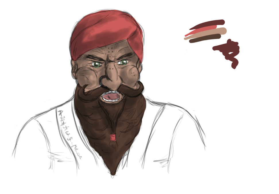
Just got a new graphics tablet. I've been putting up with a tablet that was so outdated it didn't even have pressure sensitivity for too long :P. Got it loaded up and was messing about with it and ended up with this:

DwarfShamyTest.png


30 minutes on it maybe? Probably less. Just playing around with brush thickness etc. Shading could have a lot more contrast and lines are soooo messy.
 

Thank you for viewing

HBGames is a leading amateur video game development forum and Discord server open to all ability levels. Feel free to have a nosey around!

Discord

Join our growing and active Discord server to discuss all aspects of game making in a relaxed environment. Join Us

Content

  • Our Games
  • Games in Development
  • Emoji by Twemoji.
    Top