Envision, Create, Share

Welcome to HBGames, a leading amateur game development forum and Discord server. All are welcome, and amongst our ranks you will find experts in their field from all aspects of video game design and development.

The Screenshot Thread 2

working on face portraits

0KDbxmj.png
 
If anyone can SBaHJ'ify a game it'd be you Bluxxon.

Here's me again with my overly tryhard cinematics n' shit.
http://www.youtube.com/watch?v=jKwV7RqWKRs
Voice acting by ZenvirZan in that one, defining Naxon as best as anyone can!

And ZenVirZan also has lines in the Up to date Full Clearance trailer.
http://www.youtube.com/watch?v=XPf4inORKB8
Was good to finally get a VA for Esperia.
 
Looking good! Makes me want to play a 2k/3 RTP game now, it's been so long. I think the first RM game I ever played was 2k3 RTP, before I even knew what RPG Maker was.
 
Princess Amy":3j3t4odp said:
Looking good! Makes me want to play a 2k/3 RTP game now, it's been so long. I think the first RM game I ever played was 2k3 RTP, before I even knew what RPG Maker was.
The RM2K/3 RTPs are easily the best in the series. The RMXP one was okay, but the charsets looked kinda stiff, and the less said about RMVX's RTP the better!

My RTP maps aren't really for a project, though. Just doing them for fun. I find mapping kinda relaxing for whatever reason.
 
@Pandora: Might be the gif but that mouse looks really laggy.

Here's a mock up of what Perseverance: Full Clearance may look like when it's ported to MV.
qJQDXyN.png


And here's a sweet and simple project I'm making as homework for my game design class.
UsWDz44.png

More Screenshots in the link below.
http://imgur.com/a/a6ToF
 
@Sated : it is the gif :( I need to just stop being lazy and record it, because it is so smooth its beautiful, puts default RMXP to shame lol!

Both are large images!

Working on Full Screen, just have to get my viewport to expand the the size of the screen ^-^
zmRnkGV.png

EDIT: 10/11/2015 (12:23 AM EST) Image of game graphics scaled to correct resolution ratio
3OBHkpn.png
 
9khTKJe.png


Someone on RMN already told me about adding trees and fixing where the water meets the dirt, so I already went ahead and made those fixes. I just can't be bothered grabbing another screenshot, and it looks decent as is :)
 
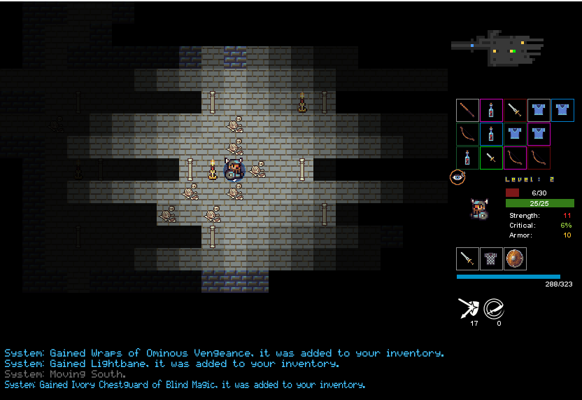
The vent minigame shown above is something that happens during the second level of my game. During the third level there is going to be a similar sequence that takes place in some sewer tunnels. I don't plan on this sewer section being as integral to how the third level plays out as the vents are to the second level, but I do think they'll set-up what comes afterwards (which will remain a surprise) pretty damn well. So basically what I've been working on are the graphics for these sewer sections, and here are some examples that'd slot into the user interface shown above:

xhqzIGT.png


I think they're okay? I'm undecided. I intend to add some cracked/missing tiles to spice things up a little. I think I'm okay going without anything on the floor because the tiles already convey everything about depth/direction?
 
New_Title_Screen.PNG
sATEIDp.png


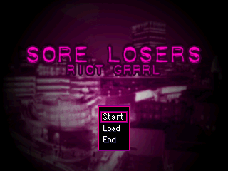
New title and game over screenshots from SL: Riot Grrrl. The background image is an open source shot of Manchester at night, with a few Paint.NET filters applied. I've also changed the stylised Start/Load/End text to something simpler because why over-complicate something like that? I think they're a lot better than the old ones, if not perfect. Also, I did these for fun since I just got RM2K Value:

BalHwlt.png
AokDwGw.png
 

Thank you for viewing

HBGames is a leading amateur video game development forum and Discord server open to all ability levels. Feel free to have a nosey around!

Discord

Join our growing and active Discord server to discuss all aspects of game making in a relaxed environment. Join Us

Content

  • Our Games
  • Games in Development
  • Emoji by Twemoji.
    Top