Envision, Create, Share

Welcome to HBGames, a leading amateur game development forum and Discord server. All are welcome, and amongst our ranks you will find experts in their field from all aspects of video game design and development.

RPG Breeze (Cancelled)

IIZeusII":1hxn069t said:
O.O

That brings up a good point, I've got a friend who fell for the "bricked" used one (Red Ring of Death), and new one's still are a bit pricy that is true, only thing i can think of is if you can find someone you know, close to you that has one you know for sure works on live, they might come off it cheaper. Or if not, a wholeseller might have a pretty good deal. But as you said, at this point it's a expenditure that might not be worth it for you to invest. :fap:

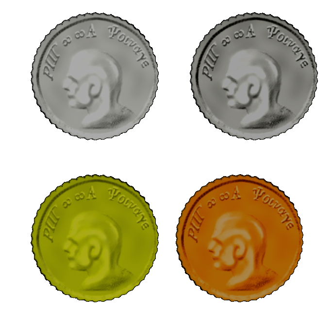
PS, here is a Really quick mock up of some worn 64x64 silver coin's. Sample includes bump mapping for indentation, embossing and sharpening. Nowhere near perfect, but i needed to see if this was the "idea" of what your looking for, if so ill work on "silver, gold, copper, platinum" first.

http://gallery.filefront.com/iizeusii/

I see what you meant about quick. Tone down the contrast, up the reflectiveness. Those look like the old photos of Roman coins you see in 20-year-old textbooks, except that they aren't Roman coins. (I think) Anyway, I'm not entirely sure, but I think Theory wanted to use a more anime style. So, my first attempts would proabably be cell-shaded. Still, I'll have to wait for theory to come back before I can confirm that. (I only talked about the programming with him)

As to the Xbox, I have a friend who lives a block over that has a live-enabled 360, but I don't trust him enough to test the program at his house (and he's often not home), and he would never let me borrow the thing.
 
New Image's!

Spent some time going color friendly, dropped the bumpmapping (hrm, maybe, no no keep going), dropped the embossing, went with some cell shading, and some layered color lightmapping, and popped in a drop shadow for depth. Hopefully this will be a little closer to what you think he might want, lemme know :cheers:

http://gallery.filefront.com/iizeusii/

PS. Be sure to click on the photo after going to filefront's site, not real sure why, but you cant see a updated image until you do. (Coins1, Coins2) (That last platinum coin still is irking me tho)
 
IIZeusII":2amy2vyc said:
New Image's!

Spent some time going color friendly, dropped the bumpmapping (hrm, maybe, no no keep going), dropped the embossing, went with some cell shading, and some layered color lightmapping, and popped in a drop shadow for depth. Hopefully this will be a little closer to what you think he might want, lemme know :cheers:

http://gallery.filefront.com/iizeusii/

PS. Be sure to click on the photo after going to filefront's site, not real sure why, but you cant see a updated image until you do. (Coins1, Coins2) (That last platinum coin still is irking me tho)

OK, they look a lot more anime styled now. I might want to try making them look a little more like a coin instead of a painted poker chip, though. (As in, maybe you shouldn't have completely dropped the bump mapping, and it definitely needs some shine to it) In other words, you lowered the contrast a little too much. Still, don't read too deeply into what I'm telling you, because I'm just guessing based on THeory's "anime-style" comment. We'll know what he wants as soon as thoery gets back.
 
I like the coins- but here's the million dollar question: is the design original?
Everything's got to be from scratch because I won't be dealing with a copyright or dirivitive works problem.

And yes, as stated, I'm trying to get as anime as I can. Traditional (video) RPGs have all used an anime-esque feel. I want to be closer to the Final Fantasy series than "Dink Smallwood" which was an epic fail, IMO. They tried to use a 3D-esque RTP- the result being that custom graphics were limited to 3D modelers.

The coins are alright, if the actual design is original.
 
jaydenfox":ewzy4bhb said:
Do you have news, even though it wasn't 48 hours? Because you said you'd be away, but you're back.

I think he prefers to overestimate the time it will take to do something at this point, after the failure to meet a projected release date. Anyway, I'm waiting for news as well. Also, welcome back Theory!
 
well at this moment I'm working on a set of tiles for 32x32, 64x64 and 128x128, they are looking pretty good so far

I'm hoping to get a demo shot of the tiles (I have to use XP because I don't have RPG::A yet) =P

I'm thinking maybe getting some screenies up next week

EDIT:

hey Theory I was wondering if there was a way to make bridges separate from the tilesets, so that you can go under them and over them on the same map. We're having the discussion on how to try doing this in XP and it's bringing up some interesting points. Bridges SUXOR in XP...can we fix this for RPG::A?
 
The bridge issue is already fixed- we had that before redevelopment. We did it with 2 map "levels", each consisting of x amount of layers. The two levels feature bidirectional "portal" tiles, which could be assigned to stairs or even with events. This time, I'm going to try to work in a z variable to make this even smoother, perhaps with a heightmap for tiles, and a configurable height map offset for levels. (so stepping off a heightmapped "incline" onto a flat piece on level two would appear smooth, rather than dropping and being off one tile).

Just so you know, an event bridge is not too difficult in XP, only catch is you can have events on top and below at the same time. But there was a script for it awhile back. You can also use a few tileset tricks with a tileset switching script for the same effect.


Edit: and Zeus, your edit is appreciated. Don't take it personally. It's just standard procedure around here to try and watch that kind of thing. Thanks for understanding.

Edit 2:
To clarify on the coin thing, you're simply putting too much effort into it. This would be good enough:


Edit 3: Although, if you wanted to put too much effort into it, try drawing it at a perspective angle. Might make it a bit more interesting...

Edit 4: And to take it even further, make additional icons as "stacks" of coins for when the player has 50, 500, 1000, 5000, 10000, etc. and they could be switched automatically (with a disable switch for the less ambitious artists that need to change the currency icon.
 
New Images!

I agree with the bumpmapping glitch, i edited it accordingly, and edited the contrast and saturation, also did some minor shading tweaks on the platinum vs silver to better tell them apart. :cheers:

Creation of this design was made from scratch, solely for use in RPG::Architect, usage right's are mine to give, and you got em :). Myself and Glitch had no real idea where to begin, so i spend about 4 hours last night coming up with a base we thought you would like. Just keep rolling the hit's on tweaks, and ill continue to revamp, or let me know if this version work's for you, 2D creation is something I've become rather rusty with lately, so i needed to brush up anyway. :haha:

Hope you guy's like it! :angel:

http://gallery.filefront.com/iizeusii/
 
IIZeusII":22v1tyuo said:
New Images!

I agree with the bumpmapping glitch, i edited it accordingly, and edited the contrast and saturation, also did some minor shading tweaks on the platinum vs silver to better tell them apart. :cheers:

Theory, On using this material, it was created by myself for this program alone, so your quite safe. Myself and Glitch had no real idea where to begin, so i spend about 4 hours last night coming up with a base we thought you would like. Just keep rolling the hit's on tweaks, and ill continue to revamp, or let me know if this version work's for you, 2D creation is something I've become rather rusty with lately, so i needed to brush up anyway. :haha:

Hope you guy's like it! :angel:

http://gallery.filefront.com/iizeusii/

Did you see Theory's post? As he said, you're putting in too much effort. In this case, the copper coin looks OK, but the others either have too high a contrast, or the light source is too bright, or they are simply too reflective, as there is too great a contrast between light and dark. I'd try to make it where you see a shine similar to in Theory's post (which takes a lot more work, I know) Maybe ever try that with the bump map as well.
 
Image's Up!

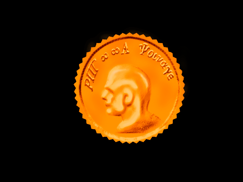
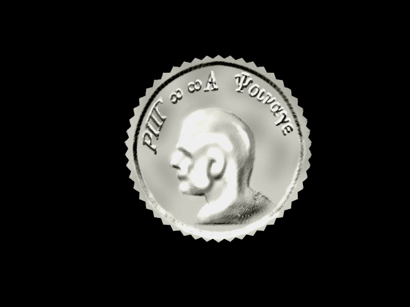
Dulled the Reflection, Added Perspective, Lightsource emanation from SW corner, Added slight film grain touch for little less poker chip style, into worn coin style :cheers:

If this is closer to what you would like, then if need be, i will entirely rework this from scratch (seriously it's not a prob). A problem exist's atm due to bumpmapping and embossing of earlier version's, where I screwed up and light emanation is actually now slightly engraved into the coin (unfortunately there is no removing it). When and if i rework, im going to reposition the light source at a NW Corner of the coin, for a light flare inside the coin, and a perspective similar to what i have already. Haha, your right, i have really been overworking this, a laser when i needed a cap gun, true! Let me know of this current version, and if it doesn't sit well, it's overhaul time. The good new's Glitch and Theory, once this is done i can move on to other thing's needed with a good idea of what you want, that will match. :haha:

http://gallery.filefront.com/iizeusii/
 
It's not bad. Just FYI- the coin I used as a demo, I made in Photoshop from your coin in less than 3 minutes. I think you need a brushup on modern design. Fortunately, that's simple.

http://www.smashingmagazine.com/2007/03 ... -round-up/

This will teach you the 5 second "shine" effect, as well as some nifty reflection tricks and basic background handling. Basically, it will teach you modern 2.0 style 2-dimensional editing.

I won't lie, I would love to see a perspective angle (where the side of the coin is visible.) I would also love to see symbolic "stacks" to demonstrate that if they have a buttload of money, the icon is a buttload of money icon, not just a single coin. Break that down to multiple currencies (copper, silver, etc.) and we've got a killer icon set for currency.

Here's a nifty pattern. Can't rip it off directly, but I love the finished coin they had. Still overworking, but just thought it would be a fun link.
http://joshviers4.blogspot.com/2007/11/ ... esign.html

And for a stack of coins:
http://www.istockphoto.com/file_thumbvi ... -coins.jpg

And a perspective coin:
http://www.iconarchive.com/icons/deleke ... 56x256.png

Maybe for millions just a chest icon would suffice (maybe open chest?) No, no, I mean *treasure* chest. But whatever.

Anyway. Still working on a few things. I have to finish up the Prometheus Engine before I can resume work on RPG::A. Should be back under development within 2-3 days.
 
Brush-up on modern design? (nice shot, you get that one for free.) :box:
Was this supposed to be modern? I was under the impression it was a 2d cell shaded reminiscent of a snes game version. I suppose a better start to this, sigh, would have been sending you a pm instead of reading post's on basic' idea of what you wanted.

Regardless, I will read your tutorial's you have posted, might help some.

I checked out the stax, and dragon version of your coin. The only issue that I see arising possibly from that, is the sheer detail included in the dragon coin squished down into a 64x64 ought to look like a squiggly circle, even with scaling. Here is what I going to do: :specs:

I have a conference in Athens (about 3 days)
I will work on a total rework of the coin from ground up : Copper : Silver : Gold : Platinum
Stacks of 50x100x1000x5000 also.
I will see what isometric (ish) view i can pull off with perspective on the coin's also.
Should be able to post up new coins by the time i get back.
 
IIZeusII":1noso2mc said:
Brush-up on modern design? (nice shot, you get that one for free.) :box:
Was this supposed to be modern? I was under the impression it was a 2d cell shaded reminiscent of a snes game version. I suppose a better start to this, sigh, would have been sending you a pm instead of reading post's on basic' idea of what you wanted.

Regardless, I will read your tutorial's you have posted, might help some.

I checked out the stax, and dragon version of your coin. The only issue that I see arising possibly from that, is the sheer detail included in the dragon coin squished down into a 64x64 ought to look like a squiggly circle, even with scaling. Here is what I going to do: :specs:

I have a conference in Athens (about 3 days)
I will work on a total rework of the coin from ground up : Copper : Silver : Gold : Platinum
Stacks of 50x100x1000x5000 also.
I will see what isometric (ish) view i can pull off with perspective on the coin's also.
Should be able to post up new coins by the time i get back.

I talked to him about it. He actually posted the dragon coin from the Beowulf site as an example of a cool coin design, not necessarily as something to emulate. Look down below the coin for the basic coin outlines.
 
Yea, i checked the outline's and stack example's listed, think i got a good hand's on this time around, just didnt enjoy the cheap shot for free help. :haha:

I'll be able to come up with some more stuff fairly quickly this time around, knowing exactly what to go after, thanks for all the help glitch! Be in touch soon. :thumb:
 
I apologize if it came off as a cheap shot (which after re-reading, it does kind of come off that way.)

Was really stressed out yesterday and therefore a bit more direct in things. It wasn't anything personal in any way, so I'm sorry it came across that way.

To be honest, the gold coin icon is probably one of the smallest details in the game. So I've decided to forfeit control over it. Use your own judgement. Come up with something, and I'll use it.
 
theory":12gifv09 said:
I apologize if it came off as a cheap shot (which after re-reading, it does kind of come off that way.)

Was really stressed out yesterday and therefore a bit more direct in things. It wasn't anything personal in any way, so I'm sorry it came across that way.

To be honest, the gold coin icon is probably one of the smallest details in the game. So I've decided to forfeit control over it. Use your own judgement. Come up with something, and I'll use it.

You do realize that that's what got us into the whole rewrite in the first place, don't you? Also, I've been working on some more ideas for the weather systems, if you wanted to see. (Just have a little (non-fatal) bug to work out with my most recent addition)
 
well, I'm gonna throw my hat into the ring on this one...I'll post some coin pics this afternoon or later tonight. And yes, Maya 8 has cell-shading so I can use that too =)

EDIT:
many hours later and a drive home:

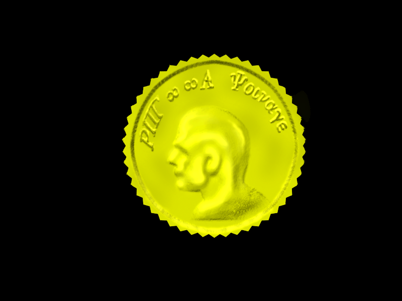
these are all 3D models I made, 100% custom and original from the geometry to the textures.

the four coin types: copper, silver, gold, and platinum:
coinsamples.png

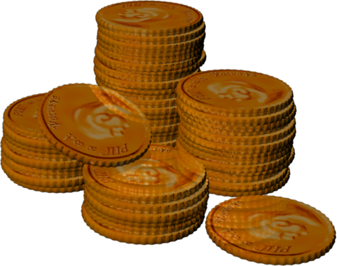
a sample copper pile, there's 50 copper here:
copper50pile.png

the same copper pile at 128X128:
copper50pile128x128.png

here is the pile at 64x64:
copper50pile64x64.png

here it is at 32x32: (I think I can actually clean it up some yet, haven't tried yet)
copper50pile32x32.png

copper coin detail:
renderedcoppercoin.png

silver coin detail:
renderedsilvercoin.png

gold coin detail:
renderedgoldcoin.png

platinum coin detail:
renderedplatinumcoin.png

I was wondering, Theory, about how you wanted to set up the monetary system in RPG::A. Will the system automatically change from one denomination to another? Or can the player control that?

I mean like this. Typically, 100 copper would be 1 silver. Can the player have the option of keeping the 100 copper coins (maybe in a money bag that has 4 pockets, 1 for each denomination of coin that's accessible from the inventory screen)?

anyway lemme know what you think. I have a whole slew of icons and things waiting on feedback ;)
 
For right now, it will be based on author's wishes. They can tally automatically, they can be completey seperate (with conversion through object events), or a mix of the two (100 copper = 1 gold, but platinum is seperate.)

We're just making a starter kit.
 
Just for the record, Rico, you might wanna change the detailed coins so they're not all jagged and stuff. They look nice that way, but if you had them in your pocket or hand, you may be liable to cut yourself.

Gah, I want this program to be out now. I'm making a game as a Health project... I'm forced to use RMXP as opposed to this... Dang. Oh well. I'll live.
 

Thank you for viewing

HBGames is a leading amateur video game development forum and Discord server open to all ability levels. Feel free to have a nosey around!

Discord

Join our growing and active Discord server to discuss all aspects of game making in a relaxed environment. Join Us

Content

  • Our Games
  • Games in Development
  • Emoji by Twemoji.
    Top