
You are using an out of date browser. It may not display this or other websites correctly.
You should upgrade or use an alternative browser.
You should upgrade or use an alternative browser.
Mapping Improvement Thread 4
- Thread starter Æ№∞₧
- Start date

Zekallinos
Sponsor
Much better. You could have the window light wider, but that's your choice, there's no problem with how it is now. A tip of advice, however, concerning the lamp. You erased a patch around the light. But you forgot the amount of light at the right side should be a little lower, due to the presence of the wall. You could say that a wall must cast shadow.
MCsephiroth13
Member
I never knew how people did those lighting effects. How do you do that? (sorry if it's been mentioned here already, too lazy to look.)
Take a screenshot of your map, open it in an image-editing program with layers, paste it on, make a new layer, and draw the effects over it, delete the layer with the map on, and save the image you have, then just use a Show Picture command with your events.
Miss Dani, your map looks really great :thumb:
Miss Dani, your map looks really great :thumb:
@Dani: At all the incarnations of the cells, I thought they were awesome. They feel the right size. I can see the real difference between the shots and I'll address an important issue in a moment about the light.
@fox5: Gorgeous house, the right size and feel, although the shape is awkward given they used to build houses in a very uniform ways (or so I think.). Still grand, though.
@Dani & fox5: That ambient light is wrong. Essentially, all outdoor objects are preshaded so even if you have special shade directions with scripts or ambient shapes - unless you remove the inherent shadows, the light always comes 80ish degrees from the west. As such, and regardless to the direction of the light at any given daytime, you providing ambient light from the northern windows (They could be west with removed shadows, but that's damned confusing) is inherently incorrect as light can't fall like that - far and wide.
I may not be the first to develop an itch to this, but it bothers my eye - looking good or not.
Just my 0.02 regarding light.
@Anaxim:
@Miss Dani: That looks much better. Just, as Zekallinos said, remember that there are other objects like walls and stuff which change what the light will look like.
Lol, I only posted it as an example, but thanks for the comments anyway. About the light thing, true, but I normally totaly ignore the RTP shadow style, and end up replacing it all with cosmetic lighting, my example was just to show Miss Dani what I meant.fox5":3vrilfr4 said:(Random map, ignore it) It's a pretty bad example
@Miss Dani: That looks much better. Just, as Zekallinos said, remember that there are other objects like walls and stuff which change what the light will look like.
Thanks, everyone.
Anaxim : Yes, you're right. However, I'm sorry, but I'm not a good enough spriter to change the premade shadows and so I'm going to keep them. I'll try not to overuse the cosmetic stuff, though.
And now for an outdoor map. xP I hate outdoor maps, indoor ones are much easier for me, but I need to get better at them.

This map is supposed to be a "fond memory" type, although I can't get the screentone to look right.
Anaxim : Yes, you're right. However, I'm sorry, but I'm not a good enough spriter to change the premade shadows and so I'm going to keep them. I'll try not to overuse the cosmetic stuff, though.
And now for an outdoor map. xP I hate outdoor maps, indoor ones are much easier for me, but I need to get better at them.
This map is supposed to be a "fond memory" type, although I can't get the screentone to look right.
Looks good. I really like the receding shoreline. For a more "fond memory" type thing, try changing the screen tone to a more yellowish color. There's definitely too much red in this one. You might get complaints about the flowers because they don't completely clash, but I think they're fine.

@Sir: The map is nice. Basic but nice. There's nothing too visually UNappealing about it, however, here's a list you might want to tackle.
1.If I were you, I would take advantage of the light and darker grass tones and make it into a path, since there really isn't any sort of path to guide the player. Try to make the lighter grass the path, and then put darker grass around it.
2.The weeds you have on the darker grass stand out a bit too much so you might want to consider moving some of them to the lighter grass.
3.There's a problem with your taller glass over where you have the elevation. It looks like you accidentally cut it off when you added the elevation to it, so I'd go back and refine the edges of the tall grass.
4. The taller grass shouldn't be growing where the tent is. If that tent was put there, the grass probably died and receded, so you might want to pull that grass back a bit.
5. Why is there a path in the middle of the tall grass behind the tent?
6. More flowers are always nice.
7. Maybe add more elevation to set more of a barrier for the player and keep them from trying to wonder off. This can also be accomplished if you "stack" several trees around the inaccessible edges of the map.
Also, the button you're looking for is here:
 You can do it!
1.If I were you, I would take advantage of the light and darker grass tones and make it into a path, since there really isn't any sort of path to guide the player. Try to make the lighter grass the path, and then put darker grass around it.
2.The weeds you have on the darker grass stand out a bit too much so you might want to consider moving some of them to the lighter grass.
3.There's a problem with your taller glass over where you have the elevation. It looks like you accidentally cut it off when you added the elevation to it, so I'd go back and refine the edges of the tall grass.
4. The taller grass shouldn't be growing where the tent is. If that tent was put there, the grass probably died and receded, so you might want to pull that grass back a bit.
5. Why is there a path in the middle of the tall grass behind the tent?
6. More flowers are always nice.
7. Maybe add more elevation to set more of a barrier for the player and keep them from trying to wonder off. This can also be accomplished if you "stack" several trees around the inaccessible edges of the map.
Also, the button you're looking for is here:
Tuna":175uped9 said:@Sir: The map is nice. Basic but nice. There's nothing too visually UNappealing about it, however, here's a list you might want to tackle.
1.If I were you, I would take advantage of the light and darker grass tones and make it into a path, since there really isn't any sort of path to guide the player. Try to make the lighter grass the path, and then put darker grass around it.
Alright.
2.The weeds you have on the darker grass stand out a bit too much so you might want to consider moving some of them to the lighter grass.
Will Do.
3.There's a problem with your taller glass over where you have the elevation. It looks like you accidentally cut it off when you added the elevation to it, so I'd go back and refine the edges of the tall grass.
Just Noticed That. Will do.
4. The taller grass shouldn't be growing where the tent is. If that tent was put there, the grass probably died and receded, so you might want to pull that grass back a bit.
Will do.
5. Why is there a path in the middle of the tall grass behind the tent?
What Path?
6. More flowers are always nice.
Will Do.
7. Maybe add more elevation to set more of a barrier for the player and keep them from trying to wonder off. This can also be accomplished if you "stack" several trees around the inaccessible edges of the map.
Alright.
Also, the button you're looking for is here:
You can do it!
Thanks.
How's this:

Also,

You're flowers are randomly placed and there is a whole lot of symmetry between them >.<
Remember plants of the same kind will often grow near each other, and flowers usually grow in bunches
Also you have flowers growing in places (I assume) to be the path
quite simply its set up a bit illogically and furthermore you have little variation,
remember you want to keep the player intrested :wink:
Hope that helps :biggrin:


The screentone is nice however you have excess symmetry,
flowers don't run perpendicular to each other, this is not math class :P
Also try to vary it up, when I said groups I meant like 1 or 2 of the same flower next to each other
and usually its a different tile with the same kind of flower (like with the yellow ones)
flowers don't run perpendicular to each other, this is not math class :P
Also try to vary it up, when I said groups I meant like 1 or 2 of the same flower next to each other
and usually its a different tile with the same kind of flower (like with the yellow ones)
A bit too much pink, and the flowers are still growing on the trodden path. And I don't know why, but the darker grass cutting across southeast of the tent really bothers me. Fill that in with lighter grass please. :D
Also, the path I'm talking about is where light green grass interrupts the flow of taller grass behind the tent and trails off to the north.
Also, the path I'm talking about is where light green grass interrupts the flow of taller grass behind the tent and trails off to the north.

silver wind
Member
@SirBigC94, It's a great map, especially being your first one. and this tileset (001-plains) is hard to work with.
You can add events of small animals like squirrels, bunnies and butterflies. You can also use the smaller grass tiles on 3rd layer around the tall grass's edges to give it a natural shape.
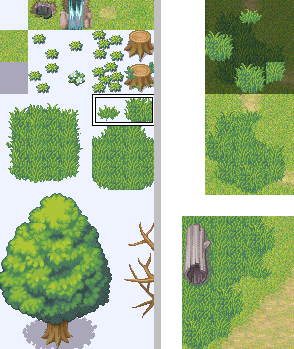
You can add events of small animals like squirrels, bunnies and butterflies. You can also use the smaller grass tiles on 3rd layer around the tall grass's edges to give it a natural shape.
Thank you for viewing
HBGames is a leading amateur video game development forum and Discord server open to all ability levels. Feel free to have a nosey around!
Discord
Join our growing and active Discord server to discuss all aspects of game making in a relaxed environment.
Join Us