
You are using an out of date browser. It may not display this or other websites correctly.
You should upgrade or use an alternative browser.
You should upgrade or use an alternative browser.
Mapping Improvement Thread 4
- Thread starter Æ№∞₧
- Start date
 :
:MCsephiroth13
Member
I can't really tell if you missed this or not (because it's zoomed out to far) but you might want to consider adding those extra tall grass tiles that are located above the corner tiles for the tall grass. They make the tall grass look so much nicer and give them more realistic edges.
Here's an example:

Here's an example:

It's a pretty boring map. There's nothing to guide the player around - no natural boundaries (except, obviously, the circular cliff), no real path, not even any trees. And about that path - it's not a path. You should a) make it look like a path that's overgrown, b) make it look like a path, or c) get rid of it and use other path markers. The way you did the cliff in the upper left is a good example of using path markers. Basically, it's just too open - there's nothing to suggest it's *supposed* to be open. You've also got some very square mountains; I recommend making them a little less rectangular.
silver wind
Member
@Lurker, start with a small map. Only expand it when you have no more room to place stuff, It may prevent the 'emptiness'.
New map from me :D
It's pretty basic, but I never did prison/dungeons before.
I need any tips you can give.
New map from me :D
It's pretty basic, but I never did prison/dungeons before.
I need any tips you can give.
Don't forget the / before your second spoiler tag. ;D
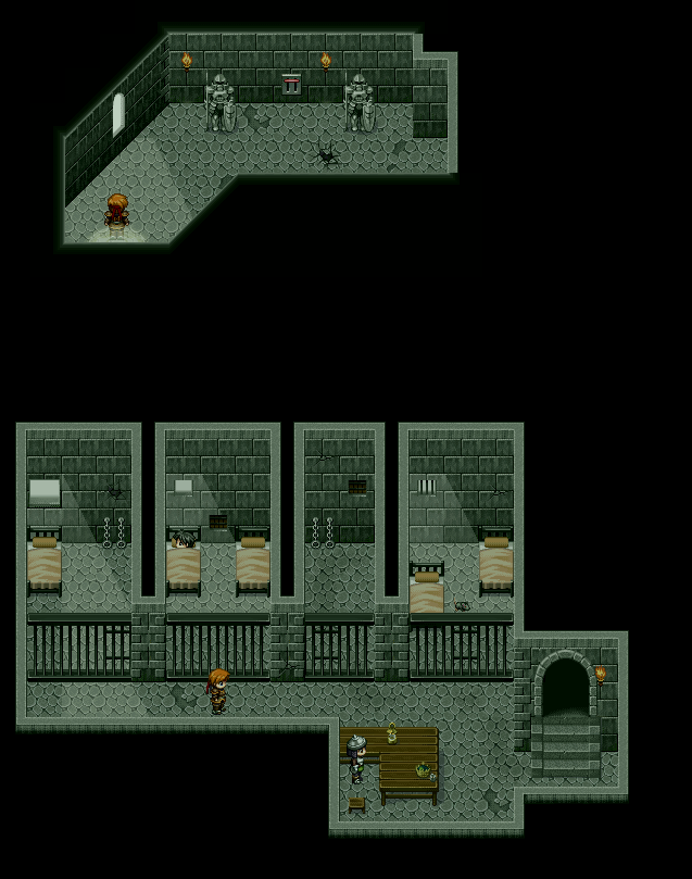
Anyway, your second cell from the left appears to be missing a gate.
The guard's seat seems a bit misplaced.
The lighting in the first cell on the left is odd because there's no light directly in front of the window and the light seems to separate in two different spots. (2 tiles above the cell door and then 1 tile down 1 tile right of the cell door.)
There's a slight light glitch directly to the right of the window on the upper part.
In the upper part if there is a door at the right end of the hallway, it should be a bit more obvious.
Other than those small things, I think it's very visually appealing and well-structured.
MCsephiroth13
Member
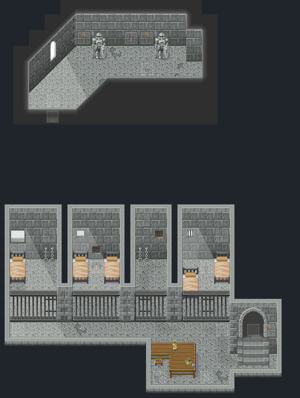
@Silverwind's map: It looks pretty good, man! One thing I noticed though was some parts of the walls were'nt the same hight as others. (Walls at the back of cells 3 tiles high, walls next to cell gates 2 tiles high?) Unless the ceiling would be slanted or something but soemthing like that can't really be pulled off in RMXP without looking looking odd.
silver wind
Member
@Love
Thanks, I fixed the wall issue. It was the wall autotile showing below the tower wall tiles.
The wall autotile doesn't work with the diagonal walls, so, now I have 2 kinds of walls. I can change the wall tiles in the 1st room, but I'll need new tiles for the walls separating the cells.
@Tuna
Heh, this is what happens when you type the tags instead of clicking the tag buttons.
Fixed what you said to, except the door being more obvious. Any idea how I can do that?
@ MCsephiroth13
Thanks. The gate wall is already 3 tiles, though it looks shorter. optical illusion? maybe it's the stairs..
New map
blakependragon
Member
okay i have some more. i've been really working on my maps, they're not great but... you should have seen them before :haha:
this is a plains so i'm not sure what else to add, but it seems to missing something


now that this is zoomed out, i see my path is square...but people walk in straight lines right?

now that this is zoomed out, i see my path is square...but people walk in straight lines right?
First map: Too much water. But it's meant to be large, it's ok but add more trees around it because it kinda looks empty.
Second one: Nice one, but you used the blankets wrong unless you want long beds. It kinda looks awkward this way, though. Also add more stuff to the walls, as they seem to be kinda empty.
Third one: More trees, more trees, please. :P And those stairs don't really fit at all, you should use the default mountain ones. And as for the paths, it doesn't look really nice how some are really thin and some are very fat.
But overall, nice. ^^
blakependragon
Member
thanks, the first map is a pond where you can fish. actually i've edited the blankets, so you can walk under them and see the characters faces, because it went to their eyes before, and that's weird... what can be added to the walls in a home besides pictures?
and thanks for pointing the stairs out.. didn't even notice it looked strange.
should the paths leading up to homes be as wide as the others? (i'm not too good on making towns yet)
and thanks for pointing the stairs out.. didn't even notice it looked strange.
should the paths leading up to homes be as wide as the others? (i'm not too good on making towns yet)
goofydiegog
Member
blakependragon, on the first map, the ledge is too......man made??? what im trying to say, is that the ledge is to perfect, try to overlap the ledges, like such
 and add some random movement, cause ledges aren't always perfect!

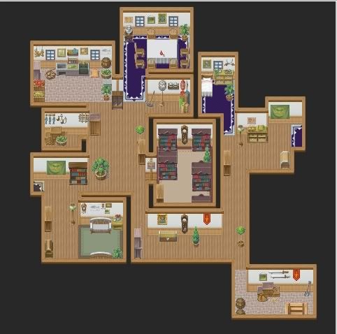
The first map is oddly shaped for a house and contains lots of empty space. Cut down on the size of the rooms, or fill it with decorations. The outdoors is a little better, but it's hard to tell because of the small size. Make sure when you upload it that you're not resizing it (you can also crop the image so only the map shows).
For larger maps, most paste together 20x15s in an image-editing program. But there's also a script by SephirothSpawn, I believe; you can try a search.
For larger maps, most paste together 20x15s in an image-editing program. But there's also a script by SephirothSpawn, I believe; you can try a search.
Zekallinos
Sponsor
It's your image hosting that resizes your image, not your screen capture program.
The layout is much better now, but there is still much wasted space.
The layout is much better now, but there is still much wasted space.
Thank you for viewing
HBGames is a leading amateur video game development forum and Discord server open to all ability levels. Feel free to have a nosey around!
Discord
Join our growing and active Discord server to discuss all aspects of game making in a relaxed environment.
Join Us