

You are using an out of date browser. It may not display this or other websites correctly.
You should upgrade or use an alternative browser.
You should upgrade or use an alternative browser.
Mapping Improvement Thread 4
- Thread starter Æ№∞₧
- Start date
Zekallinos
Sponsor
Move rooms closer together, reduce their size or design your houses in a way that there isn't overly long corridors.
you would not be able to get into the most upper-right room.Venicia":16bo24kq said:This any better?
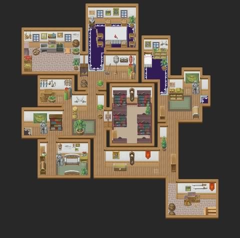
Æ№∞₧":27rzkdst said:you would not be able to get into the most upper-right room.Venicia":27rzkdst said:This any better?

Upper left, rather. I think it looks fine. I'm not really a fan of big interior maps like that, though.
LaDestitute
Member
Jungle


silver wind
Member
@Venicia, I actually like it, I'm tired of rectangular interior maps.
@Miles, add more plants, wild life, tall grass, maybe some ruins. It's too empty to be jungle.
@Miles, add more plants, wild life, tall grass, maybe some ruins. It's too empty to be jungle.
@Miles, you need to add more plants, shrubs, trees, ect, dotted around the map. Also your path work looks odd, remember that a path is ground where grass had died because it has been walked on over and over, not just random dead grass spots especially not in a forest...
And the border of trees you have used is too straight, try make it move in and out in some places.
And the border of trees you have used is too straight, try make it move in and out in some places.
Kodi Hammon
Member
I'm trying to find what's Just right for my Game's First Map(other then the House you begin in)
(Outside Path)
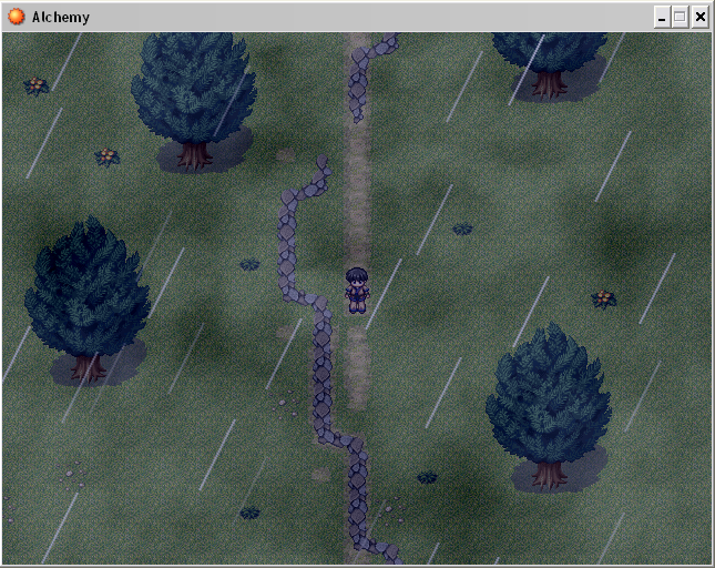
Flaws? Needs more Detail? I really Don't know
(Outside Path)

Flaws? Needs more Detail? I really Don't know
Kain Nobel
Member
Needs ALOT more detail, and the dirt path is straight... in most cases, with nature, you should never have a straight dirt path, nature is chaotic and things hardly ever "go straight" if you know what I mean. Also, the way you placed the two weeds on either side (4 altogether) isn't nature-looking either, both weeds on the left side are exactly 1 tile down from the weeds on the right side, not good. You need alot of work, there should be a Map Screenshot thread somewhere around here you can post your work there for more critique.
Did you edit the tileset at all? It doesn't look right, it might even be your screen tone... just too gray. If its supposed to be night/dusk, you should change the screen tone and saturate it with blue. Also, if you did edit the tileset, your grass looks bad. Its all tile-y, you need to break the grid by adding more detail.
Did you edit the tileset at all? It doesn't look right, it might even be your screen tone... just too gray. If its supposed to be night/dusk, you should change the screen tone and saturate it with blue. Also, if you did edit the tileset, your grass looks bad. Its all tile-y, you need to break the grid by adding more detail.
Kodi Hammon
Member
Sorry I for got to erase some of the dirt path... Thanks anyways though. and My Tileset is Totally Oringnal to editing done.
EDIT: Ok Boon, Sorry did not notice the Map thread.
Don't worry, it's no problem, and it's all dealt with now. ~boon
EDIT: Ok Boon, Sorry did not notice the Map thread.
Don't worry, it's no problem, and it's all dealt with now. ~boon
Kodi Hammon
Member
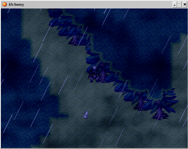
Ok I was Really Unhappy about my Map so I put a Big X over it all and went with a differnt Approuch that I like alot more, But I do not know how I make Alot of Trees with the Tree AutoTile above it with out it looking really Bad... 
This is what I mean
This is what I mean

Kodi Hammon
Member
Lol The only reason I was useing Autotiles is because I was looking for a Dense forest thing, But now that I think of it I could probaly make one. And Thanks for the Tips
Kodi Hammon
Member
Yes I was Awhere of that but the Tileset I have does not have any good trees so That was solved with making an Event/Tileset Tree forest around it. :wink:
Zekallinos
Sponsor
That canopy autotile is meant for the dark forest-type tree, not pine cones. But no canopy will ever work for the pine-cone, due to its shape.
Thank you for viewing
HBGames is a leading amateur video game development forum and Discord server open to all ability levels. Feel free to have a nosey around!
Discord
Join our growing and active Discord server to discuss all aspects of game making in a relaxed environment.
Join Us
