Envision, Create, Share

Welcome to HBGames, a leading amateur game development forum and Discord server. All are welcome, and amongst our ranks you will find experts in their field from all aspects of video game design and development.

Mapping Improvement Thread 4

Some of the trees are missing bottoms, you sould add them and make the trees a bit more distanced; Use the second and third layers and make sure tey don't overlap in a way where a tree in standing on one. Add some more dirt, and vegitation/random objects.

thejungle5.png
 
@Kodi Hammon, your two different kinds of trees are colliding and it doesnt look good. You path is too straing, you need to add variation in the grass and there are some perspective issues at the back of the house with the leafs of the near tree...

@Miles, Tree cover fogs look horrible. Its like there is giant flying tree tops up there...
Also try breaking up the long grass into smaller patches that are less organised, by using the one tile bits.
 

Tindy

Sponsor

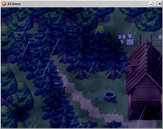
Kodi: I've generally noticed that placing as many trees as possible in a small space makes the map look better; however, you've essentially arranged your trees in lines, and it does not look so hot. It's not terrible with the two types of trees, but you really need to take care with where and how you place them so it doesn't look like a tree army. You've also got a pretty serious mapping error on the left. The house isn't bad, but.... windows much?

Miles: Lighten up your screen a bit. Even for being a dense, rainy jungle (well...it's rainy, anyway), it's too hard on one's eyes. Now about that dense jungle part: 1) While palm trees may grow in the jungle, they do not look good all spread out like this. 2)Jungles are dense - pack in your trees. Close is key. 3) Don't just randomly scatter multi-colored flotsam and jetsam around. It really doesn't look that great. Another suggestion would be to use some of the marsh tiles for the ground - most especially the dead leaves autotile, but also the marshy ground. If you're going for a jungle, the key is that not a lot of sun gets in, so not a lot of grass grows (this is true in forests as well), and stuff tends to collect and almost stagnate. Your map is also very square - not bad if that's the overall style of your game, but it looks rather odd by itself.
 
@Tindy: Would a square jungle map work well for a style of 25 or so interconnected maps (like a maze) or would the map's borders have to be mroe random?
 

Tindy

Sponsor

It's like I said - if your whole style hinges on it being square (like, I dunno, the Mario games, or to some extent Donkey Kong, I suppose), then it's fine. The player will instantly be immersed in squareness and it won't matter. If the rest of your maps, however, are more natural and non-symmetrical, then it really won't work to your favor, and players (at least gamemakers) will be saying "wtf why is this one jungle square?"
 

Tindy

Sponsor

It might not matter (due to priority), but your benches are sitting on your trees and your upper right table has been eaten by flowers. Your buildings, besides the very front one, is just boring. There's no windows, no doors, not even a dumpster or a fan, and they're so close in color that they're blending together. But that middle bit looks all right, aesthetically speaking.
 
The transition in the middle to where it it isn't surrounded anymore looks awful,
seriously like you just cut it off,

also your upper right tree has been eaten by the sidewalk monster...
 

zchin

Sponsor

Well this is not in game and the priority stuff handles that, I'm sorry but I don't have a fan or a dumpster in the tileset I'm using, and I also haven't found a modern door character set yet. If you could direct me to stuff like that I'd appreciate it!

Thank you and have a nice day!
 
I've taken a whack at combining tilesets. It wasn't the fiorst time, but I'm trying to get better at making them blend well, hence, I've made a map of an abandoned city's front gates. Is it for a game I'm making or was it just for fun!? WHO KNOWS!

Anyway, here it is:

AbandonedCity.png
 

Spoo

Sponsor

This one's a rough draft made with the RTP. I plan to make it a bit more custom some time in the future; when I actually have time to edit some tilesets.
mapcritique2.JPG

@MCSeph

I'm liking the direction you're going with this map; the flow is great. I don't, however, like the gray grass. You may want to recolor that to something a little more fitting; maybe a brownish color or something. The gray towering rocks kind of clash with the sand as well. I don't really like much of anything out of the evil castle tileset anyways, mind you, but I really do think you should go with a different type of rock formation.
 
I chose gray grass because I didn't necessarily want any living plant life on the map to give it a dead feel. Maybe I'll post an in-game screen shot to see if the Evil Castle tiles still clash.

EDIT: Here's what it will look like in-game!

PNG.png
 

Spoo

Sponsor

Since it will be black and white in game, I'll take back the part about the gray grass. The spiky rocks, however, I still say no on. Also, you have an error with your grass right at the base of the left tower. It looks like it's floating.

Use this in your tileset instead and it should look better.

grasstower.png


Note that this is a little add on by me and it has a good chance of sucking. I take no responsibility for negative criticism on any game using this tile :wink:
 

Thank you for viewing

HBGames is a leading amateur video game development forum and Discord server open to all ability levels. Feel free to have a nosey around!

Discord

Join our growing and active Discord server to discuss all aspects of game making in a relaxed environment. Join Us

Content

  • Our Games
  • Games in Development
  • Emoji by Twemoji.
    Top