
You are using an out of date browser. It may not display this or other websites correctly.
You should upgrade or use an alternative browser.
You should upgrade or use an alternative browser.
Mapping Improvement Thread 4
- Thread starter Æ№∞₧
- Start date

jacen_omas
Member
I really am not fantastic at Interior maps and was looking for suggestions to improve this one:

I think it looks great! The only thing that bugs me is the asymmetry of the back wall. The symmetry flows great throughout the rest of the map (yes, people say symmetry is bad, but it's what buildings are built on), however when you look at the back wall things aren't centered anymore. I'd suggest ditching one of the windows and centering the other two windows and the torches. That way you won't throw off the symmetry in the rest of the room. Great job!
")
jacen_omas
Member
Cheers for the help guys, I went with a mirror on the back wall to make it more symmetric:

jacen_omas
Member
archerRin":1srqfhnh said:looking good except it has too many colours. I would try and desaturate the tiles below the carpet to counter that. Also I think the lighting should be a bit more pronounced it looks like its a cave lighting right now.
Yeah I know what you mean about the lighting, perhaps I will try and amplify it a little so as to make it look more like room lighting. I will also give the colouring a go and see if I can make it a little more cohesive.
goofydiegog
Member
okay, this map is that of a fortune tellers room [just a quick note, I wont be using that fortuneteller character] and well, i kinda like it, i kinda hate it... so far the only thing that does make it look fortunetellingesque is the fact that there is a crystal ball :sad: help me make it purty?? thanks a bunch!
[img=http://img44.imageshack.us/img44/7927/fortuneteller.th.png]
[img=http://img44.imageshack.us/img44/7927/fortuneteller.th.png]
Well, you can downsize by a whole lot - a fortune-teller's room really doesn't need to be any bigger than space enough for the fortune teller and her table (and room for the player, of course). But let's start with what you currently do have - a broom? A suit of armor? A random shelf? If you can make these things useful to the scene then all the more power to you, but generally, they're just detracting from the scene as a whole. I'm getting the feeling that s/he's the type to wander around the room and not actually answer any questions. I'm also not getting any sense of mystique or wonder - probably because of that broom, but also because there's no atmosphere. It's like s/he set up shop in a closet. I'd definitely use a screen tone, something greenish or pinkish, and maybe even use a fog to suggest a heavy air of nag champa and other incense-y things.


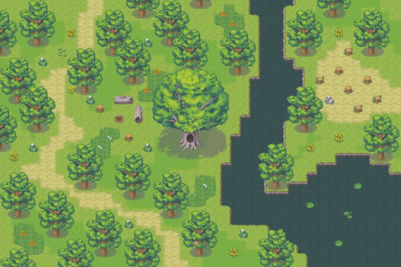
Archer, if you get a chance I'd try to remake those waterfall autotiles. They work, but they've got a mountain background, and it's just the slightest bit odd. Anyway, map looks all right, not really getting "grove" though - more dead trees? Big giant crystal thing doesn't quite seem to fit the rest of the tileset, and I think there's something going on with your ground tile - you've got a 4-pixel line on each tile. Also - scooch your rightmost big waterfall down two tiles, it's floating.
goofydiegog
Member
cool! thx Tindy! thats the type of advice i needed, u ROCK! :biggrin:
goofydiegog
Member
How's this?
 I added a tint and some fog [thx for the tip tindy!] but it still feels empty... any decorative tips?? btw, the mirror and the chest are needed for the scene. oooooh oh, another quick question!!
u prolly see that I suck at mapping and im a newbie, but how do you guys do those cool lighting effects! ie. archerRin's map w/ the light streams and jacen_omas' lighting around the candles???
thx for passing down the knowledge!
u prolly see that I suck at mapping and im a newbie, but how do you guys do those cool lighting effects! ie. archerRin's map w/ the light streams and jacen_omas' lighting around the candles???
thx for passing down the knowledge!
@goofy: Definitely an improvement, and much better. I'd add a little purple-ness to the screen tone, though, to add more sense of mystery. Also, you might add a plant or something to fill the emptiness.
Also, for your second question on the lighting effects, those are done in Photoshop but capturing the screen and using brushes and stuff. Once you are done, you delete the map's layer and use the brushes layer as a picture/fog on your screen.
Also, for your second question on the lighting effects, those are done in Photoshop but capturing the screen and using brushes and stuff. Once you are done, you delete the map's layer and use the brushes layer as a picture/fog on your screen.
Goofy, it's looking better but it still seems a bit too big. You can easily get rid of one more row of tiles on the bottom and still have more than enough room. I'd also add a tile at the bottom to let players know where the exit is. You also have a tileset usage error with the walls - those edge tiles are used for outward corners, not inward (at least, it's generally accepted that way). It's all right to have the mirror and chest needed, but you can close in the room another column and have enough room for the chest (if you rotate it to face forward). And yeah, plants are a good idea, as is (maybe) the skull bit from the Shop tileset.
MysticTrunks
Member
This is no where near done but since the BASE is I'd thought I'd post it, yea kinda bland but it's getting late and I'm tired, and I just don't want to rush the map even if it's for a Battle System test. This is meant to be a water fall map and if any one has played Seiken Densetsu 3 it's going to be like that. I had to change the FPS to 100 so I could have realistic animations(especially since the waterfall was slow...)
If anyone has or wants something added to this please post.

If anyone has or wants something added to this please post.
Celestia Whitesword
Member
Allrighty.
To make a long story short, these two maps show the characters leaving an icy area, and making way for a temperate area. Any way I could imply a smoother transistion from a cold to warmer climate without the maps seeming abrupt?
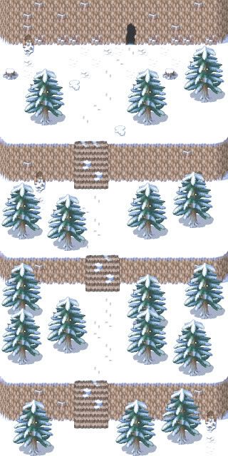
To make a long story short, these two maps show the characters leaving an icy area, and making way for a temperate area. Any way I could imply a smoother transistion from a cold to warmer climate without the maps seeming abrupt?
MysticTrunks
Member
To be honest looks like they were rushed, new to mapping? The road is fine on the second screen but add some cliffs, flowers and the cook junk. If it's your first maps than not bad and a bit random. The first map is just too straight, straight maps don't exist and they never will because if you look at earth from space is it straight? no, far from it.
Keep practicing though!
Keep practicing though!
Thank you for viewing
HBGames is a leading amateur video game development forum and Discord server open to all ability levels. Feel free to have a nosey around!
Discord
Join our growing and active Discord server to discuss all aspects of game making in a relaxed environment.
Join Us