
You are using an out of date browser. It may not display this or other websites correctly.
You should upgrade or use an alternative browser.
You should upgrade or use an alternative browser.
Mapping Improvement Thread 4
- Thread starter Æ№∞₧
- Start date

rey meustrus
Sponsor
It's a few pages ago, but I somehow missed this entire thread after the last one was closed...
I died a little bit when you said that. The script is mine, and I recently updated it. It is capable of getting 150x150 at full zoom, 400x400 at half zoom, and 500x500 at quarter zoom.
I will be posting something soon. It's really, really big, though admittedly I have only done about 1/3 of it so far, and nothing inside.
@NightWalker: The lighting effects are really nice. How do you accomplish that? Do you just make a mask and layer it as a fog? What is your method?
@Miles Castea: The blue screen tone looks really strange. The map has a lot of open grass, and it doesn't look natural. It needs more variation, tall grass, small plants, not the sparse bush. Also, the player's path should be more constricted and directed.
@Kiriashi: Something about the swamp tileset just makes it easy to make good-looking detailed maps. I don't have much to say; this part of the map, anyway, is really nice, though I'd worry about how you're telling the player where to go once the ground opens up.
Regi":313tq2b7 said:For larger maps, most paste together 20x15s in an image-editing program. But there's also a script by SephirothSpawn, I believe; you can try a search.
I died a little bit when you said that. The script is mine, and I recently updated it. It is capable of getting 150x150 at full zoom, 400x400 at half zoom, and 500x500 at quarter zoom.
I will be posting something soon. It's really, really big, though admittedly I have only done about 1/3 of it so far, and nothing inside.
@NightWalker: The lighting effects are really nice. How do you accomplish that? Do you just make a mask and layer it as a fog? What is your method?
@Miles Castea: The blue screen tone looks really strange. The map has a lot of open grass, and it doesn't look natural. It needs more variation, tall grass, small plants, not the sparse bush. Also, the player's path should be more constricted and directed.
@Kiriashi: Something about the swamp tileset just makes it easy to make good-looking detailed maps. I don't have much to say; this part of the map, anyway, is really nice, though I'd worry about how you're telling the player where to go once the ground opens up.
I'm pretty sure there's another version by Seph that I used before, but yours looks nice as well. Sorry about it, anyway.
@Kiriashi: I agree with Love on this one, it seems rather cluttered. There are a lot of linear trees toward the bottom, and IMO you overdid the curves on the area of land behind the tree just left of the bridge. You might also want to adjust the priority of the moss, so it appears in front of the tree.
@Kiriashi: I agree with Love on this one, it seems rather cluttered. There are a lot of linear trees toward the bottom, and IMO you overdid the curves on the area of land behind the tree just left of the bridge. You might also want to adjust the priority of the moss, so it appears in front of the tree.
rey meustrus
Sponsor
I have a collection of work which I have done for the RPG Palace community RPG. As our membership has been dwindling and interest wanes, I feel I can put this out there to the RMXP community at large. This map is largely my work, with some of the major or more interesting pieces being lifted from Maxy's early designs of the city.
What you see here is the path to the Beaumonde cathedral, arching over the city canals. The cathedral itself is mostly the same as Maxy's original design.
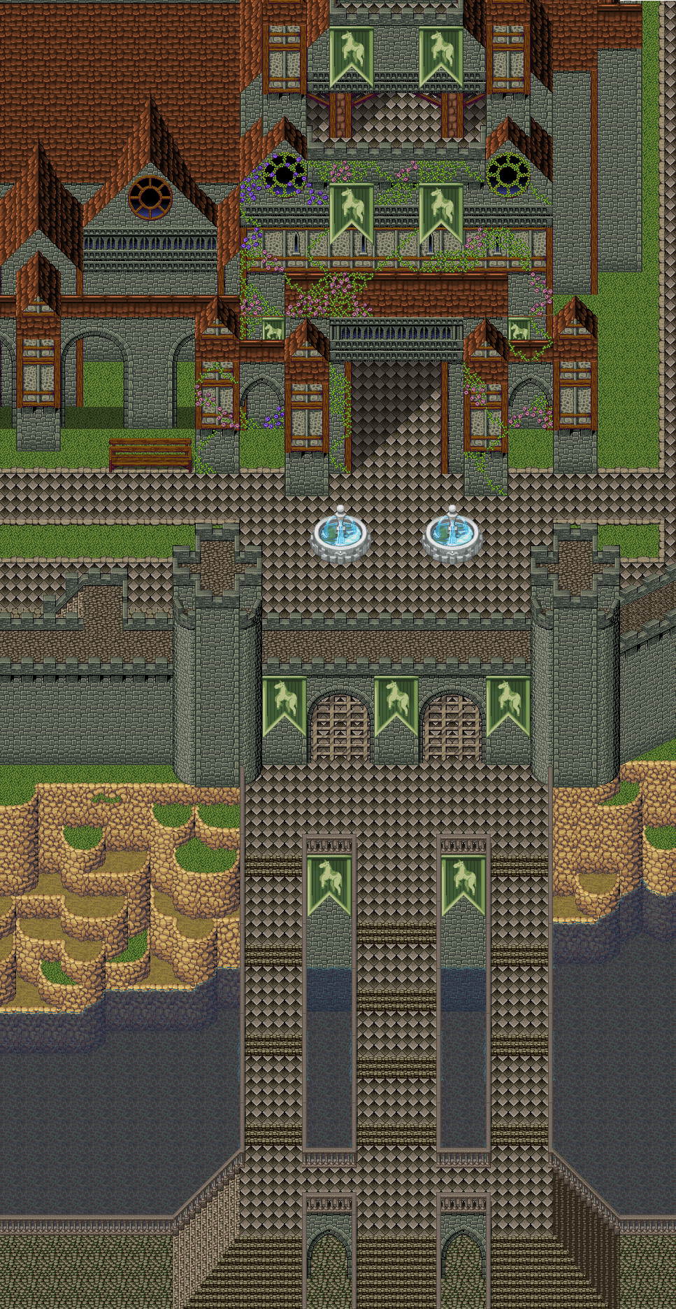
The map really has nine layers: three separate maps of three layers each, layered on top of each other. I haven't actually made the script which will control this behavior yet, but I think it's the only way to achieve sufficiently multi-layered towns, where you have traversable canals and rooftop restaurants, like Maxy's work on Beaumonde.
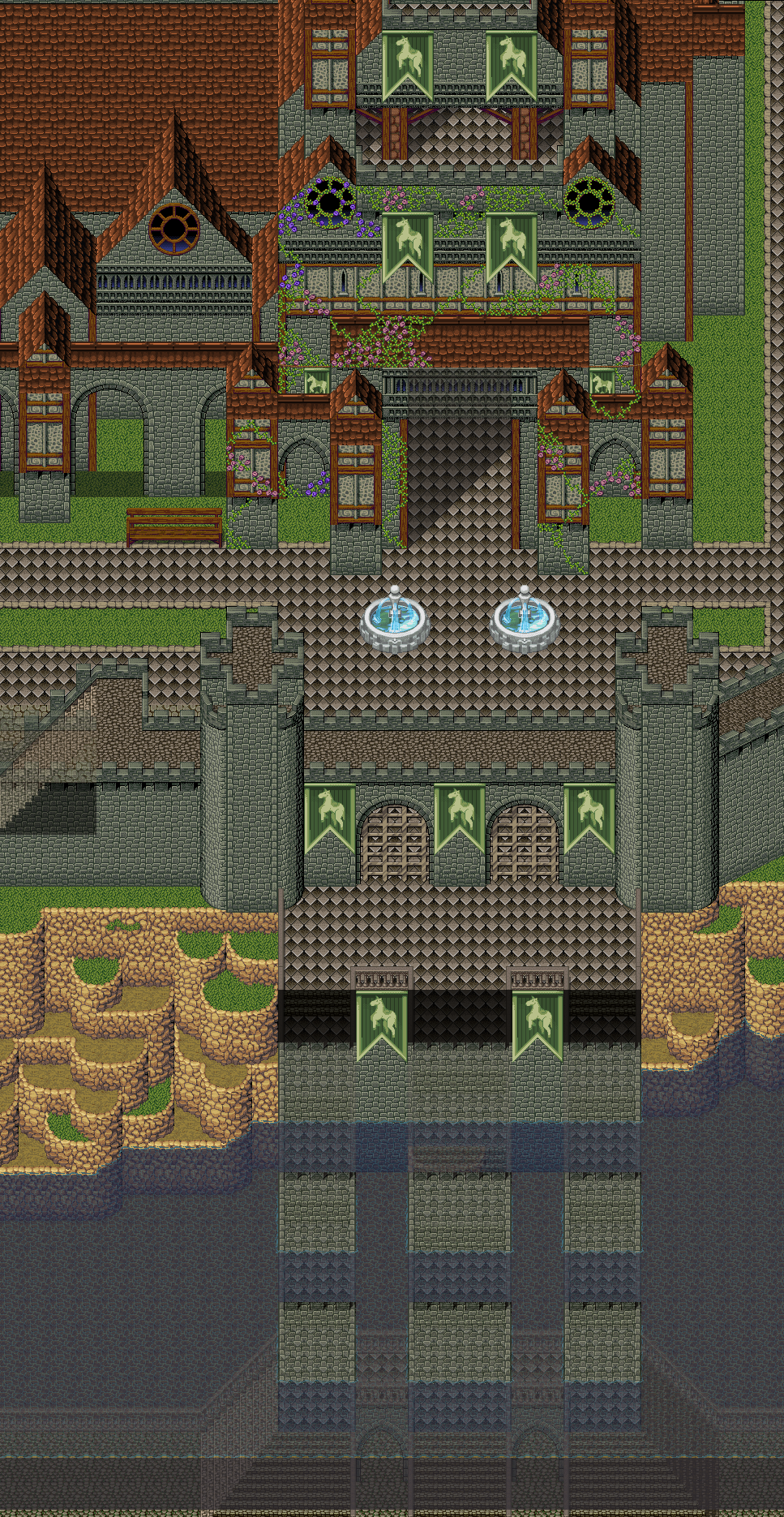
Here is the same image, but with transparency in three places to show where there is a path on a different layer. My hope is to have the script which I eventually design create this kind of transparency automatically when the player walks under the tiles of another layer.
There are several pieces in here which I added to the screenshot. The fountains are RTP, and are added by events. The water is a pair of transparent autotiles, which I share with you (1 2). There are also isometric city walls, square pattern walls going up stairs, and tiles which conjoin stairs going in different directions. I share with you my personally modified version of Inq's tileset which has these additions.
Finally, I present to you a composite image of all of my work on the town so far. It lacks detail because I'm just trying to fill the space with structurally interesting pieces right now, but there is quite a lot of it. I would like critique on anything that strikes you; the town's structure, mapping errors, the cliffs, the new tiles I've added to Inq's set, anything.
And by the way, this was constructed using my Map Image Maker, from a map of 400x400 tiles.
What you see here is the path to the Beaumonde cathedral, arching over the city canals. The cathedral itself is mostly the same as Maxy's original design.
The map really has nine layers: three separate maps of three layers each, layered on top of each other. I haven't actually made the script which will control this behavior yet, but I think it's the only way to achieve sufficiently multi-layered towns, where you have traversable canals and rooftop restaurants, like Maxy's work on Beaumonde.
Here is the same image, but with transparency in three places to show where there is a path on a different layer. My hope is to have the script which I eventually design create this kind of transparency automatically when the player walks under the tiles of another layer.
There are several pieces in here which I added to the screenshot. The fountains are RTP, and are added by events. The water is a pair of transparent autotiles, which I share with you (1 2). There are also isometric city walls, square pattern walls going up stairs, and tiles which conjoin stairs going in different directions. I share with you my personally modified version of Inq's tileset which has these additions.
Finally, I present to you a composite image of all of my work on the town so far. It lacks detail because I'm just trying to fill the space with structurally interesting pieces right now, but there is quite a lot of it. I would like critique on anything that strikes you; the town's structure, mapping errors, the cliffs, the new tiles I've added to Inq's set, anything.
And by the way, this was constructed using my Map Image Maker, from a map of 400x400 tiles.
Lune de la Cruor
Member
Well the water fountains clash with the tileset, they look totally out of place.
Also you have quite a few perspective errors in your map. I marked them.
The towers are edited a bit wierd...it looks like the tile is coming towards us(more like a bridge) than a side of the tower, but maybe that's just me.
 The rest is real pretty! =)
Also you have quite a few perspective errors in your map. I marked them.
The towers are edited a bit wierd...it looks like the tile is coming towards us(more like a bridge) than a side of the tower, but maybe that's just me.
rey meustrus
Sponsor
Does this address some of your comments?
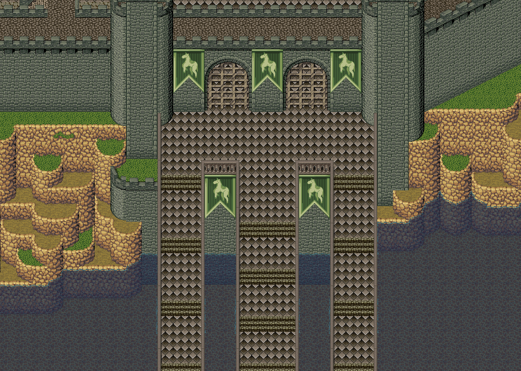
The perspective problem in the cathedral, if you'll look more carefully, is not an error. If viewed from above, it would look something like:
Where 'R' is the roof, and 'r' is a roof that does not touch the ground (the arches). If that helps conceptualizing it at all...that roof is not directly above the space you measured out as 3 spaces.
I'm not sure what's wrong with the arches at the bottom of the picture.
The perspective problem in the cathedral, if you'll look more carefully, is not an error. If viewed from above, it would look something like:
Code:
RRRRRRRRRR

RR      RR

RR      RR

RrrrRRrrrR

R      RR

RRI'm not sure what's wrong with the arches at the bottom of the picture.
Feldschlacht IV
Member
What do you think about this?

Lune de la Cruor
Member
This looks cute, Feldschlacht.
I'm guessing it's a world map or something. The clouds with shadows look really nice, so does the water. But maybe you can recolor the big mountains to match the smaller ones and blend them better together. Right now it looks like they are just placed above them, rather than actually starting from the ground.
I'm guessing it's a world map or something. The clouds with shadows look really nice, so does the water. But maybe you can recolor the big mountains to match the smaller ones and blend them better together. Right now it looks like they are just placed above them, rather than actually starting from the ground.
Perihelion
Sponsor
Uh, I don't know why this wasn't stickied, so I stickied it.
rey meustrus
Sponsor
Ah, I already mentioned in the Screenshot thread, about the chipset itself. World maps need to be viewed from afar to analyze the map itself. I would look into making the sprite get smaller on the world map, too.


The two types of moss on the cliffs don't match (light and dark). If it were me I'd ditch the lighter one cuz it looks terrible. Also, the little clumps of grass tiles seem repetitive and overused, I'd go for long grass instead (although it's a pain to map), or just leave it blank.
Lune de la Cruor
Member
@Bacon: Your map lacks the possibility for a character to walk.
Maybe you just want it to be a landscape which is scrolled over though...
What's the funny purple thingies on the water? 2 mini ducks? looks fun xD
Maybe you just want it to be a landscape which is scrolled over though...
What's the funny purple thingies on the water? 2 mini ducks? looks fun xD
BrunoTR":gffjn2bq said:That pigeon is behind the bush. If it's flying, I assume it's, like, high up. So make it always on top.
I'm not sure about the way that the cliff overlaps the water in places. I'd just use the regular cliff base.
Wow, I would of never caught the pigeon. With the cliff, yes it look odd but i want it to be in water. If this was for a project or something, I would make a tile that goes in the water to make it look ormal. I agree, yes it look odd but thats the best I could do with the RTP.
")
Regi":gffjn2bq said:The two types of moss on the cliffs don't match (light and dark). If it were me I'd ditch the lighter one cuz it looks terrible. Also, the little clumps of grass tiles seem repetitive and overused, I'd go for long grass instead (although it's a pain to map), or just leave it blank.
The moss does look odd. I think it looked better without the screenshot in the editor without screentone. It seems to stand out more with it though. It does look tacky. As for the long grass, thats something I should probably do. It not thats its hard, I just thought it wouldnt look as good with the long grass. Though, ther is that blankspace in the right side of the screen so yes, I shall put long grass in.
It is a landscape, it has no real purpose for a map nor is it a mao I would use. I mainly created a map for fun and to get back into the swing of things. The purple things are butterflies. The reason I used the purple was to accentuate the purple flowers and create an over colorscheme. If not for purple, I would of used yellow.Lune de la Cruor":gffjn2bq said:@Bacon: Your map lacks the possibility for a character to walk.
Maybe you just want it to be a landscape which is scrolled over though...
What's the funny purple thingies on the water? 2 mini ducks? looks fun xD
Fox-kun":gffjn2bq said:I think your tiny waterfall is a tile too high. It suddenly stops falling in mid-air ^^.
I did not see this, thanks for pointing it out.
Ill post an improved one soon.

Thank you for viewing
HBGames is a leading amateur video game development forum and Discord server open to all ability levels. Feel free to have a nosey around!
Discord
Join our growing and active Discord server to discuss all aspects of game making in a relaxed environment.
Join Us