

You are using an out of date browser. It may not display this or other websites correctly.
You should upgrade or use an alternative browser.
You should upgrade or use an alternative browser.
Mapping Improvement Thread 4
- Thread starter Æ№∞₧
- Start date
Nice map! Keep in mind that a dirt path became a dirt path because people were constantly WALKING on it (usually), so make sure that all of your dirt paths LEAD somewhere. Two of your weed patches are the same on the east and southeast sides of your map. The variation of open and closed windows is... distracting. And one final note, the tree overlay is very visually unappealing. I'd suggest replacing it with "stacked" trees. Good work!
The water makes it look a bit symmetrical. Maybe have the one on the left start father south on the map and stick a tree where it used to be. The cliff rubble doesn't look very magical, and you might want to keep the fairies closer to land. The one on the upper right looks a bit out of place. Otherwise, I think it looks GREAT! Very magical!
Kodi Hammon
Member
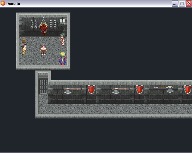
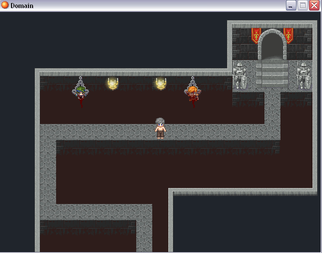
Hello, I am trying to improve on my Dungeon map making. :grin:
See I just can't seem to design a good dungeon
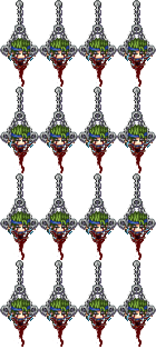
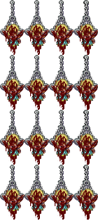
I did make people hanging from prison chains though
See I just can't seem to design a good dungeon


I did make people hanging from prison chains though


MCsephiroth13
Member
TBH, your first pic doesn't look like it's fun playablility wise as it is just a straight hallway. What you could do is add a few groves along it and make more variety with what you put on the walls. All there is are axes and shields, one after another, over and over again.
The second one you need to make the wall where the doorway is one tile higher because there are stairs so it makes it as if the stairs are on the ground...sort of. Another thing is, you have to use the entire "bottomless pit" set of tiles. I could see you only used one of them, and it's the bottom one. Using the whole wall will make it look nicer and give it a nice, wall-dropping effect. Try also adding little islands. It might help in giving it a nice touch.
The hanging people looks awesome, but I honestly don't know how they fit in at all on that map. +10 points on the actual graphic though.
Kodi Hammon
Member
Thanks alot for the help 
Kodi Hammon
Member
Ok this is my Result on this one Area. 
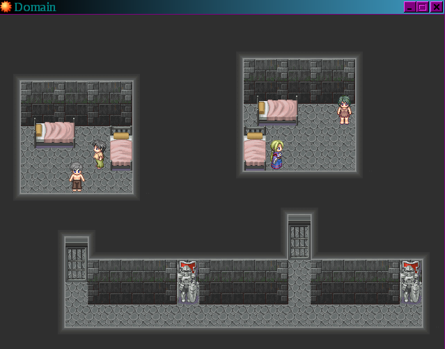
Is it better? or worse?

Is it better? or worse?
MCsephiroth13
Member
Still a little repetitive at the bottom. Try adding, for example, wepaons on one side of the wall and maybe shields on the other. The walls in the cells need that middle wall tile painted over it. But it's good, much improvement! :D
Just adding to what MCsephiroth said, try re-arranging the beds. They look kinda messy.
Here is a little forest on a hill I made. It's supposed to be a fairy world, apart from the human world so that's why there are so many trees and flowers and no paths.
(And yes, it's the big version of the "magical" map I posted above.)

Here is a little forest on a hill I made. It's supposed to be a fairy world, apart from the human world so that's why there are so many trees and flowers and no paths.
(And yes, it's the big version of the "magical" map I posted above.)
More elevation changes! Yes, little cliffs and stuff, and a winding path that leads up to the peak. That's something I would do to make it look more magical. Looks great so far though. Even though it is magical, you could still have little dirt patches here and there, breaking up the endless sea of grass.
A lot of people post maps and I look at them wondering, "If I was playing this game, how would I know where to go? I see no path. I don't want to be wandering aimlessly..." The map looks really good, but if you don't want the player getting lost and walking around in circles you should probably indicate some sort of path. And, are those white flowers in the trees? Odd.
@ama55: Thanks for the tips, will look into them. ^^
@Tuna:There are two reasons I didn't put a path.
1- This map will mostly used for cutscenes and rarely ever a place to wander about.
2- The place is a fairy world where humans and "legged" creatures don't go to. And since a path is usually made by people walking on it, I see no sense in putting it.
And yeah, those are flowers on the trees. I just thought they looked beautiful. O_o
blakependragon
Member
love; the first map of it in-game looks great, very magical.
i agree about the different elevations.
if it fits your story to not have a path then go with that, especially if it's cutscenes. but after looking, i have to ask why there are steps up the top part? :huh:
i agree about the different elevations.
if it fits your story to not have a path then go with that, especially if it's cutscenes. but after looking, i have to ask why there are steps up the top part? :huh:
Thank you for viewing
HBGames is a leading amateur video game development forum and Discord server open to all ability levels. Feel free to have a nosey around!
Discord
Join our growing and active Discord server to discuss all aspects of game making in a relaxed environment.
Join Us