
You are using an out of date browser. It may not display this or other websites correctly.
You should upgrade or use an alternative browser.
You should upgrade or use an alternative browser.
Mapping Improvement Thread 4
- Thread starter Æ№∞₧
- Start date
RadethDart
Sponsor
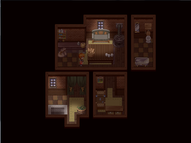
Love, I think that it is a great map! Good addition with the table though! I really like what you did to change the carpet and the too many objects on the floor. That was such an improvement there!
One thing that would really benefit the map would be some lighting from the window that is there to add to the mood a little bit.
Other than that, excellent shop!
One thing that would really benefit the map would be some lighting from the window that is there to add to the mood a little bit.
Other than that, excellent shop!
Thanks a lot for the comment, Radeth. The lighting from the window is on my schedule, but I am planning to do it once I totally finish the mapping of the whole game (it's a short one) and then I would do cosmetic lighting for all maps.
Thanks again for the comment. I might post more maps soon. ^^
Thanks again for the comment. I might post more maps soon. ^^
silver wind
Member
@Love, it's a good map. The first wasn't bad either, but since you're looking for in depth critique:
-Usually shops place the same item in a tidy raw, not one here and one there.
-The bread baskets: why is it on the floor, and near the plants? It'll make more sense to separate the food from the plants.
-The counter is too long, and the room can be smaller. I'd cut the left most column, maybe two.
-If the top right corner is a storing area, so the fancy pictures shouldn't be there.
@SpookyMcGhost
That's lovely, I'd make the area with the flags 1 tile higher. Overall it lacks details, like broken floor tiles, some birds/NPCs, bumps on the outer wall, etc.
blakependragon
Member
it still looks cluttered, but if that's how she is then it's all good. simply state as much when you talk to her, instead of the usual "may i help you?"
go for "hello dear, if you don't see what you want, please ask. it's probably around here SOMEWHERE."
or "my, my, you look like you need a plant! would you like this one, or maybe that one over there, no next to that one."
hehehe, i need to give my people personality, this is giving me ideas :haha:
go for "hello dear, if you don't see what you want, please ask. it's probably around here SOMEWHERE."
or "my, my, you look like you need a plant! would you like this one, or maybe that one over there, no next to that one."
hehehe, i need to give my people personality, this is giving me ideas :haha:
I like the shop map without the tree-type thing, however, the new floor tiles make an already very busy map even busier. I prefer the old ones.
As for the throne room map, I would imagine that it would be a bit brighter than that since there are four candelabras and two big windows. If you can, you might want to try putting the "ebbing light" feature on the candles if you haven't already, in order to make them more realistic.
Otherwise, nice job!
(Reposted Love's pictures here for everyone's convenience since I started a new page.)

@Miss Dani: Thanks. :D And about the shop, I think I'll leave it cluttered. I love cluttered shops for some reason. lol
And nice map you have there! The only problem I see is that the unconscious prisoner you have there, his head is on the wall. O_O Maybe lowering the tile one step will help. ^^
And nice map you have there! The only problem I see is that the unconscious prisoner you have there, his head is on the wall. O_O Maybe lowering the tile one step will help. ^^
Zekallinos
Sponsor
Um, no. That's pretty bad cosmetic lightning. It's extremely unnatural. Light should be much more diffuse, gradient then this. It looks like you just took an eraser and erased a spot without airbrush, or you that you created a patch of white and called that light (depending on implementation). Especially for the lamp, but it applies to the windows too. Why is there TWO spots of light for each window? Light doesn't expand, shrink, then expand again.
The map itself is fine though, but you could add more details (ex : cracked floor tile) so it looks less plain.
The map itself is fine though, but you could add more details (ex : cracked floor tile) so it looks less plain.
Tuna : Yes, that would usually be the case, but one of the guards drinks a lot. The other covers for him when he's drinking.
Zekallinos : Okay. Is this better?

I tried making it a bit more defined and gradient, although I'm not sure how well the lamp turned out.
As for the actual map : I changed a few of the floor tiles, added a couple small detail-type things, and boarded up one of the windows.
Zekallinos : Okay. Is this better?

I tried making it a bit more defined and gradient, although I'm not sure how well the lamp turned out.
As for the actual map : I changed a few of the floor tiles, added a couple small detail-type things, and boarded up one of the windows.
Miss Dani that map looks pretty good but there are just a couple of things I have to point out.
- One -
The ladder you've used is for underwater, you can tell by looking at the top of what you've placed, there is a water line visable.
- Two-
Remember at the very bottom of the room, the player can walk behind the first line of the autotile. This means that the player will be able to walk from behind the auto tile straight onto the stairs. This can look a little odd, but it is ok. Change if you want.
Good luck.
Rather than making the rest of the room dark, and making it lighter where light is, you seem to be adding light as a white glow. Take a look at this:

(Random map, ignore it) It's a pretty bad example, but rather than making the light an actual glow, I've darkened the rest of the room, and erased where the light would be, making it appear to be lighter, instead of actually making it lighter. If you get my meaning.

(Random map, ignore it) It's a pretty bad example, but rather than making the light an actual glow, I've darkened the rest of the room, and erased where the light would be, making it appear to be lighter, instead of actually making it lighter. If you get my meaning.
Thank you for viewing
HBGames is a leading amateur video game development forum and Discord server open to all ability levels. Feel free to have a nosey around!
Discord
Join our growing and active Discord server to discuss all aspects of game making in a relaxed environment.
Join Us

