Envision, Create, Share

Welcome to HBGames, a leading amateur game development forum and Discord server. All are welcome, and amongst our ranks you will find experts in their field from all aspects of video game design and development.

Mapping Improvement Thread 4

No that's still incorrect. None of the RTP tilesets are properly designed for tiled lighting. Take a look at the screen you provided, Love. Why does the light expand forwards and to the right but not left? Go with what Dalton said and use cosmetic lighting for the proper effect.
 

Tuna

Awesome Bro

I guess some tilesets are just made to be modded. I've decided to ditch the window lighting and just stick light squares in front of my fireplaces and doorways. The fireplace lighting looks a lot more natural with a rug hiding the fact that the light covers a perfect square. I think it looks pretty good.
 
Tuna":1grl2axx said:
I guess some tilesets are just made to be modded.

not completely true....

what happens, in any game maker with preset graphics, is that you get good graphics for a specific game or set of game designs that the maker's creator thought about, thats why a tileset works perfectly for one game, and flawed on the next, preset tiles work by giving you an idea of how to graphically work with the program\engine, if you want to get creative you're on your own, because its impossibe to create graphics that work for EVERY scene and map

so its not that its meant to be modded, its just sort of a start point
 

Tuna

Awesome Bro

I've been working on my interiors off and on and I finally finished them today. I'll post them here for everyone's convenience. Alternatively, http://s779.photobucket.com/albums/yy77/TheTunaBucket/New Snow Interior/.

Any criticism is greatly appreciated!

yourhouse.png
innhouse1.png
innhouse2.png
richhouse1.png
richhouse2.png
shack.png
 

Tindy

Sponsor

It's looking better than the first maps you posted, but they're still too big. Now, I read your criticism on my tut that my rooms were claustrophobic, and I get that a lot - you want big rooms. That's all right. But if you're going to do bigger rooms, you still need to balance them. Yours, at the moment, just look empty, plain and simple. Specifically the last map; the bedroom is excruciatingly huge and empty. You could easily shrink it by 3 rows and 3 columns, and it would still be a very large room. The map above it looks more balanced, but the right bedroom is almost as huge as the last one. Remember that your interior does not need to be a square. In the 3rd map from the last, I would just shift everything over by 1 column, starting with the fireplace, and then delete a row at the end (on the right). That should make everything a little more balanced. 4th map up isn't necessarily too big, but for what you have in the rooms it's way too empty and plain. I know that tileset has stuff to put on the walls - right now it just looks like you posted an unfinished map. The next two up are your strongest maps. You could still shrink the corridor in the second one, though. Oh, and in all your maps, your shadows are opaque. Might want to fix that. :)
 

Spoo

Sponsor

Tuna -
I'm loving that first map; it looks good while not being too empty nor too cluttered, but you did put two beds together to make a bigger bed, which may seem logical, but really it doesn't look great and is not meant to be done. Editing the tileset to make your own double bed is easy enough, so you may want to try that.

Your second map is -- as Tindy said -- empty, plain and simple. I realize it's harder to make bigger rooms without them being too empty or repetitive because the tileset doesn't give you many 'final touch' decorations to work with. I'd add some pictures or other decorations on the walls, and maybe rearrange the furniture in the bedroom to make it look more filled.

The third map needs a lot more decor' or a lot less space. You have no furniture save for the beds and lamps in each room. There's no windows (visible, anyways), no dressers or chests, and no wall decorations save for the fireplace. Again, pictures, windows, and maybe some bookshelves and dressers would do some good here.

Map #4 is a bit too wide in the hallway/foyer. I'd shrink this by a column and make the rug stay in the middle of the hall rather than stretching wall to wall. You certainly did better in the ways of wall decorations this time, and the map actually looks better because of it. Points on using the separating boards floor tile correctly, I rarely see people use it right. I think the library area should have a rug. It would make it seem warmer and more homey.

Your fifth map is obviously too big. Shrink it down a good bit before anything else. You could make four rooms rather than just three if you wish, or you could just use the wall autotile to fill in. Your choice. Again, don't put two beds together to make a double, etc, etc. The second bedroom needs some wall decoration and some kind of filler for floor space. A bookcase or chest would work here.

Number six is the worst of the six. It is huge, empty, and ugly. And even worse, it's only one room! One bedroom could be about the size of the mini room on map five. I recommend a maybe 8x8. Here's an example:
map1p.png
(Yep I want critique on this)
 
I will criticize your maps one by one, just to avoid confusion and to be detailed.

yourhouse.png

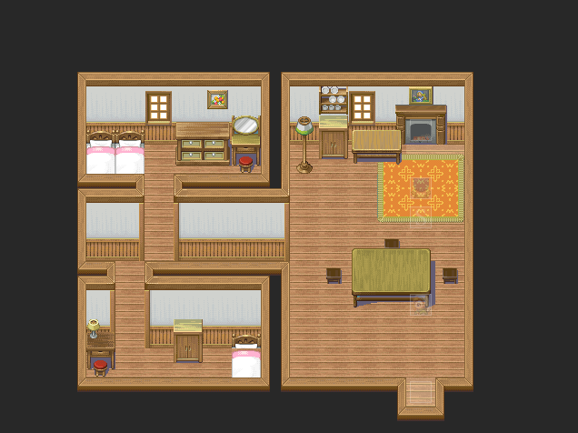
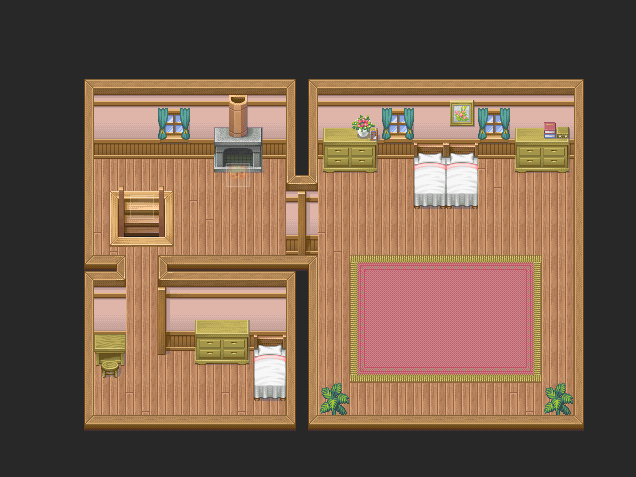
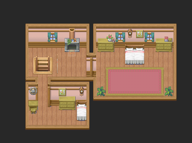
This one is the best of them all, but it needs some improvement still. Your bedrooms look too empty and simple, especially the walls. The tileset has some pictures to put there, why not use them? And try adding more than just that as there are more stuff. Don't limit a bedroom to a bed, mirror and a cupboard only. There is no limit to what a bedroom can take. :)
The right side of the map is better, but the lower part of it is still empty. Try closing it up a little.
innhouse1.png
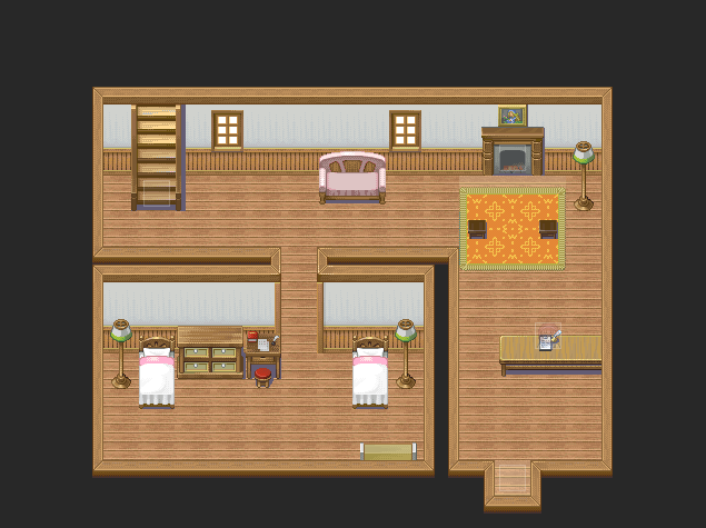
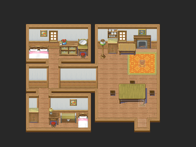
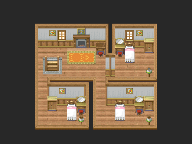
If I am right, this is an inn. The outlay is nice, but I can't really imagine a bedroom in an inn's hallway. Also, like I previously said, it lacks lots of details like pictures and other stuff.
innhouse2.png
The bedrooms are really empty here. I can't really imagine a bedroom with just a bed and a lamp, even if it's in an inn. Add some pictures, a mirror, a cupboard. Also, close them a little. It doesn't have to be a perfect square, you know. And this isn't for the bedrooms only, generally for all rooms.
richhouse1.png
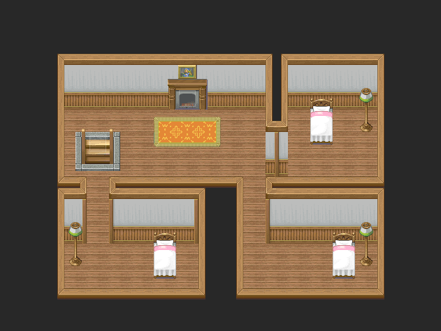
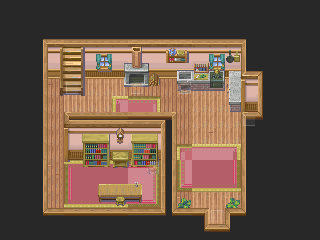
Not much I can mention here, but you should close it up on the right side of this map as it rather so huge. And like I said, details, details, details. :)
richhouse2.png
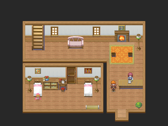
The room on the right is so huge and empty. Close it from the lower part and try adding more details there. Same for all maps.
shack.png
[/quote]
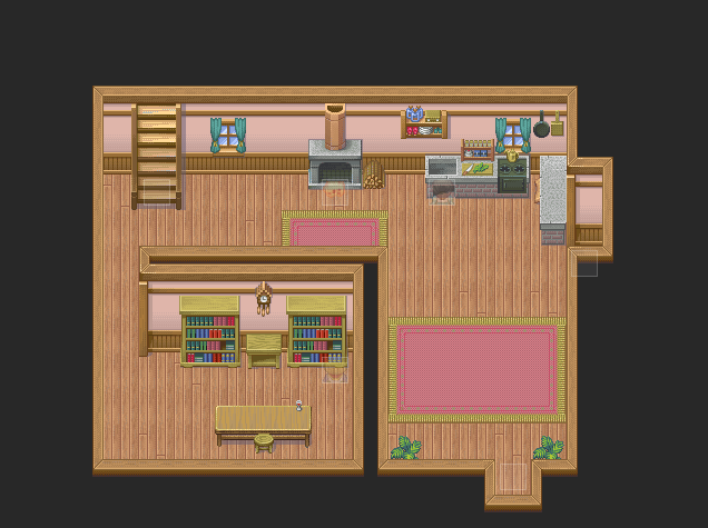
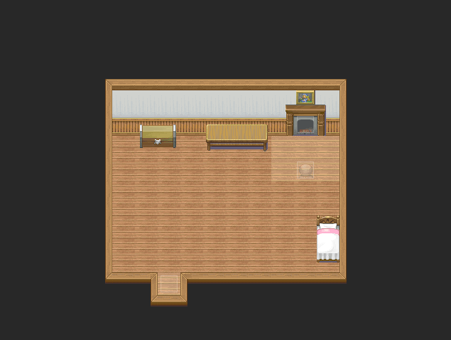
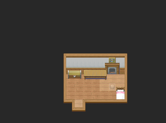
This can't be really a layout for a house, honestly. Why is there a bed in the middle of the house? And it is so huge and empty there, can't be really a house honestly. Close it up, divide it and be sure to use "logic" in your maps. ;)

@Ghost: Nice map. :) Not much to criticize there, but it's a little empty on the left side, I think.
 

Spoo

Sponsor

This one is for a cutscene. It's from the roof of a castle, and the mountains panorama is just a placeholder until I can get a city one.

map2b.png


C&C plzkthx
 
Those small brick elevations for the tower? It's done correctly on the lower half, but the top half isn't done correctly. Should be fairly obvious as to why and I can't be bothered to demonstrate with an image.
 

Spoo

Sponsor

KRoP":210yg1az said:
Those small brick elevations for the tower? It's done correctly on the lower half, but the top half isn't done correctly. Should be fairly obvious as to why and I can't be bothered to demonstrate with an image.

It doesn't look right because they're not towers. They're just small bumps to elevate the standards. And I just noticed the mapping error so no need to mention it.
 

Tuna

Awesome Bro

First off, thank you guys so much for all of this great feedback!! This is a really great, friendly, helpful community! When I started out, my interiors were ugly, huge, and empty. Now I feel like I've nearly gotten them down. Hopefully this is the last time I'll have to post these. To make things clearer, I've added descriptions detailing what each map is for and what changes I've made and why. My little way of helping you help me.

The Player's House - Used my Gimp magic to make a double bed, closed up the bottom right area bit, and modified the floor tiles a bit. (I did this last bit on every map.)
yourhouse.png
House w/ Upstairs Inn - Modified a door to stretch to the ceiling and close off the downstairs sleeping area, added stuff to the sleeping area walls, new bush. I added to the floor tiles AFTER I took this screenshot.
innhouse1.png
Inn, Second Floor - Closed things up, added more stuff to the rooms, windows, lighter floor tiles.
innhouse2.png
Rich House - Closed things up a bit, more wall stuff, new carpeting.
richhouse1.png
Rich House, Second Floor - Closed things up and added to the walls. Used my Gimp magic again to create another double bed.
richhouse2.png
Shack - Yes. It's a shack. That's why I made it so small. I probably should've mentioned that. I closed things up a lot in here.
shack.png

And that's that. Any further criticism would be greatly appreciated! Thank you guys so much!
 
Wow, good improvement! The only thing I can mention, though, is that in the rich house, second floor, there is a wrong thing beside the stairs.

And the shack looks a little empty. Try adding a few more items to it. :)
 

Tuna

Awesome Bro

Love":106fzf5k said:
Wow, good improvement! The only thing I can mention, though, is that in the rich house, second floor, there is a wrong thing beside the stairs.

And the shack looks a little empty. Try adding a few more items to it. :)
Oops. Looks like my double bed went a bit far to the left on the new tileset. I'll have to move it to the right more. Thanks for pointing that out to me. I'll add a thing or two to the shack, but I still want to keep it pretty bare because the old man living there isn't exactly wealthy. Thanks!
 
Wow, Tuna, all of those maps went from okay, to really good! I am glad to see how much you improved in a little amount of time! One thing I recommend, is on the Shack Map: What exactly are the light tiles for again? It doesn't look that good with the fire, but that is probably the only thing that I noticed really wrong. I do recommend moving that table though, it is way to close to the fireplace...don't want to have the place catch on fire now!

Also, since you are in the GIMP mode of working on those beds, I think that maybe flushing the sides of the beds together a little better would do you some good in making them look like a double bed. The sheets go down into the middle of the bed some, they need to go smoothly across the bed, not dip into the center...unless...unless...someone cut the bed down the center! Oh no!

Haha, well, that is all for me right now. I can't really find anything, so good job there Tuna!

~RadethDart
 

Tuna

Awesome Bro

Thank you so much, guys! This really means a lot to me! I know I couldn't have improved my mapping without everyone's help, so thank you all very much! As soon as I get most of my story down I'll be working on a large forest map, so I'll post that for critique as soon as I'm done with it.

@Radeth: I got rid of those light tiles, shortened the table, and evened out the beds. Thanks for the advice.
 
looks good, but i think there is such a thing as too full. it looks really cluttered. which is okay, depending if the shop owner has that in her personality.
but half the floor is randomly covered in groceries and plants. i would suggest having her set-up some tables to display her smaller items :biggrin:
 
The carpet looks really funny covering half the floor. Either have it cover the entire room, or make it a little rectangular rug in front of the entrance.

I would also get rid of something on the walls and some items on the ground, like blake said, it's too cluttered.
 

Thank you for viewing

HBGames is a leading amateur video game development forum and Discord server open to all ability levels. Feel free to have a nosey around!

Discord

Join our growing and active Discord server to discuss all aspects of game making in a relaxed environment. Join Us

Content

  • Our Games
  • Games in Development
  • Emoji by Twemoji.
    Top