Envision, Create, Share

Welcome to HBGames, a leading amateur game development forum and Discord server. All are welcome, and amongst our ranks you will find experts in their field from all aspects of video game design and development.

Mapping Improvement Thread 4

Tuna

Awesome Bro

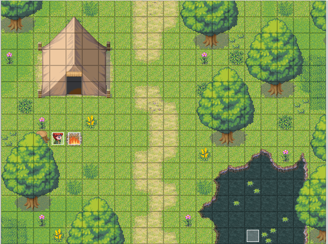
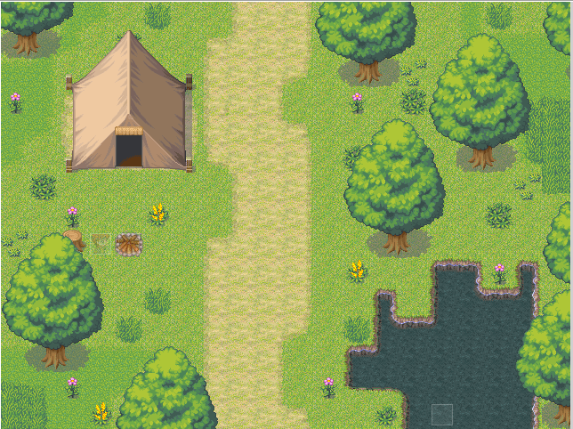
Your path is a bit TOO crooked. When people build roads/make paths the goal they're trying to accomplish is to make it easier to travel from Point A to Point B. Having to ride their horse/drive their vehicle like it's a snake detracts from this purpose somewhat. Don't be afraid to make the path straight. Instead of making it curvy to add more depth, why not cut into the path with some grass tiles to simulate that the road has been unused for a bit and the grass is regrowing?

It's also a good rule of thumb to make bodies of water more rounded. This doesn't mean you have to use the Circle Tool. You can mess around with the edges of the water until you get the look you're going for.

You did a nice job varying the placement of your trees to make them look more natural. I believe I read somewhere that arranging them in a vague triangle formation is pleasing to the eye (like you did above the water), but I could be wrong.
 
You got the triangle thing from the general mapping turtorial. I reread it to help with my mapping (although that was there before). Also, I do think that the path should be straighter because it is one of the main roads to the castle thus would be high traffic. This is also a cut scene map (said cut scene takes place at dusk) which is why it's rather small for a field map.

Really, since this is a main road, one would expect that carts pass through here a lot. That would lead to the ground having ruts from the cart wheels and have some grass between them (or not). Really, since this is such a small section of the path, I fail to see why it can't be straight. Actually, given what I've seen of dirt roads in real life and other fiction, having really windy paths like the ones Bacon made are rather unrealistic. Yeah, they can be that curvy but not every road is like that (especially if there's no good reason for them to be).
 

Tuna

Awesome Bro

I'm not sure if I wrote it wrong or you read it wrong or I read your reply wrong but... I definitely think the path SHOULD be straight. Here's something I did really quickly for you that I think is a bit better:

maphelp.png
 
Once again, the road in question is a high traffic road. I don't think there would be a part where the grass cuts through due to disuse. Also, how about this:

Road1withTent-2.png
 
@ShadowMainZERO:
I think you might want to use this water tile instead, or maybe this one. :)

Tuna's advice for the path way is good, I think you should do that. It looks..I dunno, a little weird with just a straight line of dirt. It can still be a high traffic area, of course :P

I think more wildlife, plants, grass and some more trees will greatly help too. :)
Maybe add some rocks?

Also, bacon's paths are very much realistic. There are paths like that cut all through the forests I live in and around :p
 
Alright, I added the road. Snaking paths in the forest does make sense due to all the trees but this isn't a forest. This is an open field (this section just has a few more trees than others because it is leading away from a forest. Also, I have to disagree on adding more weeds and trees. The number of trees is just right for where the path is located and any more would make it far too crowded. Same goes for the foliage.

I do thank you for the round lake though.

Road1withTent-3.png
 

Ares

Member

ShadowMainZERO":3hd4q5e7 said:
Once again, the road in question is a high traffic road. I don't think there would be a part where the grass cuts through due to disuse. Also, how about this:

image

If it is a high traffic road, with a lot of people/people on horses(?) passing by, it may not be the best idea to set up a tent immediately next to it. Other than that I think your map has improved. Good job :thumb:
 
Maybe, but something you can't tell by the picture is that the cut scene that includes that tent takes place at sunset and during the middle of the night. That and something the player will never know is that the tent is completely empty. The entire thing is a trap set up for Stephen (the hero).

Thank you!
 
prisons.png


I think I can tone down the size of the entire thing, like a tile off every side of every wall. Other than that, it's a prison. It doens't have much stuff, except for some various (ornamental and unharmful) misc that pirsoners can keep. The choice of the floor tileset is sorta so-so imo, since other tilesets have a bit more texture. However, that tile specifically had variations, which I hoped coul dhelp. Any ideas?

Ps: only one cell has a wall per prison wing, and the pots are the shit pots. Forgot what they were called, and pots were the only usable item I could sue :P
 
Yeah, it could be shrunk down, to look better.

Dungeon%20Example.png


I'm not the best, but it's shrunk down a bit.

I could probably use some improvement as well, though. Looking at mine, I realize, I could make the hallway smaller and add more cracks in the floor, among other things.

*fixes map*
 

Tuna

Awesome Bro

The thing about prison cells is that they're not meant to be comfortable. They're meant to be small, solitary things that more or less convey a psychological message that you're there, and you're there to stay until you've served your time. It's important to make all of the cells basically the same, but it's fine to add small touches to occupied cells that the prisoner may have been able to make.

The cells on the top left and top right are a bit illogical because a prisoner definitely shouldn't have a sword mounted in their cell, and things like picture frames and large desks could also prove to be safety risks. Additionally, you most certainly do not want a window like the one in the top-right cell. Prison cells should have windows, but not ones that a prisoner could have any hope of squeezing out of.

You definitely have the right idea, though. And props for 30 Seconds to Mars. :biggrin:
 
@strawberry

Yeah it could easily have less a tile less wide in the hallway but if you notice, you have an uneven width between the cells that are on the bottom and the ones on the top. Normally you wouldn't be able to see the beds on the bottom because they're pressed against the wall. But if you want to show them the top cell's need to be a tile less as well.

Some other things to add besides the cracks in the floor and walls could be dirt/sand, hay, spider webs, or some discoloration or rust on the metal bars, variations in the bedding (such as no cover, rips in the sheets, stains, etc). Depending what kind of prison it is... you could put some bones hanging off the shackles (or even a live person :eek:, cuz what else are they for?) you could also have some bones on the floor. Rats running around or just chilling in the cells would be good too.
 
I think those cells are the perfect size now, with the table on the side. Not sure why there are chains hanging from the wall in cells that look fairly humane, though. Of course, if this were a more medieval dungeon, it wouldn't have any furniture and only chains. Anyway, the stairs in front of the doorway need to be placed on a wall, not on the ground like that. You don't really have room for stairs; you should probably just keep the arch and maybe put the stairs in the next map or something.
 
Meh, seems a bit too much now. The lamps on the wall seems a bit much and elaborate for the small dungeon. MEANWHILE, there are chains hanging up at the table where the prisoners eat. Lol.
I'll admit it does add more color/variety and etc. to the map, which is imo what rmxp needs as much as realism in pictures: having players attentive and tuned to the game/gameplay/presentation more than the realisticness of the map.
 
I say randomize..

Use some with chains, some with beds 'n table.
Use this to make some difference in your captives :D
The size is right though, but i think its a bit big :S
 
looks pleausible, just needs a bit of, like liquid's comment, randomization.

And the mouse looks like a cat :D aka, really big for a rat.


Ps: you ever see the ultimate exterior/interior tileset, the tileset that combines the material from every single rtp tileset? you might find extras from there.
 

Thank you for viewing

HBGames is a leading amateur video game development forum and Discord server open to all ability levels. Feel free to have a nosey around!

Discord

Join our growing and active Discord server to discuss all aspects of game making in a relaxed environment. Join Us

Content

  • Our Games
  • Games in Development
  • Emoji by Twemoji.
    Top