
You are using an out of date browser. It may not display this or other websites correctly.
You should upgrade or use an alternative browser.
You should upgrade or use an alternative browser.
Mapping Improvement Thread 4
- Thread starter Æ№∞₧
- Start date
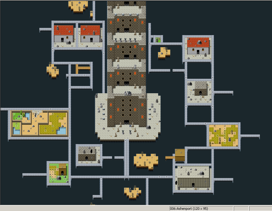
Jorge420":1hmct04q said:Hi, I was looking for any feedback I've been making maps recently and still working on more but I just really want to see what some people might have to say if anything, thanks.


Why make such a nice looking dungeon and hide it behind such an ugly fog? Why is it so foggy in there, anyways? Could you not use a light, white fog. You've essentially made something you worked hard on, that actually looked nice, look like shit because of that fog.
That could have been worded so much better...Prexus":2zjdw4p7 said:Why make such a nice looking dungeon and hide it behind such an ugly fog? Why is it so foggy in there, anyways? Could you not use a light, white fog. You've essentially made something you worked hard on, that actually looked nice, look like shit because of that fog.
Well I don't know i expect dungeons to be dark and I want it to be creepy in a way. I guess I don't know how to make the lighting right and I'd prefer to have it almost completely dark with a light around the hero but I don't know how to do that either my bad I'll look into making it look nicer.
Yeah I could have worded it nicer.
Why not remove the fog entirely, or use a white mist?
Unless your game hinges on atmosphere and lighting (like a Resident Evil game would, perhaps) no-lighting is just as good as meh lighting, and infinitely better than bad lighting. I would just use screen tints if you need to make the area look a little darker or bluer or whatever you need to accomplish.


Ace of Spades
Member
@ Jorge420; Less is more, don't tint the screen so much. It looks really unappealing the eye with the tint the way it is now. Try using this as a starting point: -90 Red, -90 Green, -40 Blue, and 140 Gray.
luv_kitty12
Member
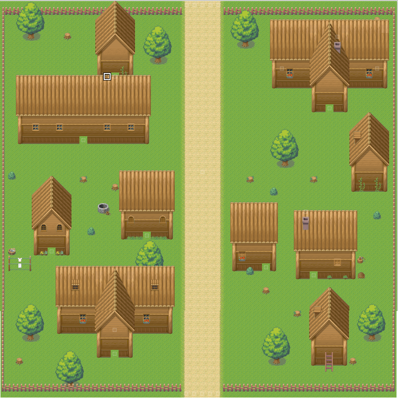
Long time no posting. Here is a new city I've mapped a while ago, any thoughts?

theGoldenMoon
Member
luv_kitty12":2qufm830 said:Long time no posting. Here is a new city I've mapped a while ago, any thoughts?
Hmm, not bad at all. But for me, there's to much open spaces. The buildings could use something on there roofs (maybe chimneys) and I think some of them also need doors. I know that this map will seem more alive when you put events in. Make sure there are enough NPCs to create a plausible, engaging environment. Other than that, it's great. Keep up the good work!
Pokémaniac
Awesome Bro
In-game:

ShadowMainZERO
Member
Okay. This is my first time doing this in years and I was a bit below average back then so I have no idea how this'll go. I also don't remember if there was another way to get pictures other than ctrl/fn+prt sc.
I have more maps than that. This is just for general impressions.
Ludai Village:
Stephen's (Hero) Home 1F:
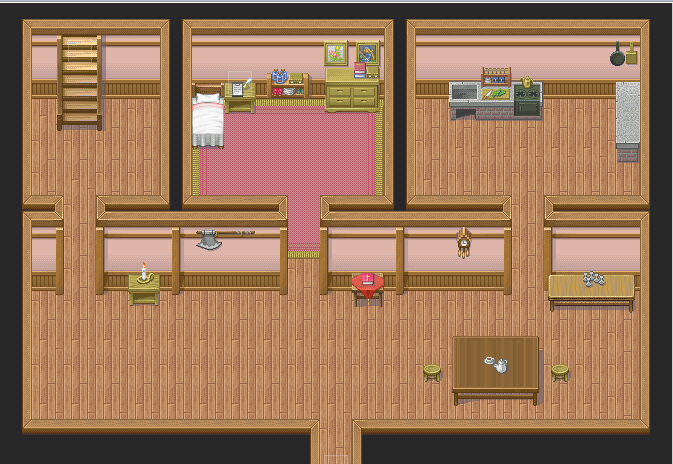
Stephen's Home Attic:
Ludai Inn 1F:
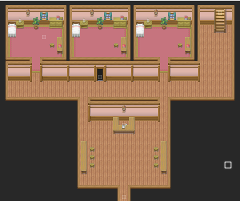
Ludai Inn 2F:
Stephen's (Hero) Home 1F:
Stephen's Home Attic:
Ludai Inn 1F:
Ludai Inn 2F:
I have more maps than that. This is just for general impressions.
Your maps are overly large and sparse with detail. You really want to shrink your maps down. You can easily make an inn room that is 5x4 or even smaller. Same with the entry way. You need to add some more interesting elements and condense.
Same with your outside shot. The path is way too straight and doesnt curve or even go to other house. The houses lack features and there is no scenery to break up the monotony of green. Ill try to find or map and example.
Same with your outside shot. The path is way too straight and doesnt curve or even go to other house. The houses lack features and there is no scenery to break up the monotony of green. Ill try to find or map and example.
ShadowMainZERO
Member
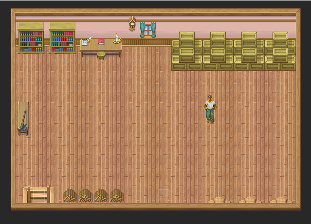
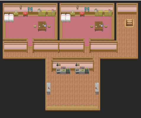
Well, the attic is the size it is because that's where Steven trains in private (the northwest building is a dojo where he learns swordplay and such but sometimes he wasn't to practice in peace). That and I like things to match up. Having an attic that's, say, 5x5 is a little silly in my opinion.
It may sound silly but mapping wise it looks 10x better. You can convey the message of training space without such a large space. You have a bunch of negative, unused space.

Example. Its a store room. There isn't a lot of unused space and everything looks crowded. It looks like a store room with a bed.

Its not a very good village but look how i try to kill that empty space. I try to fill it using the least amount of different colors to try and create a cohesive and somewhat busy map.

I tried to do a dojo. I added some weapons around and made it smaller.
Its silly to have a bunch of space with nothing in it and it is not pleasing to the eye. I understand what you are saying, but smaller is better in mapping. There is nothing going on in your maps.
Example. Its a store room. There isn't a lot of unused space and everything looks crowded. It looks like a store room with a bed.
Its not a very good village but look how i try to kill that empty space. I try to fill it using the least amount of different colors to try and create a cohesive and somewhat busy map.
I tried to do a dojo. I added some weapons around and made it smaller.
Its silly to have a bunch of space with nothing in it and it is not pleasing to the eye. I understand what you are saying, but smaller is better in mapping. There is nothing going on in your maps.
ShadowMainZERO
Member
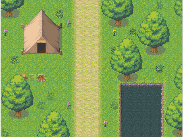
Bah. I'm just not good at mapping. I started with the path but what I made looked very ugly to me.
What about this one (ignore the straight road and lake/pool thing)?
What about this one (ignore the straight road and lake/pool thing)?
Plain Maps are, in my opinion, some of the hardest maps to map mainly because you have to detail while trying to avoid a bunch of trees. A great way to break up the monotony is to add long grass and use autotiles. Also changing the elevation a little bit and adding some more objects such as weeds and flowers also help.

its not a great map but its a decent example
its not a great map but its a decent example
ShadowMainZERO
Member
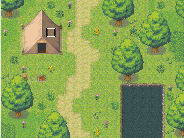
Okay. I added some things and stopped using shadow grass as my main grass so I could use it to add detail. How's this?
Thank you for viewing
HBGames is a leading amateur video game development forum and Discord server open to all ability levels. Feel free to have a nosey around!
Discord
Join our growing and active Discord server to discuss all aspects of game making in a relaxed environment.
Join Us