Envision, Create, Share

Welcome to HBGames, a leading amateur game development forum and Discord server. All are welcome, and amongst our ranks you will find experts in their field from all aspects of video game design and development.

Mapping Improvement Thread 4

Jason

Awesome Bro

So I've tried my hand at using the port tiles, not too sure how well I did with this, again I've added fog and colour tones, as well as weather too, since it's meant to look as if it's during a storm, and everyone is packing up or whatever people do during a storm... (I'll admit it doesn't look as good in a still picture, since you can't see the lightning and stuff either, or the shaking screen... but meh)

port21.png
 
The map overall looks pretty good. Although seagulls flying freely in a stormy day is odd, since they would hide or try to protect themselves from the storm. You should also put a reflection in the water of the boats.
 
@ShadowMainZERO
Man just because there's stuff outside of store doesn't mean there's wares in it. If you want a lengthy explanation (since you seem to favor those) How about the store clerk took the goods out of the boxes and stored the empty boxes and empty barrels outside of his place instead of cluttering up his nice shop? No one said they had to be filled. It's an rpg man. You don't have to be so logical or even think in such a round about complicated matter. ~.~;

@Jbrist
I like that one with the cave a lot but I feel like the fog takes away from it a bit. It probably looks better moving but I forget if there's the possibility to make it more transparent. Of course I've never been a fan of fogs... but anyways that auto-tile kicks butt.

The port town looks pretty good but while the board walk is walkable doesn't seem like there's enough room. I'd add a tile or two in width to it. As well as I'm not sure what's going on with the tiles in the board walk.. The bolt stuff seems kinda randomly placed. The birds imo would look pretty cool circling something (I figure you got random motion on). But they all kinda go in the same direction. Of coure >> I never liked random motion. But anyways birds look spiffy circling things (at least at sea!) and going in a triangle type formation by a mountain or whatever. Or a single bird just taking off is cool.
 
RavenTDA":1slybtu5 said:
@ShadowMainZERO
Man just because there's stuff outside of store doesn't mean there's wares in it. If you want a lengthy explanation (since you seem to favor those) How about the store clerk took the goods out of the boxes and stored the empty boxes and empty barrels outside of his place instead of cluttering up his nice shop? No one said they had to be filled. It's an rpg man. You don't have to be so logical or even think in such a round about complicated matter. ~.~;

But that's one of my personality quirks. If I didn't think about things in such a round-about, complicated manner, I wouldn't be me.
 

Jason

Awesome Bro

RavenTDA":1bpckpgt said:
@ShadowMainZERO
Man just because there's stuff outside of store doesn't mean there's wares in it. If you want a lengthy explanation (since you seem to favor those) How about the store clerk took the goods out of the boxes and stored the empty boxes and empty barrels outside of his place instead of cluttering up his nice shop? No one said they had to be filled. It's an rpg man. You don't have to be so logical or even think in such a round about complicated matter. ~.~;

@Jbrist
I like that one with the cave a lot but I feel like the fog takes away from it a bit. It probably looks better moving but I forget if there's the possibility to make it more transparent. Of course I've never been a fan of fogs... but anyways that auto-tile kicks butt.

The port town looks pretty good but while the board walk is walkable doesn't seem like there's enough room. I'd add a tile or two in width to it. As well as I'm not sure what's going on with the tiles in the board walk.. The bolt stuff seems kinda randomly placed. The birds imo would look pretty cool circling something (I figure you got random motion on). But they all kinda go in the same direction. Of coure >> I never liked random motion. But anyways birds look spiffy circling things (at least at sea!) and going in a triangle type formation by a mountain or whatever. Or a single bird just taking off is cool.

Well the first one isn't in a cave it's outside, and there's a sandstorm going on, hence the heavy fog (Which is actually the sandstorm fog anyway)

The second one is also in a storm lol, I probably could make the boards a little wider, it WOULD make sense I suppose, and what do you mean by the bolt stuff? The things used to tie up boats? They're all evenly spaced out and not randomly placed... the birds are moving to the left since they're flying away from the incoming storm, so I thought it'd make sense to have them going the same way (Like when you see birds migrating, they all move the same way)
 

Jason

Awesome Bro

MarioSuperStar":24qxj9cy said:
The map overall looks pretty good. Although seagulls flying freely in a stormy day is odd, since they would hide or try to protect themselves from the storm. You should also put a reflection in the water of the boats.

Firstly, as I said above they're flying AWAY from the storm, lol, secondly, that would require a tileset edit and I can't be bothered doing that, otherwise I'd change the water tile entirely, it just doesn't look nice in my opinion.
 

Cait

Member

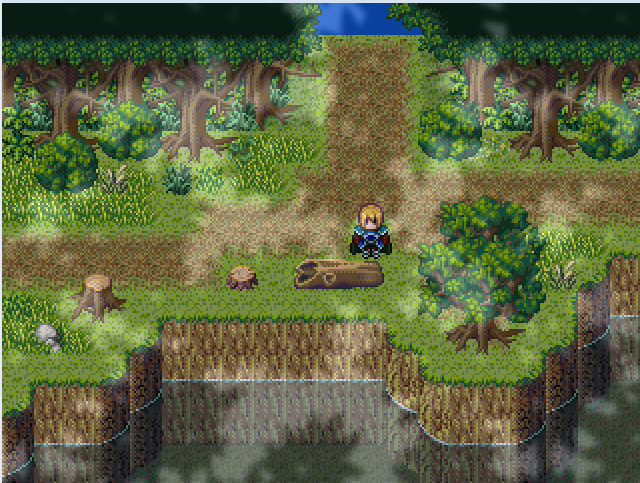
\(^_^) Hi! I wish I had more to say about the maps, but I have no opinion. Anyway, Jbrist, I like your maps. Even if people say the birds are funny, but it might have just started raining, who knows. o.o But I think most birds seem to know something's coming, but oh well. I don't know. But anyway, I converted Mack and Blue's tiles for RPG Maker 2000/2003 and I have the feeling that the FOG just doesn't work. I might have to create custom fogs to use with it, not that I know how or even where to begin. o.o I've NEVER made a fog... Anyway, here's the map. It's really a test map, so I know there could be stuff I could have added, but please feel free to tell me your opinions. It's been awhile since I worked with these kind of graphics.
mackxp.png
 
You have a problem with symmetry/randomness, your cliffs are too square, your dirt path needs to be curvier, and your forest canopy is too square...I don't use canopy tiles to begin with, they look horrible.

Not an actual area in TCT, just some practice so I don't get rusty.
2m7i41v.png
 
LaDestitute":1pgccqke said:
You have a problem with symmetry/randomness, your cliffs are too square, your dirt path needs to be curvier, and your forest canopy is too square...I don't use canopy tiles to begin with, they look horrible.

Not an actual area in TCT, just some practice so I don't get rusty.
Empty, empty, empty. Since you're using breeze, you actually need to fill the map more, since the objects and characters are smaller. Your map has to hold visual interest and detail, otherwise, they'll just run through it in hopes of finding something more interesting. Your map should say, "Hi, Look at me, explore for awhile."

Also, the yellow-green of the grass tile looks like split pea soup.

Here is an example:
test.png
 

Cait

Member

o.o Thanks! Yeah, the trees are way too square. I tried to vary the cliffs, but apparently, wasn't successful enough. The tree canopy is apart of the tileset and the experience. I happen to LIKE this canopy, rather than the XP version. (^_^) Thanks for the advice!
 
Nickster, I understand your point in avoiding emptiness with maps (that is...say unless your mapping a large canyon or dustbowl) but mappers should also avoid adding too much details as well as this can make maps cluttered. Anyhow, I took your advice and improved on it:

156a1px.png
 
Hey, I am just looking for some tips and criticism on my maps.
The map I am going to show you is my 'Mini Map' (so you can't see the events). And also, it isn't one map, but four. ('Player's House' (top left), 'Kamino forest' (bottom left), 'Kamino Village south' (Bottom Right), 'Kamino Village North' (Top Right) ).

There is actually a fifth map called Kamino Lake, but I am yet to implement it into this mini map. But critique would be great :D


Edit: There is also three blocks width missing on the right hand side of the map.
 
Get rid of the tree autotile in the middle and top part of the map. Those things are as ugly as sin. You can keep the ones of the bottom and sides if you wish. I'm also not fond of the tree sticking out of the bottom tree autotile. It draws attention to the fact that said autotile would be best from a top-down perspective while everything else is isometric.

EDIT: Also, by looking at your map, I do believe I have a better grasp of the meaning of the phrase "a busy map".
 
First of all: Do NOT use the tree canopy autotile. Gawd.

To begin with, your map looks decent. You appear to be having a problem with symmetry. Try spreading out your objects (especially natural ones) a bit more and try not to have them be symmetric. Also, the majority of your use the sand and dark grass autotile isn't good. Btw, try to make the river bigger. I just don't see a river having thin parts.
 
@ ShadowMainZERO
Firstly, thanks for your tips. Would you know of what i could use instead, i am using the maplinks and i need somewhat of a border to stop players being able to go through with them, do you have any ideas?

@LaDestitute
Again, thanks for your critique, can you help me with what i could use instead?
And which objects are to symmetrical, or is it just overall?

Thanks guys, when i get a little bit more info, or find some new tiles to stop players moving to the next map, i will update it and show you once again


EDIT: Actually, LaDestitute, I quite like the way your map is. I'm no expert of course, but I am fond of how it looks.
 
Sir Ver":1th7y6io said:
@ ShadowMainZERO
Firstly, thanks for your tips. Would you know of what i could use instead, i am using the maplinks and i need somewhat of a border to stop players being able to go through with them, do you have any ideas?

If you'll kindly reword what it is you're trying to do, I can probably help you with an event. Are you trying to force players to be able to change maps from only one section so you don't have to use a lot of events?
 

Thank you for viewing

HBGames is a leading amateur video game development forum and Discord server open to all ability levels. Feel free to have a nosey around!

Discord

Join our growing and active Discord server to discuss all aspects of game making in a relaxed environment. Join Us

Content

  • Our Games
  • Games in Development
  • Emoji by Twemoji.
    Top