Envision, Create, Share

Welcome to HBGames, a leading amateur game development forum and Discord server. All are welcome, and amongst our ranks you will find experts in their field from all aspects of video game design and development.

Mapping Improvement Thread 4

Actually, it wouldn't. Making the exterior would be simple and I'm not letting the player enter every house anyway. Even if I was, it would also reduce the number of maps since I could use one map for both sides of the home.
 

Tuna

Awesome Bro

Sir Ver":17uule9x said:
Ok guys, I have been practicing, using some tips from the tutorial and you guys, and this is what I've come up with so far.


Uploaded with ImageShack.us
This looks pretty good! You seem to have a great understanding of making a natural barrier to the map utilizing trees (which fits perfectly since I'm assuming this is a cabin in the woods) and you did a great job adding variety to the map. I found the small lake to be particularly eye-catching.

There are only two small things I'd like to comment on. Since houses are mostly designed with symmetry in mind, it might be a good idea to have the attic windows parallel to each other as opposed to being offset like they are now. Also, there is a tile error directly below the bottom-right corner of the attic roof. You should have the support beam continue all the way through. I'm not sure if you'll find a tile like that in the RTP, so you might have to do a quick fix with your favorite image editing software.

Other than those two small details, I think it looks great!
 
I agree with Tuna on those mapping errors. The one thing I also see is that it seems a bit empty, maybe add a fence around the house or something, it seems dead to me. But other then that, great job!
 
@Tuna
Thank you for the comments, I'm glad to see I've improved. The natural barrier was something i learned from bacon's tutorial.

I see, yes I was thinking that as well with the attic windows, but I wasn't to sure. I cringe at the idea of spriting haha, but I will give it a go.

Again, thank you!

@Mr_Smith
Thank you for your tip, I didn't want to go overboard, but I'll do my best make it less empty.
 
About making the village smaller: People won't mind if it seems like some of the NPCs are homeless? Really, my village is painfully small when compared to real life villages. Then again, things are allowed to look dull in real life.

What's the standard for number of houses in a village in a RPG?
no one will really notice
and the number of NPc's you have doesn't justify the number of houses
even with the number of houses, your houses should be way closer together and more tight-knit
you need detail

Sir Ver: Yes. You got it. You are getting it.
One thing I would suggest is changing up the type of tree
you are using one type of tree when maybe you should be using two (make sure to use the one that matches)

Your long grass could be a little better. Do you know those patches of long grass that are round and 1 tile? Those are supposed to go around the edges of the long grass on a separate layer!

I dont know if it needs a fence but it needs something.
What I would suggest doing is playing on the white. You have this white flower that is bold, try adding other objects with a similar color. (I dont know if there are any x:). Birds are good though and would match the tile.

Dont use long grass on a house like that.

But again, you are getting and doing it so congrats!
 
@bacon
Again, thank you for your comments bacon, but I'm not sure what you mean about using a second tree type. Would that by chance be the dead tree?

The white colored flower with other matching objects is a good idea.

The long grass on the house does look odd, I agree. But without the long grass I thought the vines look odd. Could you advise me on whether or not the vine tile should be used, and when?

Thanks again for your tips and comments.
 
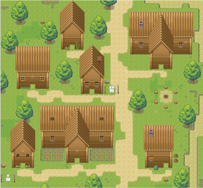
Okay. I shrunk the map from 50x50 to 38x41. I also took advantage of the flowerbed autotile to make up for the lack of normal flower tiles. I also combined it with the sunken undulation autotile to what I hope is good results.

LudaiVillage-3.png
 
I suppose it kind of does but I'm not sure how to fill up that space and still have it look good. I suppose I could just throw in more weeds and flowers but there's only so much one can do with those.
 
I'd like to take this opportunity to remind all of you of my Map Image Maker script/utility which lets you save large maps to a single PNG file easily. I see there's been some difficulty with large maps, and that's what this script was designed to help with. It even supports events and tiles drawn in exactly the same positions as in-game, using priority before tile layer. It also supports panoramas and fogs, though only with "normal" blend mode. The latest version, over a year old now, can save all maps at full resolution, even up to 500x500 tiles, although saving a PNG file of that size with Ruby can take an hour or more depending on your CPU speed.

I'd say more but there have been more than 50 posts since I last checked on this thread, and the maps posted since then look mostly fine to me.
 
@rey meustrus
That is a wicked script, I will definitely have a play with that, thank you!
EDIT: Wow, that is a really cool tool, but one bug I had, which I will post in your thread.

So, I've tried to follow everyone's advice, but I'm not sure how to proceed.


Uploaded with ImageShack.us

As you can see, i have added two fences, and an extra patch of grass.
With the grass, I'm not sure what you mean on which tile you are talking about, can it be found on the 'Forest Town' tileset?


As my objective with this map is to make a mysterious area, I've decided against using the white flowers and theme, it's to bright for the atmosphere i wish to create.

I am unsure what to add to make it less empty. I thought about more weeds or grass or things like that, but I think it looks to symmetrical for nature. It's confusing me.

However, all in all, I think it looks better.

Edit: Also, i added a lamp post in there to see what you guys thought, if you could tip me on that one as well please.
 
Redo, second time. I'm quite satifisfied with my efforts, despite there's not much different about the map. Only thing that bugs me still is the fog I'm using, and the placement of the flowers and trees.

2h5tetd.png
 
Sir Ver, it definitely looks better now, but you forgot one error, I believe, bacon pointed out.

map1nd.png


If you want to go for the mysterious appearance, I hope you will re-add the fog you used, as it looked quite good. Other then those two points, I think you've got it:)

LaDestitute, your map seems... empty. It looks like you've just thrown in some trees to make it look more filled, but they seem too random to me. Maybe you can add some little cliffs, or if you have them, a few undolations. Also the path, as it is man-made, it is not straight enough I think. Most paths made like that are, in fact, nicely done, but this one does not have the same width as I'd expect. But maybe there is an explanation for that:) I like your tileset though.
 
Regarding the emptiness you think is there, I didn't want to go overboard with objects either. But since, I mapped this like a park; it's plausible to have multiple trees
 
Mapped like a park you say? Then it would also make more sense to have it more structured and organized, as a park is man-made as well.
 
Eh, since it was just for some practice so I don't get rusty; I won't bother. I'll take those points in note next time I map another park.

However, a point:
No matter how much man attempts to control nature, nature is for one...random.
 
@ Mr_Smith
Hey, thanks for the comments. And yep, That will be fixed as soon as my spriting gets a little better.

And yes, that fog is staying, that picture was taken with rey meustrus' script tool.
 
No problem Sir Ver, good luck with your further mapping.

LaDestitute":167yzjz7 said:
Eh, since it was just for some practice so I don't get rusty; I won't bother. I'll take those points in note next time I map another park.

However, a point:
No matter how much man attempts to control nature, nature is for one...random.

I don't completely agree on that last point, if humans make a park and plant the trees where they want them, they can be in the exact place the humans want them to be. Of course you can't control how plants grow, but you can control the place where they grow.
 
@ShadowMainZERO
I just thought I would give some advice I just thought of. Now this isn't a mapping technique, but when i was doing landscaping, plants were always planted either as even as they could, or just a little bit proud (raised) I have never seen plants planted below ground level.

The flower beds just caught my attention.

@Mr_Smith
Much appreciated
 
Sir Ver":9pedewty said:
@ShadowMainZERO
I just thought I would give some advice I just thought of. Now this isn't a mapping technique, but when i was doing landscaping, plants were always planted either as even as they could, or just a little bit proud (raised) I have never seen plants planted below ground level.

The flower beds just caught my attention.

I wanted something surrounding the flowers. I tried using the road autotile but it looked ugly. I tried to raise it before I lowered it and you can't really tell that the flowers are on a higher plane. The way I did it is the only way I can think of to make it look good. That and I'm sure someone has done that in real life.
 

Thank you for viewing

HBGames is a leading amateur video game development forum and Discord server open to all ability levels. Feel free to have a nosey around!

Discord

Join our growing and active Discord server to discuss all aspects of game making in a relaxed environment. Join Us

Content

  • Our Games
  • Games in Development
  • Emoji by Twemoji.
    Top