Envision, Create, Share

Welcome to HBGames, a leading amateur game development forum and Discord server. All are welcome, and amongst our ranks you will find experts in their field from all aspects of video game design and development.

Mapping Improvement Thread 4

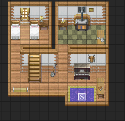
This is another screenshot... and it doesn't look like extremely dark like the other one (This screenshot is way older, so, i don't know why the new one was so dark D:)

sshot-3.png
 
It needs to be smaller. Think about the size of the RTP sprites, and then think about the size of that house. It's massive in comparison, and that's why it looks wrong. Because there's just too much space. Your whole interior map, inless it's for a stately home or something should fit easily onto a 20x15 map with space to spare. Just pull everything together.
 
@Nldarklord
Your map is nice. I don't see anything wrong with it. However, you can improve it:
- first, the undulation autotile, and the square water are very bad visually. Using round autotiles is a must if you wish to be a serious mapper.
-don't place tiles above the shadow autotile, as it gets cut.
-your cliffs can be less straight, and you can learn to make more interesting cliff shapes with some practice.
 
I would also get rid of some of the stuff you have in the map such as all the cacti. If you have detailed cliffs, there should be no need to have all of those objects. Furthermore, spread some things around. Also, watch out for symmetrical mapping.
I have already said this once already but undulations do not work like that.
undalations%20right1.png

It looks bad to have undulations against the same tiles such as grass to grass and sand to sand.
 
I like your layout just some key things you might want to be on the lookout for:

1) Since this look like more out in the wild, I would use the erosion grass autotile, not the path autotile.

2)Your pond is circle. Never use the circle or square selectors.

3)Vary your trees, use different kinds that match.

4)Your cliffs are boring. Add layers to the cliffs and make turns and whatnot. You can make some cool effects with the waterfall as well.
 

zchin

Sponsor

Eventing_guy
I suggest:
1. Making that map on a bigger scale, And you should add some mist events around where the waterfall meets the water.
2. Adding more varieties on the trees, by adding flowers on it or a nest or something...
3. Make the road thinner so it looks more natural like a lot of people walk there or something.
4. Add some more rocks, grass bunches and make the pond more less perfect unless it is meant to be man made.
5. I'd also suggest making the waterfall a tad smaller...


The other things I haven't said have already been said from Nldarklord and bacon. I hope your mapping goes along well, best of wishes to you.

Thank you and have a nice day!
 
As maps go I really like that one, Eventing_Guy. The only minor quabble is the flatness of the cliffs and symmetrical pond - though I don't think these are major issues as the map looks very nice aesthetically. The trees mask the flatness of the cliffs nicely in my opinion, no sense worrying about that.
 
Bland. It is very bland.
For one, there's no panorama. Even if it's looking into chasm, there are certain techniques you could use to represent the chasm, not just use pitch black. If it's the night sky, get the space graphic or some graphic of the sky/moon, something.
The tree to the left of where you get off the bridge/stairs whatever slightly obscures the view.
There are one or two inconsistencies of the small shrubs that lie ON the cliff- the color of that is lighter than the cliff itself. Use it higher up.
Differentiate, use more shrubs and grasses and shit all over the place.
The little piece of land that is seperate from the main cliff is a bit square. I'm sure you know that nature and randomness works best for xp rtp, so make it a bit more, you know, random
I recommend most to use a bit more of the general tileset. The four/five shrubs in one tile tileset doens't work all that well- the one or two shrubs work best.
 
There IS Panorama I just prited the map from the RMXP map editor; not in playmode!

It looks like this in Playmode:

http://img237.imageshack.us/img237/7609/introtile2.png[/img]

But the little single cliff is going to be changed and yeah I'll put more random thing like grass on it ;)

EDIT: Here's the updated version of my map:
introtile3.png
 
It looks nice in that shot but to be honest everything below that seems rushed. The cliffs are very samey, and the steps really don't work there. If you notice, the cliffs fade to dark grey, whereas the stairs don't. Unfortunately not much outside tileset editing can fix that.
 

candle

Sponsor

Well, the stairs aren't meant to be used in long strings like that, especially if there's nothing on the sides. Think about it, for those stairs to be usable, they would have to jut out from the rock for meters at the bottom. There's no way they could be natural rock that was carved if you do it like that. Probably add some ledges to the sides to make it look like the stairs were carved into existing rock

Other than that, all I have to say is to use a little more variety with your weeds. maybe use some tall grass or dark grass (meant for shadows, but works wonders for variety), or even add some dirt patches. Remember, in nature, nothing is perfect.
 

Thank you for viewing

HBGames is a leading amateur video game development forum and Discord server open to all ability levels. Feel free to have a nosey around!

Discord

Join our growing and active Discord server to discuss all aspects of game making in a relaxed environment. Join Us

Content

  • Our Games
  • Games in Development
  • Emoji by Twemoji.
    Top