Envision, Create, Share

Welcome to HBGames, a leading amateur game development forum and Discord server. All are welcome, and amongst our ranks you will find experts in their field from all aspects of video game design and development.

The sketch thread!

zchin

Sponsor

Strawberry: The picture of the guy is really nice, but I can tell that there wasn't much predrawing to his body ( the confusing circles and lines) I stilll seem to do that a lot too >.> but you are getting a lot better!


Started playing metroid again... so I decided I might as well try at some more realistic stuff...

Tyahand
 
Zchin: Wow that is really cool. I could recognize it instantly. The body angle looks a little wonky. Like the right shoulder (our left) looks smaller compared to the rest of the body. And the hand is just sort of floating there with no real reason.
But its a really good start. The face looks pretty good.
 
Makasu":2kgbj7sm said:
65enw.jpg


sold for $150
o_O

was gonna say "i could fart paint on a napkin and it'd have more artistic style" but instead i will take the high road and only say that i was GOING to say that, but then obviously totally not say it.

argh it's like "yay look at my novice ability in applying texture overlays, using lens flare renders & preset gradients, and playing with a wispy, wide brush type"

which, let's be honest, everyone is guilty of doing at some point in their lives, and it's no big deal, people learn
(the signature even looks half-assed and drawn with a mouse)

but you don't SELL IT

who would

who would buy that

"oh it's a girl with a nice rack who did it though"

SO?

I would be impressed if it was done by an amputee who had to put massive amounts of effort into re-establishing their art by jostling their stubs in a certain way
I'd be impressed if this was one of those things that that painting elephant painted, b/c man it's gotta be hard to paint with a trunk
I'd be impressed if the artist were age 5-12 and by buying it, I was somehow encouraging her to keep improving and not give up

But you don't buy something off a chick who has nice bosoms just because she still was in possession of said bosoms when she did it
It's not like you'll get laid by her if you buy it
It's not like framing it and putting it in your house will make you look cultured enough to attract other bosoms like hers

I

argghgh

god damn it I hate my gender sometimes FUCK

@strawberry: so cute! you seem to be developing well, stylistically. the eyes commonly are doing the anime drift though so don't forget to block things out, even on the face!

@zchin: starting to look cool! i am guilty of this too sometimes, but it's bad practice to finish the face/head before finishing your rough sketch of the rest of the body. Now that the head is finished, as you clean up the rest of the lines, you will feel the need to modify the body around it to compensate for fluctuations in positioning that occur when detailing/fine-lining -- and this is not how people move (the head goes where the body moves it).
 

zchin

Sponsor

Thanks for the wonderful feedback!

Venetia: I finished adjusting and finishing the line art, the last part was entirely true on what I felt like I needed to do...

As far as colors I'll have to adjust it a lot... is there any major things I'm gonna need to work on with the lines?


Tyahand
 
you need different hues in the face. Right now it only looks like you are changing the saturation when you adjust your shadows/highlights.
 
Venetia":36pwqyvg said:
Makasu":36pwqyvg said:
65enw.jpg


sold for $150
o_O

was gonna say "i could fart paint on a napkin and it'd have more artistic style" but instead i will take the high road and only say that i was GOING to say that, but then obviously totally not say it.

argh it's like "yay look at my novice ability in applying texture overlays, using lens flare renders & preset gradients, and playing with a wispy, wide brush type"

which, let's be honest, everyone is guilty of doing at some point in their lives, and it's no big deal, people learn
(the signature even looks half-assed and drawn with a mouse)

but you don't SELL IT

who would

who would buy that

"oh it's a girl with a nice rack who did it though"

SO?

I would be impressed if it was done by an amputee who had to put massive amounts of effort into re-establishing their art by jostling their stubs in a certain way
I'd be impressed if this was one of those things that that painting elephant painted, b/c man it's gotta be hard to paint with a trunk
I'd be impressed if the artist were age 5-12 and by buying it, I was somehow encouraging her to keep improving and not give up

But you don't buy something off a chick who has nice bosoms just because she still was in possession of said bosoms when she did it
It's not like you'll get laid by her if you buy it
It's not like framing it and putting it in your house will make you look cultured enough to attract other bosoms like hers

I

argghgh

god damn it I hate my gender sometimes FUCK

This. +1 but just goes to show you that if you have it you can use it to get ahead in life. If I could go around waving my male bits in peoples face via the internets and disregard having to actually show some artistic ability AND make bank then I most certainly would. Big breasts = win in the art world. You don't even want to see the mural she was paid $500 to do on the side of a building. :p nonetheless that's what my competition is in the art world. And so far I'm getting my ass handed to me. Again kudos to her for "making it."

And for further ranting. The artist who draws the rumble roses art, draws with only his mouth and produces better stuff than I can with both my hands. That I could understand. Her art. Not so much.

Anywho it was aimed at Peri but got out of control.

@zchin: Samus! Do you not happen to have a pressure sensitive tablet? I know photoshop tends to be a butt towards tablets that aren't wacom branded. Also you have to be careful whilst coloring that ways as colors tend to easily muddy up when painting like that. It's great though! But I opt for either a softer brush or softer stroke

@Strawberry: You're showing such great improvements! Taking risks and things are doing you severe favors! On the latest one of male, I struggle sooooo much with 3/4 view shoulders. That's why I usually draw everything in that angle. But I think you're onto a winner. Have you been studying realism? Your anatomy is also improving quite the bit.
 

zchin

Sponsor

Makasu: I have a wacom tablet... not sure is I'm supposed to be setting something or the other in photoshop for sensitivity, but the tablet I do have does have pressure sensitivity...

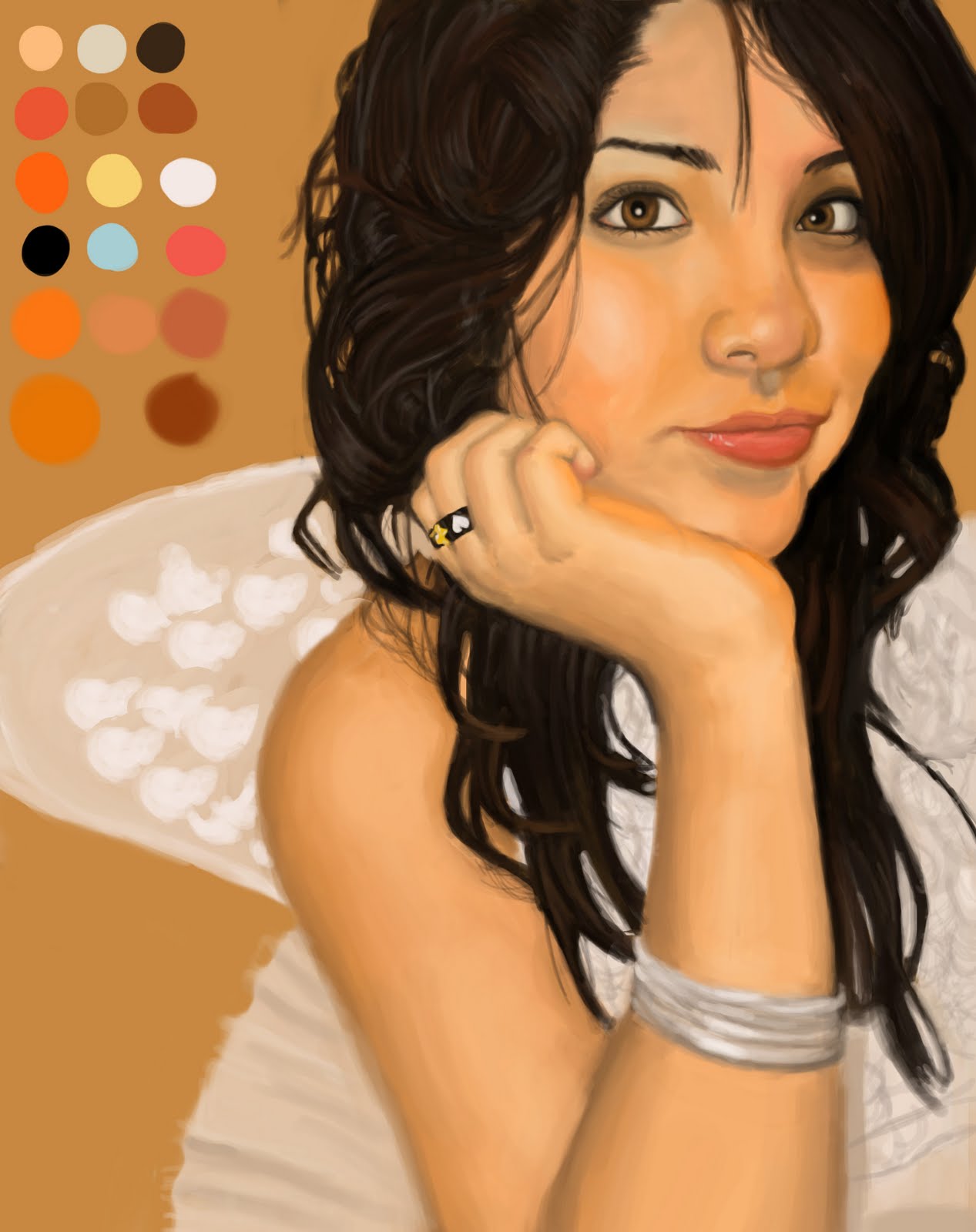
I tried again... getting killed by the colors again.... I don't really like it so what worse? The shading or the colors?


Tyahand
 
lilo_the%2Bfairy.jpg
look how much saturation is in the face and look at the different colors. There are reds and oranges and things in between in people's faces. Right now you have a palette but everything is pretty linear with it. Add some color and spice it up~
 
Well the face has all sorts of colors in it. Reds, blues, oranges, greens and all sorts of things. I think the color palette you have picked out is more suited for anime coloring, whilst you're approaching it from a more painting sense. There's nothing wrong with that par se, BUT it's probably not going to turn out to well in the end (I may be wrong so don't quote me on that ) also I think from the way you're painting it you would be better suited painting over the lines. But that's all artist preference really. Jump around and paint other parts! If you stay stuck on the face it'll frustrate you. Google charlie bowater vimeo and click the vimeo link. I would link it but I'm typing from my phone. :/

http://vimeo.com/10743423

That should be the link and help you. I know it helps me.
 
With the simplicity of the linework, I wouldn't do realistic, painted shading, but rather, simple block/"cel" shading, like what you'd see in anime.

Example:
cell_shading_anime_hair_by_moni158-d30lgjq.png
In the example, see how only solid colors are used to denote changes in shading, with a few well-placed, very subtle gradients?

more examples:
http://fc07.deviantart.net/fs17/f/2007/ ... riNeko.jpg
http://fc03.deviantart.net/fs71/f/2012/ ... 51ykh9.jpg
http://browse.deviantart.com/?qh=&secti ... g#/d2edmdo

also you really need to clean up some of the lines (some are clean, others are more "scratchy"), and the foreshortening is too strong on the shoulder circles (the circle that is further from the camera is too small ... it's not far away enough to be THAT much smaller).
 
I've been trying to get that persona style coloring down FOREVER and it's seriously kicking my arse. Teach me V! Pretty please :3
 
I seriously use this EXACT method: http://browse.deviantart.com/?qh=&secti ... g#/d2edmdo
(i also do highlight layers with the exact same method as the shading, and erase any of the crap that goes outside the lines.)

Actually I also use it as a way to start out "realistic" (blended) shading too (except more layers are involved for each color used, and the next steps would involve merging the color layers, and playing with smudge tools).

I'm REALLY bad at color choices, so I let Photoshop layer filters pick most of the colors for me :D
It's a very lazy way to operate and doesn't help a whole lot for doing dynamic lighting, but can turn out nice anyway.
 

zchin

Sponsor

I think that if you get really good at drawing your faces will have realistic proportioning so keep at! Oh, and I really like the eye you colored in.

From both Makasu and Ven's comments and suggestions I think I'm going to stick towards less realistic coloring until I can get better at it, because I've run it through 5 times and each time isn't better then the 1st try...


So I followed Venetia's hair shading, not sure if I got that part right...

Tyahand
 
yeah that def looks better
I think the hair looks fine but thats just me
Keep at it; I want to see it when you finish~

speaking of face coloring

tumblr_m7g71o20hP1qb0pnjo1_500.png

well
i dont get how to color people
or how to do people oh dear
idg how you add texture without it getting muddy x:

tumblr_m7h3rphjFA1qb0pnjo1_500.png

edited
idk if i like the colors
but they are interesting
tbh i dont know if this will turn out but oh well~
 
zchin":3tm0nhs4 said:
I think that if you get really good at drawing your faces will have realistic proportioning so keep at! Oh, and I really like the eye you colored in.

From both Makasu and Ven's comments and suggestions I think I'm going to stick towards less realistic coloring until I can get better at it, because I've run it through 5 times and each time isn't better then the 1st try...


So I followed Venetia's hair shading, not sure if I got that part right...

Tyahand
MUUUUCCCCHHCHHCH BETTER!
(dont forget to follow the shadows that her hair is making on her face, and highlight things like tip of nose, cheekbones, chin

it looks like you're "paint bucketing" the color fills in, though ... make sure to place your lineart on an alpha layer above your coloring, then paint in on layers beneath the lineart. so you don't get white fuzz around your lines.
 

zchin

Sponsor

Actually, I think that's just some rough lines after I changed the lineart... or some coloring that went over the lines and I forgot to erase... Not sure how to put the lineart on alpha though...?

Anyways, I seem to have no idea how to shade the shoulder parts without it looking pillowshaded... This was the best I could come up with...


Tyahand
 
Pipe: an easy way (for me at least] to avoid muddy colors is to use different more saturated colors. But not to saturated. I usually use a lot of blues, greens, purples and orange. Very seldom yellow. Also I mix the colors that ways I know I made the color and not just color picked the straight skin tone color. Experimentation would definitely be key there. Because a lot of the time something I paint starts out looking muddy but eventually comes out alright.
 
Thanks Makasu. Yeah I definitely need to experiment more. So do you just take two saturated colors and mix them? Either way, Im going to continue playing with painting a bit more hopefully the next one turns out better. Seriously Makasu thanks for taking the time and responding. Im looking for any bit and piece of information/critique I can get x;

I have this too
tumblr_m7lqx6Gg9y1qb0pnjo2_1280.png

tumblr_m7lqx6Gg9y1qb0pnjo3_1280.png

tumblr_m7lqx6Gg9y1qb0pnjo4_1280.png

tumblr_m7lqx6Gg9y1qb0pnjo1_1280.png

tumblr_m7lqx6Gg9y1qb0pnjo5_1280.png
 

Thank you for viewing

HBGames is a leading amateur video game development forum and Discord server open to all ability levels. Feel free to have a nosey around!

Discord

Join our growing and active Discord server to discuss all aspects of game making in a relaxed environment. Join Us

Content

  • Our Games
  • Games in Development
  • Emoji by Twemoji.
    Top