Envision, Create, Share

Welcome to HBGames, a leading amateur game development forum and Discord server. All are welcome, and amongst our ranks you will find experts in their field from all aspects of video game design and development.

The sketch thread!

That's pretty good. From those, I like the second one more, looks more clean.
You did a very good job with the sideview of the last one. Lyn looks odd, I think the
eyes are bit more outside than inside(Don't know if you're getting it, lol), but the clothing/body
looks great!

Made the head and the shoulders, and decided to do the rest of the body, but since I don't practice the latter
pretty much, I would like you guys to point me out if there's something wrong with the body or the face, whichever works!

2urma6w.png
 
j1.png

the roughest of lineart
i am going to color it hopefully so i didnt take tons of time on this~
usually i would do another lineart only it would be x100 cleaner but i dont give a shit im painting~

EDIT AW YEAH some coloring son

tumblr_m2z9prS5oe1qb0pnjo3_1280.png


i still dont know if im crazy about the palette but ill figure all that shit out later~
 
I personally was a fan of the blue outlines. I think if you did it in a neon type setting, I would have a much more "dynamic" feel. Idk exactly what I'm looking for there but when I see your inital sketch it makes me think of

http://www.youtube.com/watch?v=RV2qiy1zaIc

for some very odd reason.

But I think its the version from DKC2
 

zchin

Sponsor

Well I like the flying octupus!

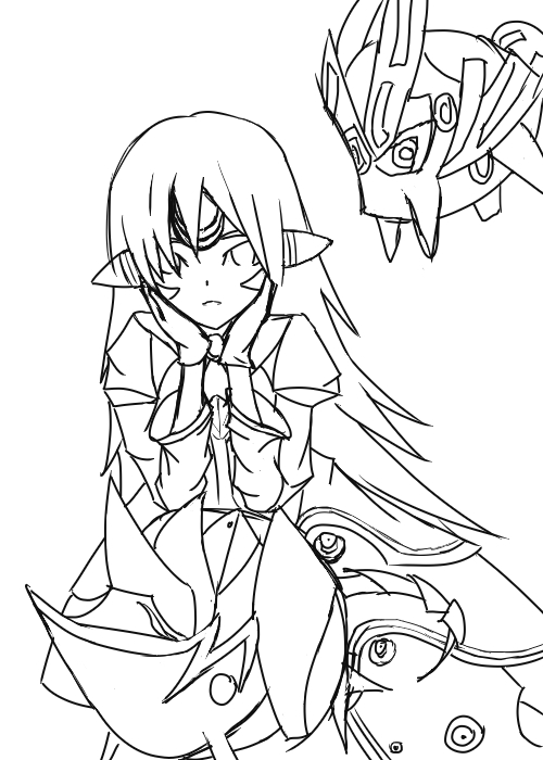
This is what I did to avoid doing homework today!


Fanart for an MMo called Elsword... Don't think I did a good enough job to be able to actually recognize it unlesss you look at them beside each other... But the pose is 100% original... I hope.

Tyahand
 

Jason

Awesome Bro

I've always liked your style mawk, it has a cool look to it... but why do all your people just about have proper gadoosh 10ft wide necks? (Obviously exaggerated...)

... Or maybe that's just how necks look? :huh:
 
that's rather spiffy, zchin! i ... can't quite tell what the heck is going on with her dress though. it has ... a lot of parts o_o


@mawk:
the neck is really really wide. also the eyes are off and some of the facial proportions. i scribbled out a diagram.

mawkhelp01.jpg


the red lines indicate some positioning/blocking lines. I drew a horizontal line through the face that indicates the face's "equator", so to speak (tried to compensate for the tilt of the page in the photo). The eyes should run along it. Pupils should be in relatively similar zones along the "equator".

the vertical arc would be the "meridian" of the face. The centers of the nose and lips should follow it (they're close but somewhat off).

the fellow has a very thick face, but the jaw does not compensate for it, implying that the guy has a sort of ... inverted triangle for a face. Which DOES happen, but not usually in people with a strong chin or a jawline strong enough to be thickly outlined.

the ears need to be within the longitudinal lines leading away from the tops of the eyebrows, down to a line that runs either from the top of the lips to a point between the lips and the nose.

The neck would begin nearish to the innermost boundaries of the ear-circles. This is indicated with the green lines. I predicted where the other ear would be, considering the slight tilt and curve of the face. The only thing that would skew this geometric constant would be fat deposits ON the neck, which typically only happens with fairly obese people. of which this fellow does not appear to be.

If you want his neck to be muscular, it would still issue from the same location, but would bell out somewhat, where the neck muscles gather.

The line that indicates the anterior triangle of the neck (the innermost neck section, where the adam's apple is) is too far out.

Sometimes people draw lines that shape out the muscles which protect the jugular veins. This sort of deep volume change which would require such outlines would only really occur in EXTREMELY lean and or very muscular people. (or if the character is doing an extremely sharp head turn or is flexing so that these muscles stand out)

A volume change depicting ONLY the anterior triangle, however, is common in many people. But that would only run down and away from where the chin/jaw connects to the flesh of the neck.
diagram ... diagram ... oh, here's one: http://webgel.net/bf/necktriangles.gif

The hair looks fine.

Hope that helps ~<3
 

mawk

Sponsor

that is probably the most helpful post I've seen in this thread! oh my goodness!!

also yeah my necks are ridiculous. ever since I stopped drawing people with torsos twice as long as their legs I guess I needed to develop another bad habit.
 

zchin

Sponsor

The only thing I can say is that the eyes are really nice, an original shape in my opinion and very simple... haha, I'm always over complicating the eyes.

Finished the line art and started coloring... I think I'm just gonna clear the top right...


I'm really liking the coloring I've been doing today on it... Yeah Venetia, the dress is where everything doesn't make any sense... The drawing is missing some furls or some kind of short cut fluff at the end of the sleeves... need to add that. But is this still allowed in the sketch thread?

Tyahand
 
BUMP! Just because I can.

wzoqn.jpg

just messing around. Nothing is final because I certainly cannot figure out what to do with Isaac and Chief. :p
 
I agree with what action said!

6rfqk.jpg

which is what has inspired this. I'm playing around with a slightly different style so that's why there are some wonky proportions. :p Its coming along good I would like to think. I hope. :p
 

Thank you for viewing

HBGames is a leading amateur video game development forum and Discord server open to all ability levels. Feel free to have a nosey around!

Discord

Join our growing and active Discord server to discuss all aspects of game making in a relaxed environment. Join Us

Content

  • Our Games
  • Games in Development
  • Emoji by Twemoji.
    Top