
You are using an out of date browser. It may not display this or other websites correctly.
You should upgrade or use an alternative browser.
You should upgrade or use an alternative browser.
The sketch thread!
- Thread starter dadevvtsvre
- Start date
SteelReserve
Member
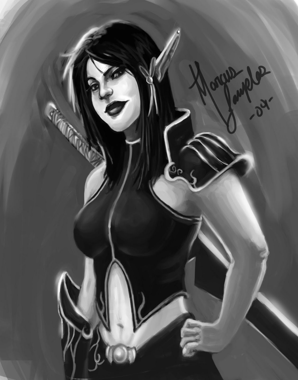
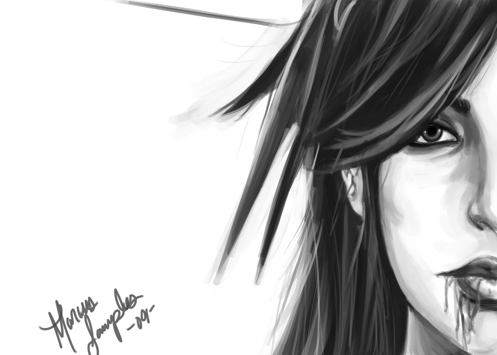
Heres one I've been working on.


yeah, me too. I think that was a leftover from back when I was thinking of it as simply an oversized suit instead of a silly jrpg tailcoat.
yours are just badass, btw. the first one looks maybe a bit strange around the mouth and cheeks, but otherwise it looks like you have facial construction and all that down pat.
yours are just badass, btw. the first one looks maybe a bit strange around the mouth and cheeks, but otherwise it looks like you have facial construction and all that down pat.
Hahaha well change it up man! If anything it could have a very The World Ends with you style to it. Because they have giant ass hands in that. But I love the anatomy in that. Sooo I like what I see.
And thank you. The first ones shit. When it started it was something completely different. It all started out as an exercise to if I could draw a face from a lower angle and then turned into a frustrating sketch that eventually I gave up on. :p But hahaha you think so? I struggle with faces incredibly though. And shoulders...Lol if you could see my sketchbook [[the real one]] you'd see so many different shoulders in there. Yet when I draw can't decide. If you look closely in the first ones you'll see that right shoulder [[our left]] is completely off. :/ But the cheeks look weird because I didn't smooth them out correctly. Or something. I don't know. Everything went wrong with that piece like I said.
And thank you.
@Nex: well he's back for now. Chances are you might have seen them if you have me as a friend on myspace. I post art there first before anywhere else. So idk you might have more than likely yes.
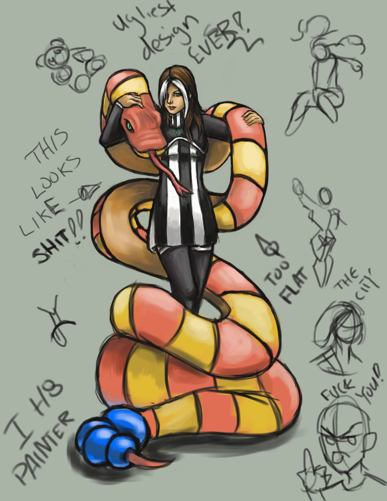
@Ven: well its the concept I hate more than the line quality. I thought it'd be an interesting concept but the idea didn't translate as smooth. Plus that has to be the ugliest costume design I've ever come up with. :p
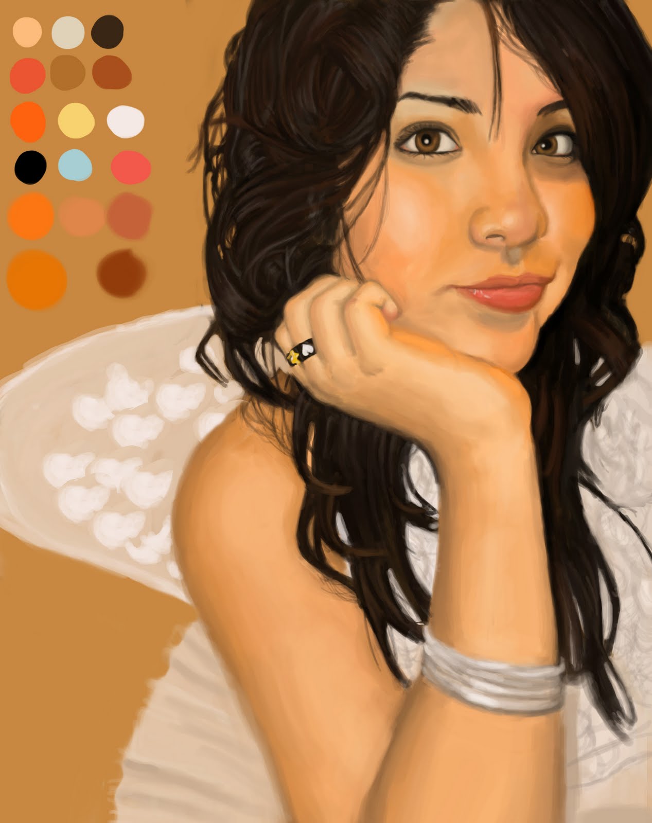
And Painter is to hard to use for some odd reason. At times I know it but then I don't. And ever since I got a wacom (which has working pressure sensitivity in photoshop) I see no need to over complicate when I can just pick a brush and go with the flow!
painter offers way more realistic media styles, that's its only advantage over PS. i sometimes have a hard time with it too but its palette builder and blender is fucking god
if they combined that aspect of painter with PS, and paint shop pro's super simple grid function with PS, there'd be no competition whatsoever
if they combined that aspect of painter with PS, and paint shop pro's super simple grid function with PS, there'd be no competition whatsoever
Thank you for viewing
HBGames is a leading amateur video game development forum and Discord server open to all ability levels. Feel free to have a nosey around!
Discord
Join our growing and active Discord server to discuss all aspects of game making in a relaxed environment.
Join Us


