Envision, Create, Share

Welcome to HBGames, a leading amateur game development forum and Discord server. All are welcome, and amongst our ranks you will find experts in their field from all aspects of video game design and development.

The sketch thread!

workinprogress.jpg

I love how I just disappear for months at a time and then just show up again. Almost like an STI....:/

Anywho love all the works! So much progress is being made!

I on the other hand have not drawn since I've turned 21! Which was back in January 9th so here's brushing off the old digital art skills. :p

Nowhere near done either.
 
Impressive :eek:
I love the details in the eyes, they're very well drawn. The only things that stand out to me are the reddish spot on the left nostril, and the orange shaded part of the nose (it extends out a bit too much IMO). The face is a tad jagged, looking at the small image. Otherwise, it's shaping up quite nicely!
 
Why thank you Regi! Yeah I can't seem to get the color right on the nostril and the nose and the picture is SUUUUPER saturated. :p and since I have a strict "No color selecting" from the original image (that way I can learn to spot colors easier) I'm trying to get a correct shade. Of course though I have to smooth everything out and I'm only using a basic 100% hardness round brush. I'm not all into fancy brushes just yet but I will try and smooth it out.

And oddly enough I can never do eyes correctly. Blargh!

EDIT: Wait which orange nose part? Lol I think I've gone color blind. :(
 
Strawberry: Awww why thank you! You'll be good. You'll pass me! you've made incredible strides as an artist in like 3 months. I'm a lazy bum and draw when its convenient for me. :p So just keep doing what you're doing finding inspiration and in no time I'll be wishing I could draw like you! :)

PLUS! I've got 14 years of doing this and I cannot for the love of me draw a body correctly. Lol so you're doing great in my eyes.
 
Makasu":1jwau6qe said:
EDIT: Wait which orange nose part? Lol I think I've gone color blind. :(
I meant that little splotch of color on the right side of the nose (it looks like it extends a bit too far, but that might just be me).
 
AHHH I see it! Lol I missed that completely. I was looking at all that orange and not the nose. I think I got it at least. XD
 
DOUBLE POST!!! *Sorry mods*
allihart.jpg

Got tired of looking at it. YAY for my lack of ability to come up with interesting backgrounds lol

I should probably smooth it out some more. :/
 

moxie

Sponsor

looking good makasu!! nice to see you back too!

it's been nice seeing this one as it progresses, seeing the way you do colors is really helpful
 
Lol I wouldn't say welcome back. I have a nasty habit like I said of disappearing for months at a time. :p

But thank you both!

chrisdaughterwip.jpg

First time drawing a child. This should be interesting :p
and or severely frustrating.
 
She looks a bit like a little old man now. Try rounding the face a little more? Might look better when you shade it.

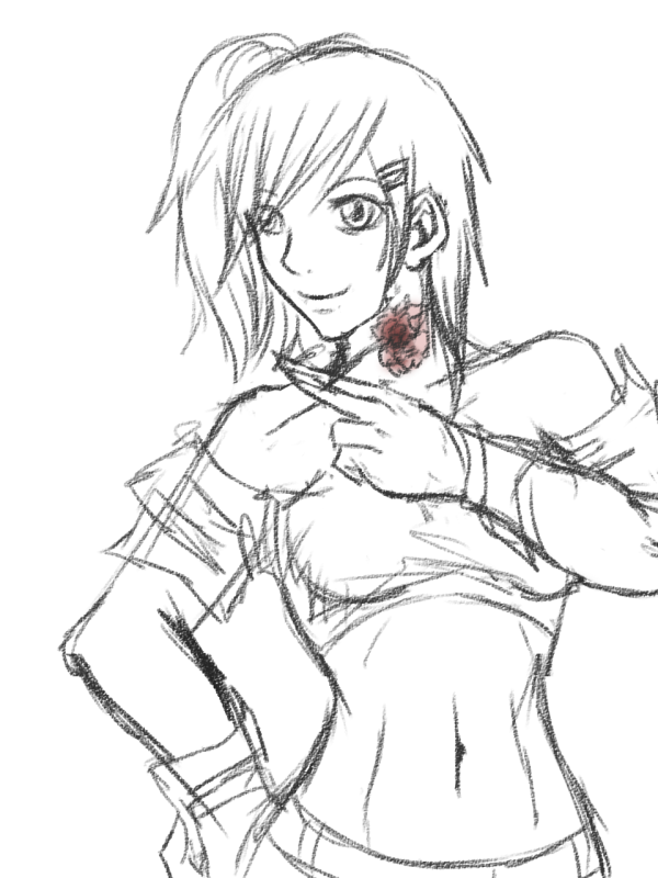
I did a quick sketch last night. It has a lot of weird parts, I know; I'm pretty awful at figure drawing. Trying to get better, though.

anneka01-2.jpg
 
left shoulder looks weird, too broad, sticking out a bit?

curve of the clothes above the waist seems wrong, makes her lower half looks bigger while that part, where the creases come together, seems to make that part look smaller (?)

chin and face is def off. I actually don't see much of a chin at all.

Breasts seem unemphasized and the right (her left)'s curve going up seems to be off as well, a bit too much of the back/body there?

cool style.
 
@makasu: ya, she looks a bit old with the sketches. I'm not an artist in anyway, but maybe draw everything softer? her curves and just about everything isn't very defined, so i guess just make the coloring to make the colors softer, make the lines less defined, etc.

if not, just draw big eyes and make it cute.
 
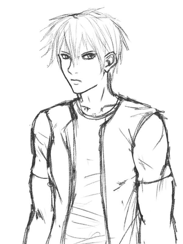
Hi everyone =w= don't hang around here much but the critique's really thorough so I thought I'd post some stuff.

gabby1.png
Issues I know of:
Face is retarded and the shoulder/arm on the right is fairly off. Torso might still be too long.

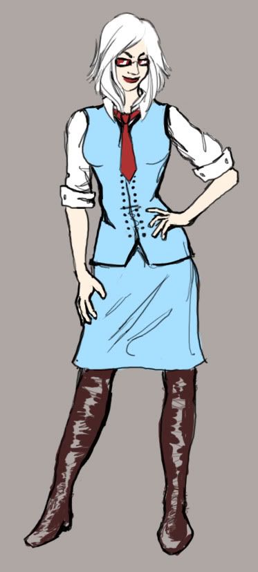
loljacksonwut.jpg

Folds don't follow the anatomy properly and I think the musculature on the right arm is off.
 
Peri: I seriously love that. I want to collab with you! Or mayhaps some fan art for your game! :D Either ways I think that if you gradient shaded that it would look absolutely stunning.

Tomas: Have you seen the music video for Her morning Elegance? That is what that fish reminds me of! <3

abbey.jpg
:p I'm well aware of the features being a tad bit off. ie: the head is too long.

Sorcerer: I like the pose on the first one but on the second one the guy either has two biceps on his left arm [our right] or his elbows are really low! lol
 

Thank you for viewing

HBGames is a leading amateur video game development forum and Discord server open to all ability levels. Feel free to have a nosey around!

Discord

Join our growing and active Discord server to discuss all aspects of game making in a relaxed environment. Join Us

Content

  • Our Games
  • Games in Development
  • Emoji by Twemoji.
    Top