Envision, Create, Share

Welcome to HBGames, a leading amateur game development forum and Discord server. All are welcome, and amongst our ranks you will find experts in their field from all aspects of video game design and development.

The Screenshot Thread

Status
Not open for further replies.
RedRedd":9ykoxzar said:
spaceheroespic.png

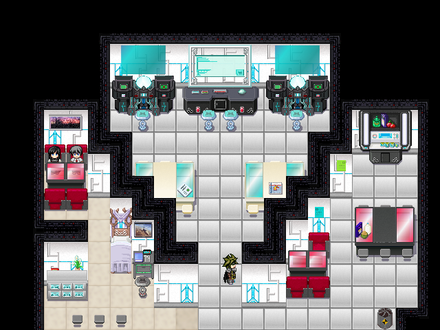
Here's a screenshot from Space Heroes that I came up with quite a while back. It's the Captain's HQ

BTW RobinP, that game is looking FANTASTIC!!
Will you have to Pay2Play?
I recognize KiearaPhoenix's tileset. You may want to credit her, since she put a lot of effort into it.

Anyway, this has some pretty serious contrast issues! Try using darker walls and floors, or a lighter ceiling. Actually, yeah, I'd replace the ceiling, since the style is totally different from Kieara's work. Also, I really don't like those floor tiles. The combination of gradient and dark outline is unattractive. I would recommend finding a replacement. The beige ones on the left are much better but also somewhat inconsistent with the rest of the graphics.

From a mapping POV, I don't think the diagonals work. You really need actual diagonal walls if you're going to do that, and as it is, everything looks cramped. The table and chairs on the left are impossible to get to, the tables behind the diagonals are cut off by the walls, and it's generally just kind of hard to tell what's going on.
 
x5sj2b.png


Here's a little (very early) sample of a tileset I'm working on. This map isn't part of any project, I just whipped it up to demonstrate (more or less) the entire tileset I've compiled so far.
 
That actually looks really nice, but you have some contrast issues. Here's a two-second adjustment:

Untitled-657.png


There's also a horizontal line on the side of the angled wall, and the grid is pretty visible on the grass. If I were you, I'd make a few variations on the grass tile (frankenspriting is fine if you don't have the spriting chops to make it from scratch) and stick 'em in the tileset and use them by putting them on the second layer so as to not break the autotiling. Most professional games with tiles use tile variations to conceal the grid. Also, from a mapping perspective, I'd move the interior wall inside the building up.
 
Perihelion":2sfldnyg said:
That actually looks really nice, but you have some contrast issues. Here's a two-second adjustment:

There's also a horizontal line on the side of the angled wall, and the grid is pretty visible on the grass. If I were you, I'd make a few variations on the grass tile (frankenspriting is fine if you don't have the spriting chops to make it from scratch) and stick 'em in the tileset and use them by putting them on the second layer so as to not break the autotiling. Most professional games with tiles use tile variations to conceal the grid. Also, from a mapping perspective, I'd move the interior wall inside the building up.

  • Could you elaborate on the contrast issue? I've been told by people that my monitor seems to display things a little differently.
  • Thanks for spotting the line, it's been removed.
  • The grass I use is nothing more than a recolor of the tall grass that comes with the RTP, it may only seem to tile more since I've increased the contrast. I'll still look into using variations, though.

Thanks for the feedback.
 
Yeah, regardless of whether the grass tile is RTP or not, it could still use some editing. You could even do something like rotate it and then make it tile with the others.

As far as contrast goes, it looks a little washed out as you have it. You just need darker darks and lighter lights and maybe some more saturation.
 
Sorry about that Grav; here's a proper screenshot.

playersheet.png


Also shown is the bestiary, which shows the top (by level) four players and enemies this character has defeated.

"Biography" is a player writeable thing, like a signature.
 
lol, does he have a swordfish for a weapon?
also those scrollbars thouroughly disgust me.
and if you can set the spacing anyway, why not make that menu item a wee bit pixels smaller, so the rows fit in properly? ;D
 
Tomas":gxfxz2to said:
lol, does he have a swordfish for a weapon?
also those scrollbars thouroughly disgust me.
and if you can set the spacing anyway, why not make that menu item a wee bit pixels smaller, so the rows fit in properly? ;D
what's wrong with scroll bars?
 
@RobinP: Tales of the Savage Cows? WTF? Anyway it looks absolutely beautiful. I was going to ask how you got that screen resolution with RMVX, but since you said it's a custom game engine, I'm instead going to ask you how you dealt with autotiles, both with mapping and with animation. Did you write a mapping tool or are you using RMVX for mapping? How does the engine animate the tiles?

@Tomas: I suspect the issue with menu items (I'm assuming you mean the inventory grid) is a particularly annoying layout "feature" of HTML. If each item is represented as an inline image or inline-block image, the browser will display any space between the elements in the source code. To prevent this, one either has to switch to a floating block model or change the markup from this:

HTML:
<div class="html" id="{CB}" style="font-family: monospace;"><ol> 

  <span style="color: #009900;">[url=http://december.com/html/4/element/p.html]<span style="color: #000000; font-weight: bold;"><p>[/url]I'm a paragraph!<span style="color: #009900;"><span style="color: #000000; font-weight: bold;"></p>

  <span style="color: #009900;">[url=http://december.com/html/4/element/p.html]<span style="color: #000000; font-weight: bold;"><p>[/url]I'm a paragraph!<span style="color: #009900;"><span style="color: #000000; font-weight: bold;"></p>

  <span style="color: #009900;">[url=http://december.com/html/4/element/p.html]<span style="color: #000000; font-weight: bold;"><p>[/url]I'm a paragraph!<span style="color: #009900;"><span style="color: #000000; font-weight: bold;"></p>

  <span style="color: #009900;">[url=http://december.com/html/4/element/p.html]<span style="color: #000000; font-weight: bold;"><p>[/url]I'm a paragraph!<span style="color: #009900;"><span style="color: #000000; font-weight: bold;"></p>


To this:

HTML:
<div class="html" id="{CB}" style="font-family: monospace;"><ol> 

  <span style="color: #009900;">[url=http://december.com/html/4/element/p.html]<span style="color: #000000; font-weight: bold;"><p>[/url]I'm a paragraph!<span style="color: #009900;"><span style="color: #000000; font-weight: bold;"></p

  <span style="color: #000000; font-weight: bold;">><span style="color: #009900;">[url=http://december.com/html/4/element/p.html]<span style="color: #000000; font-weight: bold;"><p>[/url]I'm a paragraph!<span style="color: #009900;"><span style="color: #000000; font-weight: bold;"></p

  <span style="color: #000000; font-weight: bold;">><span style="color: #009900;">[url=http://december.com/html/4/element/p.html]<span style="color: #000000; font-weight: bold;"><p>[/url]I'm a paragraph!<span style="color: #009900;"><span style="color: #000000; font-weight: bold;"></p

  <span style="color: #000000; font-weight: bold;">><span style="color: #009900;">[url=http://december.com/html/4/element/p.html]<span style="color: #000000; font-weight: bold;"><p>[/url]I'm a paragraph!<span style="color: #009900;"><span style="color: #000000; font-weight: bold;"></p>


I forget if that's exactly how it's done, but the idea is to eliminate spaces between the closing caret and the next opening caret.

@dadevster: I don't think it's an opposition to scroll bars in general, but rather an opposition to the Windows-style scrollbars instead of theming them to match the application. Unfortunately there isn't any good way to theme scrollbars that doesn't sacrifice usability; at least, I've never seen one. You'd have to completely re-implement scrolling with Javascript, and when I've seen it done it never taps into the mouse scroll wheel. I don't even know how you would do that in Javascript. It's unfortunate that the scrollbar styles in IE6 never became part of any web standards; just one more thing about IE6 that was actually kind of nice but completely pointless or even counterproductive because it wasn't a standard (like the box model, which usually breaks standards-compliant websites but I think the IE6 model makes more sense).
 
I'm trying to work out the best dimensions for the inventory box so as to fit full rows in. I'm thinking of having top five, instead of four, enemies/player defeats.

I'd like to replace the scrollbars but can't find a cross-browser compatible one that actually works. I did try several scripts but they either didn't work or they weren't as "feature filled" as the standard ones (as rey says, things such as mousewheel).
 
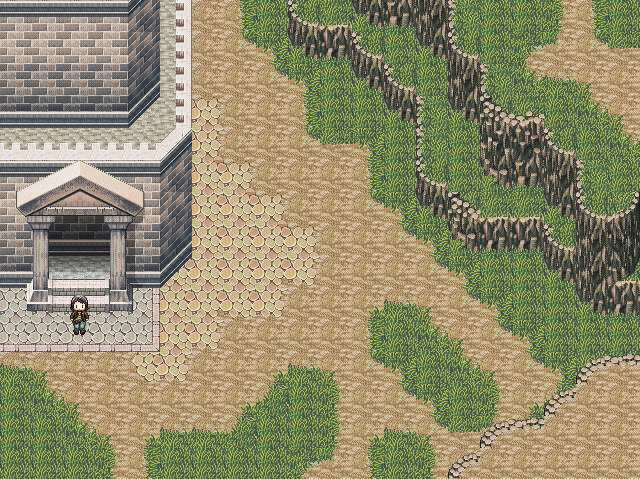
the rooftops too clean? should be dirty and got smeared with leafs
bunchflower bloom in road? dont they get stomped?
cutted tree in road?
wanted to say door but u prob use event for it.
 
Only thing I can think of is there isn't a clear path through the dirt. If the climate is dry enough that grass can't really grow near the path, though, maybe the dirt path should be that wide instead of having a smaller path carved out of the ground.

Also, there's the huge empty space in the top right, but I think you knew about that already...
 
262352s.png
1: the buildings look like one, but are on a different height.
2: you've got the fence on the stones on the other parts, but here its on the grass.
3: the shadow from the tree isn't on-top of the fence
 
This is online and working.

27d8e267232c20580969e7c0a53f0607.png


Your top five defeated players now show on your profile.

The number is the difference between your levels (-10 is better than 0 is better than 10).

:D
 
rey meustrus":1kjjdlu4 said:
@RobinP: Tales of the Savage Cows? WTF? Anyway it looks absolutely beautiful. I was going to ask how you got that screen resolution with RMVX, but since you said it's a custom game engine, I'm instead going to ask you how you dealt with autotiles, both with mapping and with animation. Did you write a mapping tool or are you using RMVX for mapping? How does the engine animate the tiles?

Every single piece of software used was developed by yours truly. I wouldn't be able to use RMVX for the mapping because it's so damn limiting. I think they have the possibility of one custom tileset and two map layers. All the experienced developers have gone over to developing their maps in Photoshop and just dumping them on to the screen as an image. That's a sign of a broken mapping system if I've ever seen one. :P

Not to mention the fact that I built all editors in to the game so any changes done are instantly sent to the server and then everyone logged on. Would be a real hassle hacking RMVX to communicate with my server.

I simply programmed in a method which allows me to place autotiles when editing the map.
 
Status
Not open for further replies.

Thank you for viewing

HBGames is a leading amateur video game development forum and Discord server open to all ability levels. Feel free to have a nosey around!

Discord

Join our growing and active Discord server to discuss all aspects of game making in a relaxed environment. Join Us

Content

  • Our Games
  • Games in Development
  • Emoji by Twemoji.
    Top