Envision, Create, Share

Welcome to HBGames, a leading amateur game development forum and Discord server. All are welcome, and amongst our ranks you will find experts in their field from all aspects of video game design and development.

The Screenshot Thread

Status
Not open for further replies.
All of your elevated areas don't have anything on them other than plain grass, which looks weird because the rest of the map has a bunch of stuff on it. For some ideas and tips... well usually number one thing I say is plants and nature grow in groups and like groups at that. In other words a patch of flowers that are the same color more than likely grow together in a small group and another type somewhere else unless planted there (or some kind of cross pollination happens... but even if that were so then there'd be a point where one color was separate from the other. The more you helter skelter trees, the more it seems like someone came around there and chopped them purposefully down. Right now it looks like someone went and chopped some in there.

Besides low elevations that end up in mud like you got there (which is good!) taller grass tends to grow near moist areas as well as mushrooms. Sometimes trees can sap the ground of growth and there's actually less grass growing in those areas near them unless it's in a populated spot... which means the less grass is near the path and because people tend to walk not in the path of trees then the grass around the trees are probably taller.

For specific to your map... if you want it to look less traveled then I'd group the trees a bit more together and add some more wildness to the upper levels. Looks good so far though!
 
Okay, all taken in but when you refered to the upper levels I did say before,

Ignoring the cliffs and the parts that obviously haven't been done so well...

Because that part's not done. I only wanted critique on the parts that have clearly been done. I'm still trying to get a feel for this map and I've been messing around with it a bit to see what I could come up with but something has always felt a bit off.

This all being said, I am taking in what people are saying here. I'm not dismissing it when I reply in "defence" as it were. I am grateful for any constructive critique that can help me develop my map's feel better.
 
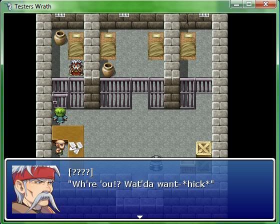
Nothing fancy here, I'm not an awesome map maker, but I was wondering if this seems like a typical place to find a drunken mage, if it reads like drunk speech, and possibly point out how to improve my small map.

DrunkenMage.jpg
 
Looking good, that's a pretty nice map. I think a couple of simple improvements would be perhaps empty economy food bowls, rats, dripping water, cracks in the walls, or perhaps loos, but that's just me picking something to improve on; it looks fine as it is.

-----

In your opinion, does the following change represent an improvement?


Before:

attempt4.png


After:

basecamp.png
 
Shadow for the top-left tent is on both sides whereas all the other objects have a shadow on one side.
As long as there's consistency, it is an improvement.


http://www.youtube.com/watch?v=PWwvYkZcf9I
I'm going to see about making a particle effect come off the flares to show that they're active. They will also burn out after a few minutes.
 
The drunk speech is a bit too hard to read. When doing some kind of speech impediment or accent it's always a thin line between doing it right and making it hard to read. I think you're removing too many letters. Maybe try: "Who er you?! Wadda ya want- *hick*" And if you're getting worried about readability just adding "*hick*" is enough to get the point across.

Amy, I really like the map you made. But then I just have a special love for your trees there. ^^
 

R.J.

Member

Petros":eowmgj8f said:
Okay it's a large picture this one, and if you follow the URL for it, you'll find a full-size version. Ignoring the cliffs and the parts that obviously haven't been done so well, does this look like a "not so often travelled River Pass". And most importantly, any tips or hints on the actual mapping itself.

screen

Should there really be dead trees among the green ones? It's a genuine question, I've always wondered. Why would some trees die off while the rest stays green?
 
Various illnesses, fruit bearing so more prone to animals eating the leaves, or just generally being a species that sheds it's leaves at a different time to the others. Heavy snowfall can also kill one or two trees (and when it melts the rest are unscathed), or lightning strikes, etc.
 
attempt4.png
basecamp.png

attempt1.png
tibencentral.png

attempt3.png
westgate.png


Thanks @xilef on the shadows, will fix.

I know the transition from green to purple is harsh; it's largely due to how different areas are "mapped" in the rest of the game and not something I'm planning on removing.

The scrap heap represents confiscated items; the player can take something from the pile once a day. I'm not too happy with the paths in Tiben (map 2 here) but not sure how to improve on that.
 
Amy Pond":2d1t8ki4 said:
Various illnesses, fruit bearing so more prone to animals eating the leaves, or just generally being a species that sheds it's leaves at a different time to the others. Heavy snowfall can also kill one or two trees (and when it melts the rest are unscathed), or lightning strikes, etc.

Actually originally it was just going to be a part of a puzzle for this section. But you've just given me an idea as to why the hell they're doing this puzzle.

As for your shots Wyatt, I really like the way the paths are done if I'm being honest, It's not often you see well made curved paths that look natural and blend into the environment. Must have taken a while to craft that.
 
@AmyPond

I wouldn't worry about the transition to the purple. I actually think it works really nicely and looks interesting. Definitely a great improvement over the originals. The pixel thin iron sign on the second screen looks ever so slightly out of place though... I think you could probably get away with fattening up a few of those lines just to make it a little less jarring - a little closer to the sign post perhaps? But other than that, love it. :D

Screen9.png


Just revamped the main protagonist of my project... haven't quite finalised the "faceset" yet, but it's certainly better than it was before.
 
In the past the diary system was some boring encyclopedia. Though I thought it would be more interesting to write it from the protagonist's perspective to make it more entertaining. I added the box on the side because sometimes he is wrong, bias about certain acts or very limited in his point of view. I really wanted people to read this for edutainment and also to clarify important points not covered in the actual game or clarification for dramatization errors.

Ve1bz.png
 
Damn! that looks really nice Eagle good stuff! I think you should add pixeled profile images for ben franklin and washington it'll make it look perti-er lol :]]
 
i think that those pages on the right don't fit in well.
the text with the white outline and the colored portraits don't match.
also the fact that the spacing between lines is different from the left page doesn't help either

you should keep it simple in my opinion

i do like however that you want to do more with it than just plain text
that's a good thing.
 
@VexedEnigma: Everything in that Pic it's just plain perfect :biggrin:

@MigratoryEagle: What Black_Vamp said xD

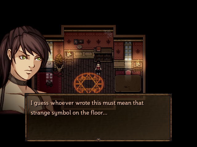
Trying again to make a Survival Horror Game, this time i'm making the graphics (well, if using HKCP templates and adapting textures/brushes is considered "making" :blank: )...


Status
Not open for further replies.

Thank you for viewing

HBGames is a leading amateur video game development forum and Discord server open to all ability levels. Feel free to have a nosey around!

Discord

Join our growing and active Discord server to discuss all aspects of game making in a relaxed environment. Join Us

Content

  • Our Games
  • Games in Development
  • Emoji by Twemoji.
    Top