
You are using an out of date browser. It may not display this or other websites correctly.
You should upgrade or use an alternative browser.
You should upgrade or use an alternative browser.
The Screenshot Thread
- Thread starter Ellie
- Start date
- Status
- Not open for further replies.
So, some strange error destroyed my last little fun project. Now I'm going to try and get a little serious about it - perhaps that will keep away the VX demons. Here's some exterior shots with some flashy tileset additions.


The game is going to be called Dark Justice, and I plan on releasing it in smaller episodic releases. I'll try and get a concept thread or something up soon.


The game is going to be called Dark Justice, and I plan on releasing it in smaller episodic releases. I'll try and get a concept thread or something up soon.
Twin Matrix
Member
Wow, that IS a great font. But it's not Windows standard, is it? In which case it's not a perfect option to use, in my opinion...
http://www.youtube.com/watch?v=f65GG09DoUQ
Is this kind of a battle background better? Or still too detailed?Juan J. Sánchez":vgf8sdoy said:The scrolling panorama might be unnecessary. A nice background image would do well instead.
http://www.youtube.com/watch?v=f65GG09DoUQ
Juan J. Sánchez
Sponsor
That is so much better.
StrawberrySmiles
Sponsor
So I decided to do a solo project in order to learn how to map, event, sprite, etc. You know, learn the ropes of RMXP better, so I can help out Star with my new skills on Ghost Shards.
I created a fairy village in the middle of a forest - but I feel it should be more... magical and prettier... It's missing something...

I created a fairy village in the middle of a forest - but I feel it should be more... magical and prettier... It's missing something...

Twin Matrix
Member
@Ares: Jep, perspectief klopt daar niet helemaal. x3 Maar dankje!
@Juan: Thanks! That's good to hear.
@Strawberry: Yes, it isn't that magical looking right now. You could add stuff like... little fences, a cart of food, some magical mushroom/stone looking circle, strange fantastical plants growing because of the fairy's presence, a pond, etc.
@Juan: Thanks! That's good to hear.
@Strawberry: Yes, it isn't that magical looking right now. You could add stuff like... little fences, a cart of food, some magical mushroom/stone looking circle, strange fantastical plants growing because of the fairy's presence, a pond, etc.
Today I went back to my old ray caster engine and re-created the code base and replaced the old floor code with the polygon code from battle world rpg, I then repaired a lot of the visual bugs and ported the code back over the battle world which fixed the swimming texture problem in the battle system.

The number at the top left is frame-rate, with the original flood-fill floor code the frame-rate was 50 fps at this exact same position, so there's a 5x improvement in speed.
In this engine it renders the floor based on what sectors are visible from the wall rendering code, these visible sectors are added into an array along with the player's sector and rendered before the next wall rendering, so there is 1 frame latency between the floor and wall sync, but at ~250 fps you will never notice it.
Unlike sprites, the flats (Floors and ceilings) can be rendered in any order.
I also removed the square root from the renderer, so that's only currently used for the input commands.
Finally, I took the system code from battle world RPG and applied it's timing functions to this, I added some mathematical stuff into it and then once again ported it back into battle world.
I may make this ray caster open source for the forums if enough people ask me for it.
rey meustrus
Sponsor
Nice. Any chance for some anistropic filtering on the floor and ceiling?
It's not done on the GPU, all software, so no chance at allrey meustrus":2k77noiw said:Nice. Any chance for some anistropic filtering on the floor and ceiling?
EDIT: Also, it's anti-aliasing you want to solve the scattered floor and ceiling pixels in the distant, anisotropic filtering solves a problem with mipmap levels as mipmapping only takes distance into account so is extremely visible when viewing a plane from a non-perpendicular angle.
rey meustrus
Sponsor
How about anything as simple as linear interpolation?
I could do but the processing cost makes the benefit worthless.
With my older engine the texture sample's X co-ordinate changed at various distances so I could make distant textures darker or blur them so they look interpolated, but because of the polygon flat rendering this is no longer possible for the floors and ceilings.
I'm also throwing around the idea of a horror FPS in a ray caster engine
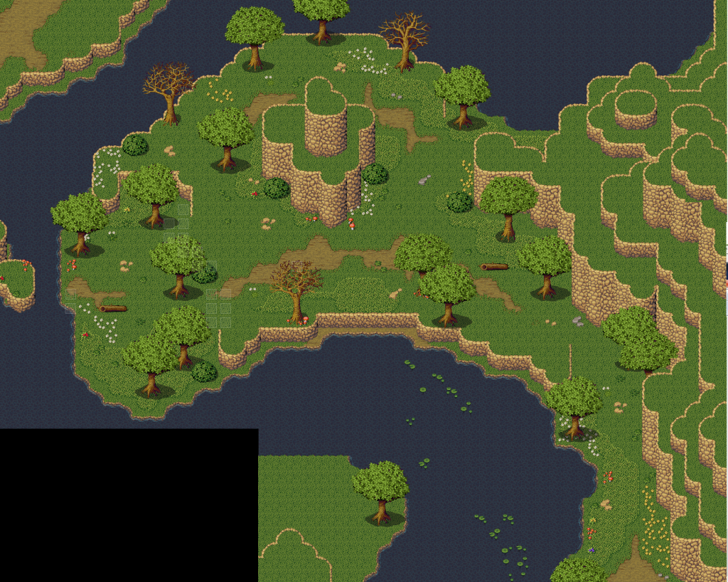
Okay it's a large picture this one, and if you follow the URL for it, you'll find a full-size version. Ignoring the cliffs and the parts that obviously haven't been done so well, does this look like a "not so often travelled River Pass". And most importantly, any tips or hints on the actual mapping itself.


Ah, perhaps my description wasn't very apt, I meant that whilst people do travel around here, it's not a very often used area. I have started putting in a few climbing plants on walls as you suggested, I want it to look pleasant however because there's two choices at this point, the River Pass (longer and peaceful) and an Ancient Battleground (shorter but more dangerous).
As for the rock formation in the middle, it's really just there to take up space.
As for the rock formation in the middle, it's really just there to take up space.
- Status
- Not open for further replies.
Thank you for viewing
HBGames is a leading amateur video game development forum and Discord server open to all ability levels. Feel free to have a nosey around!
Discord
Join our growing and active Discord server to discuss all aspects of game making in a relaxed environment.
Join Us