Envision, Create, Share

Welcome to HBGames, a leading amateur game development forum and Discord server. All are welcome, and amongst our ranks you will find experts in their field from all aspects of video game design and development.

The Screenshot Thread

Status
Not open for further replies.
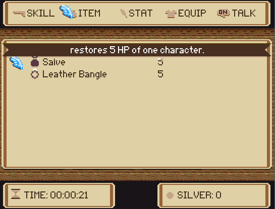
1.) it's odd that the cursor and the stats icon are the same
2.) the stats icon doesnt have the 1px shadow like the others
3.)Does the item description move with the cursor? Not sure I like it..
4.) the Time icon should go 1px down, and the silver icon 1px up

Other wise, as usual, everything fits! Good design choices on your part
 
Oh man, hahahaa! Is it just me or that skill icon looks like a penis? :P
Looks great. Strange that the wooden background fades gradually at the top, but not at the bottom...
 
I hate to point it out, but all I see next to skills:

derp1.png


Is this:

emot-dongs.gif
 
@action: I really like it, looks nice and simple :) However, what's that letter that's in the head of each of the face graphics? Is that supposed to be there?


This screenshot is a test of the Ragnarok Sprites I plan on using with the tactical battle system made by Gubid. This whole map is actually a Panorama (This is the first Panorama map I've ever done), it's a test of the new graphics I'm ripping from Ragnarok Online, so far I put in some textures, but I didn't put in any objects, so I used some RTP graphics for placeholders for now. I was also playing around with lighting. Obviously the map is not finished yet and this is only a test so far, but what do you guys think about the ripped textures and the Ragnarok sprites I'm using for the battle system?

 
@theScripter: Looks great, just I.. really dont like that font
also yeah the Names supposed to be there. Just not sure about how I want it lined up
 
Thanks! And you don't like the font? I actually thought it would fit perfectly lol, but I'll try to find a better one, is it just not readable or does look bad? And I wasn't talking about the names, I was talking the one letter above the names.
 
I agree about the font, I'm not really a fan... And on the status bars, the text is somewhat difficult to read.
It's weird that the squares are much smaller than the characters, but I guess that it can't be helped... :P
By the way, is it supposed to be that dark? o.o

And I wasn't talking about the names, I was talking the one letter above the names.
lol, that screen wasn't him, it was noise's :lol:
 
Man, it looks great, but you've got some problems with proportions. Just compare the bookcase size with the characters and you'll see. It's kind of weird, but it's not impossible to fix these little issues there.

I have an old school project here... every other day I make something, but not too much...
mapateste-162.png
 
@Scripter: One; too many people use cursive fonts in their game, because they think it looks good. And they do look good. Just not in a game. Possibly for a journal or a letter. But for message windows, you need something perfectly readable - preferably a sans-serif font like Arial (default). Two; That font. That specific font. Is the font everybody uses as a cursive font. I wouldnt say it's as infamous as Comic Sans, but I still wouldnt use it. If you really want to use a cursive font, check DaFont.com for something.

@megalukes: Your name sounds familiar.. On the map, it's really dark. Hard to see the characters. Brighten up the characters more, or at least contrast them a bit, if you want the map to be that dark. Also the tileset is really busy, which also attributes to the difficulty of distinguishing the characters :\ Frankly, I love the tileset and characters, great pixelling, just it's hard to see them.
 
@action: Thanks a bunch, I'll get to fixing that font ASAP, I really appreciate the criticism :)

@Megalukes: Yea, the bookshelf is just a placeholder has I haven't ripped and objects yet from Ragnarok. As for your map, it looks great! I like the Old School feel to it :D
 

SPN

Member

action":1bvtkz5a said:
thanks
also I cant seem to get the exp bar to align, might just use text instead

edit: I lied
menu3.png
I know that this is such a minor thing, but typically, the current number is the focus, not the total number. Keeping this in mind, would it make more sense if you bolded the first set of numbers instead?

HP: 80 / 100

As opposed to,

HP: 80 / 100
 
Here's a lot more done with the battle system, damage is incorporated into standard attack and recovery is added.

http://www.youtube.com/watch?v=LZ2x1ThS5gs

If you're interested in helping, please look at my signature.
 
@Xilef: It looks good so far, what sort of other features are you planning on adding?

Couple of some screens for some tilesets I'm working on for a project I have in mind (It's the one i mentioned in the concepts thread)
These are made up of about 75 perecent tiles I made, and also a bit of stuff I got from Pixel Art World:

29q1js1.png


70dton.png
 
dinnerordie17":2apjsmlh said:
@Xilef: It looks good so far, what sort of other features are you planning on adding?
I'm not going to throw in crazy stuff that you see in some RPG Maker games these days, so the battle system will be simple and not over-done with features. However there are 2 unique stats that effect what happens, 1 being the defence metre you see in the video (Violet bar), this replaces health and gradually regenerates, once defence hits zero or an attack does damage beyond defence hit-point take the punch.
Defence regenerates to 100% after battle, but hit points do not, this is to solve the issue of coming out of a series of hard battle, you hit the world map with a tiny bit of HP left then bam, a spoon attacks you and in 1 hit takes you all out.

The second stat I'll probably say when it's working fully, the idea is all damage is constant, so when your attack stat is 50 you can expect to deal 50 damage against an enemy when elements aren't involved, the second stat will vary the attack damage in a unique way.


I think you've overdone the bright lights, they seem too glowing.
Are they in the tileset or overlays?
 
@dinnerordie17: The tileset itself looks pretty good. But the lighting needs some work...
First of all, it looks pretty artificial, specially on the red carpet. The light shouldn't make it that pale. And there are several surfaces where the lighting is leaking where it shouldn't. The top screenshot is the biggest offender - the light is leaking on the chairs that are facing against it and should be dark. And to the right the lighting is leaking on the bars. The lack of shadows looks rather strange too. Another thing is that the lights coming from the windows to the left are smaller than the window to the right. And the bookcase should cast shadows.

@Xilef: I think the characters are moving slightly to the right after each attack. You might want to fix that.
Also, because there are no animations the movement looks very mechanic...
 
Status
Not open for further replies.

Thank you for viewing

HBGames is a leading amateur video game development forum and Discord server open to all ability levels. Feel free to have a nosey around!

Discord

Join our growing and active Discord server to discuss all aspects of game making in a relaxed environment. Join Us

Content

  • Our Games
  • Games in Development
  • Emoji by Twemoji.
    Top