Envision, Create, Share

Welcome to HBGames, a leading amateur game development forum and Discord server. All are welcome, and amongst our ranks you will find experts in their field from all aspects of video game design and development.

The Screenshot Thread

Status
Not open for further replies.
Thanks! :D I would, but I wanted to keep historical figures strictly as cameos, because I wanted to keep these non-human characters Alfred/Arthur/etc. as a "side story" to history.

And it would be pretty weird if Washington had an anime face haha. :barf:
 
messing around with a new style, thoughts?
a&d_screenshot1.png


also yeah the area surrounding the building on the right is bad I just haven't made any tiles to put there yet...
 
is that character supposed to be harry piotter? he looks like harry potter

as for the tiles i gues they're cool and i'm all for a limited palette but those specific values of gray really aren't jiving for me. i think that your darkest gray is a bit too close to the black and creates a sort of jarring effect rather than a smooth transition.

i really like that pipe thing on the side of the building though dude.
 

No ID

Sponsor

the horizontal street looks a bit to wide in comparison to the character sprite's size and the vertical street. Other then that it looks great.
 
http://www.youtube.com/watch?v=GpHFJbQ3FNg
Been working on the camera animations and I've added user input, the attack command happens instantly though so you don't see anything happen yet.
Enemy AI needs to be created still, also all the sprites are the same test sprite, I need a spriter!

And the test speed of the battle is painfully slow, I want to make battles much quicker, but the speed stat for all the characters is locked at the same value until I finish party databases.
 
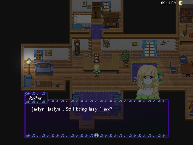
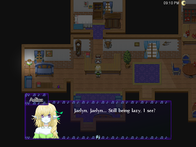
The only C&C I would be able to point out in regards to the portrait bust would be the brightness, though I assume that it's darker because it's adjusted with the day/night system that it looks like you've got in place.

It's hard to place those size busts, because your eyes start from the right, jump over to the name, then read left to right - if it's above the name then you're loosing some details because of the name box.
I guess the only advice I could give would be to grab some screens with it in various locations in and around the message box. Try to see which one suits constant text more, or even ask around here.
 
The windowskin works, but the notes by the name window bother me (they're rather clustered together). Also, this is more of a tileset issue, but why is there sunlight filtering in through the window at 9 PM? Most people are too lazy to fix it, I know, but it really makes setting so much nicer.

As for the portrait, I like the former better, although maybe you could modify it so it's brighter?
 
I just figured out what I could do to fix that problem! I could change the tileset so it only appears at certain times of the day.

I wonder if there's away to make two different windowskins for the dialogue. There should be. I'm going to check out the script.

I'm sure we'd make the former brighter, but I don't know how, since I don't handle that stuff.
 
Status
Not open for further replies.

Thank you for viewing

HBGames is a leading amateur video game development forum and Discord server open to all ability levels. Feel free to have a nosey around!

Discord

Join our growing and active Discord server to discuss all aspects of game making in a relaxed environment. Join Us

Content

  • Our Games
  • Games in Development
  • Emoji by Twemoji.
    Top