Envision, Create, Share

Welcome to HBGames, a leading amateur game development forum and Discord server. All are welcome, and amongst our ranks you will find experts in their field from all aspects of video game design and development.

The Screenshot Thread

Status
Not open for further replies.
I'm with Glitch on the default photoshop brushes screenshots. It's so damn glaring to me. I mean you could at least try to resize the leaves so they're life size more or SOMETHING. The one with the RO sprites... makes them look like little gnomes or fairy-sized or something. The one with the XP sprites looks like a blurred mess. Being "different" isn't always good. Yeah there's some people that think custom = automatically awesome.... but well it's not all the time. It's worth a shot to try it... and I think having a painted background is a nice idea but not with splashed about photoshop brushes.

@MigratoryEagle
Woo! Looking awesome!
 
-3-/Map
World
56fa53e173c932396804b80cea24c747f198a6e41660b46c656770cd6219e0ea5g.jpg

Town3
4313a2549d50b1ae135d1529244e003a9c7bd5ac23092deeba930f31e930ccc35g.jpg

Water Cave
24e3a07b55ee9b64bf3c33ba105bc27f2d4f04a81c19c74a243d1763e41f4a1b5g.jpg
Battle
15459409d62e9b88275b08c70e1aaaea9475b4f30a86ffc8d67473927e6919665g.jpg
 
Battle system gauges starting to be implemented.
battlebars.png

The timer is a visible circular gauge, all these characters have full timers though (They currently increase at the same rate as individual character stats are still WIP).

I had to be careful with developing the UI for the battle system, the original design was incredibly complicated with numbers displayed everywhere, 3 different gauge bars above every character and about 2 more with the active actor, removing the fatigue bar, the additional MP bars and the numbers over the timers made the UI less cluttered and easy to see, also the active actor arrow was originally going to be much large but the smaller bars seemed to work fine for the secret stat and HP so that got shrunk down to fit along side them.

Camera wouldn't be this far zoomed-out in a real battle.
 
hengmana":2cme2gu2 said:

Try to avoid that doing things like that circular area in the middle of the map. Not only does the set up on the land make very little sense (even as far as RPG world maps go), but areas like that scream, "THIS IS THE LAST AREA OF THE GAME," and are excessively cliche in 2-D RPGs.
 
Well, thanks for all the input on the forest cut scene, everybody. I've decided to scrap idea of using Photoshop to make backgrounds and then put the Ragnarok sprites on them, though. Originally I thought it was just a unique and cool idea, however, I never truly liked the looks, though I thought just for it being unique, it would be fine. Especially this:

Yeah there's some people that think custom = automatically awesome

Made me really think and stop for moment and realize that this wasn't worth it. Not only am making a bunch of pictures for each cut scene, the quality isn't even that good, and I don't have the amount of Photoshop experience to make something really good and worth the time. I'm simply going to try to find another way to make my cut scenes unique AND good in quality. Thanks for all the help though, guys :D


And for my new screenshot, I've decided to script all the major systems I'll need for my game before doing any major mapping or graphics type stuff. So here's the shop scene for my game. There will only be one shop, which is in the main city. First what I did was take a script called Final Fantasy Tactics Advance Shop System (by Mac), and then I edited it heavily to add the selectable window at the top to allow you to switch between different item types to buy. I also made it compatible with Charlie Fleed’s Skill Learning System that allows you to learn skills from equipment. Here is the screen:


Thoughts?
 
I think it looks nice, though the box over the selected item type icons at the top as an ugly innershadow, and would be better off as just a white frame or something. Also I think it's cool that weapons have different abilities for each class - that'll add alot more to the gameplay
 
Nice windowskin, Scripter. It's a tad more interesting than default, but the gold window doesn't quite match (perhaps change the color to the same green as the other windows?)


[flash=640,480]http://bb.ohsk.net/uploads/Ruined%20Library.swf[/flash]


(Excuse the flash-- you may need to rightclick -> Play/Loop. I tried to make a gif but quality was too terrible)

Here's a little thing showing off a feature I call (as of now) visualization. Examining certain artifacts in a room in Scavenger will allow you to walk around while imagining the past. While you may garner certain clues, however, beware obstacles and enemies in real life! You can easily fall into a hole or hit an impassable rock, all of which are invisible in the past.

Ruins1.png

Ruins2.png
 
regi":3p55sree said:
Nice windowskin, Scripter. It's a tad more interesting than default, but the gold window doesn't quite match (perhaps change the color to the same green as the other windows?)
That window-skin is based off of FFTA's UI, I know because I made a window-skin just like it :U

I think the gold does match.
 
Thanks for the input everyone!

@Action: The inner shadow on the box is due to the window skin I'm using. However, if it really does look that ugly, I put in a line of code that makes it so that only that selectable window uses the default window skin so that it has that white frame you were talking about. And thanks for the comment on different classes learning from the same weapon!

@Regi: Thanks for the comment! Actually it's not really a window skin and I'm still debating if I should make one like that. You see the base of the script came from here:

http://www.rmxpunlimited.net/resources/ ... hop-system

Mac (the author) made it so that you use different pictures to represent the background for the shop scene. It's not the actual window skin of the game, it's just a way to better replicate Final Fantasy Tactics Advance (Which is why the gold background is green). I can make it so that the shop scene uses the window skin I'm actually using in my game or I can make it like Final Fantasy Tactics. Which one would be the better choice?


@Xilef: Yeah, the shop screen's window skin is from FFTA which is why the gold window is green like you said.

@noise: I don't know why, but I really like those character sets, where did you get them from? The map though, looks pretty good, but could be filled up more. I don't know, as of now I feel like something's missing, but maybe I'm wrong lol Overall, good map :D
 
@noise
Ha cool to see you working on that again. d:eek:

@TheScripter
If you look closely the sprite Noise uses are really default with color and eye tweeks (mainly). It's a simple edit but makes them look really cool.
 
no those ones are original (the one facing up is an edit). the eight main playable characters get their own sprites

@TheScripter
If you look closely the sprite Noise uses are really default with color and eye tweeks (mainly). It's a simple edit but makes them look really cool.

yeah this is true for the NPCs but the characters that really matter get unique sprites, especially since im gonna have to make a bunch of extra poses for the battle system anyway
 
Regi: Nice idea. This sure adds more gameplay and can be used as a way to tell some stories from more than one point of view.

noise: I very like that RTP recoulor.
The map though, looks pretty good, but could be filled up more.
NO DON'T DO THAT. This map is good without tons of filler shit.
Windowskin doesn't really fit the rest. Maybe try adding some opacity.
BTW it reminds me "Blood Meridian" book by Cormac McCarthy. Does your game setting is placed in America durning Civil War?
 
@gubid: (Oh hey Gubid! It's me TheLaw from youtube lol) Yea, that skin is from Mac's FFT shop, he released pictures that we could use for the shop. I just edited Mac's script so that the selectable window could be at the top since I wanted it to really mimic FFTA's shop and I made it compatible with the Skill Learning System from Charlie Fleed.

@GameBoy: You're right, it doesn't really need any filler lol
 
@noise: Looks good. The colors are very consistent. It's good to have you back.

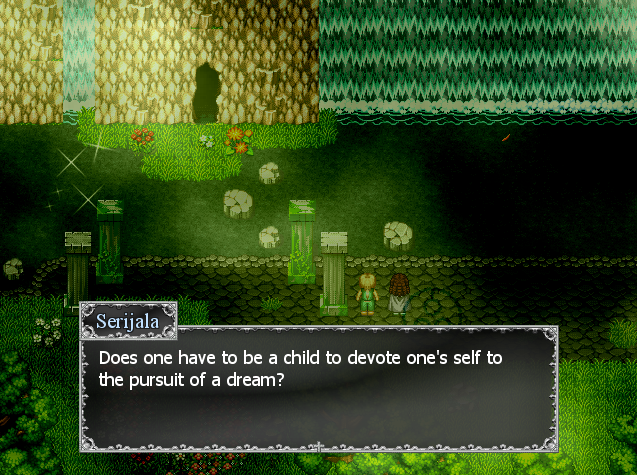
Here's one of my own. A brief cutscene from Vacant Sky Act III has been expanded into a playable segment which explores two of the party members' backstories.
cess03.png
 
@noise: The art looks pretty good, but I can't help but feel that the message box doesn't look right... I don't know why, maybe it's that there's a lot of blank space in it. :P

@Sailerius: Ehmm maybe the fog's a bit too heavy there... I had my monitor on a dark setting and it didn't look nicely. Increasing the monitor brightness helped a bit for me but still... Despite that, it looks great :wink:


Aaand I'm once again back to the RPG Making. :grin: It's been a while - three years!
I have a new project, but not much to show right now, as I've started working on this last friday. For now, pretty swords!
dreamproject2.png
 
@noise: The art looks pretty good, but I can't help but feel that the message box doesn't look right... I don't know why, maybe it's that there's a lot of blank space in it. :P

yeah message box is still default i haven't gotten into the system stuff yet. i was just showing off the tiles and sprites.

Sailerius bro that's pretty and all but i think that the overlay is a bit glaring. unless like it's animated or something in the game itself but be careful of falling into the LITING FX trap.

Legacycrono what is with the weird anime face thing in the background? i hope that's placeholder it looks a little weird not sure whats going on :crazy: :crazy:
 
Status
Not open for further replies.

Thank you for viewing

HBGames is a leading amateur video game development forum and Discord server open to all ability levels. Feel free to have a nosey around!

Discord

Join our growing and active Discord server to discuss all aspects of game making in a relaxed environment. Join Us

Content

  • Our Games
  • Games in Development
  • Emoji by Twemoji.
    Top