Envision, Create, Share

Welcome to HBGames, a leading amateur game development forum and Discord server. All are welcome, and amongst our ranks you will find experts in their field from all aspects of video game design and development.

The Screenshot Thread

Status
Not open for further replies.
Cait":2d17xzm9 said:
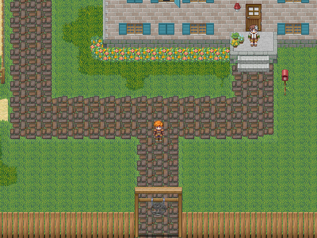
\(^_^) Hi! I got bored and decided to play around with some graphics. So here's a screenshot from me. o.o Not sure about the one window on the top with the shutter slightly open. .... The rest of them look pretty good to me, but that one, not sure about. Anyway, I know the left side is a bit open, but I haven't found the right trees to go there, or what to put there. I imagine this is a ranch, and I... don't or haven't EVER visited a ranch. @_@ no clue what to add, besides chicken houses and such.
Try making that shutter wider and make it slightly brighter than the closed shutters? See if that helps it.
 

Cait

Member

Thanks! That's what I was thinking, but since I'm not exactly confident yet. Now, if I can only learn to pixel grass that doesn't make me want to throw up...
 
@Cait: If you're looking for better grass, you can go for something like this:

shiwt":g5k9tszm said:
beztytuuuic.png

I thought that looked nice, despite the complete lack of explanation. It's basically just the tall grass tile turned a darker green with yet darker shadows, then used as the main grass tile and worked into autotiles. If you're trying to map an open field you could mix a nice grass tile like that with some dirt and mud, and with other kinds of grass. Not sure where you'd get other kinds of grass, though. If you want to be extra cool, you can put together an animated tile of grass swaying in the breeze, then copy it a couple of times with the animation starting on different frames, and paste those tiles together at random.

If there's lots of open space, be more conservative with the fences. Why should the yard be so small with all that open space nearby? I'd say a remote ranch shouldn't have any fence around the yard at all (but still consider the boundaries of the yard as opposed to the path to get to places). The yard could be more on the other side of the house so as not to be constrained by the path. Lastly, I think if this is a remote place, it probably shouldn't have street lamps and wide, clean paved paths.
 

Cait

Member

o.o That would sound cool, but alas, I'm horrible at animated stuff. T_T (*note to self- must study animation*) As for the road, I might create another tile, but I imagine that this is a successful ranch. Visitors and such, but something a little simpler in nature than that one. That tile was created and left there, as I was testing an autotile. Which I slightly also suck with alignment issues. Lucky, not so much with that one.

UPDATE: (#>.<) I need a simple tile for a road that WON'T end up looking best served in a city of some kind. I tried the white tile for the bridge and well, it looks nice, but doesn't exactly fit. Groan, I don't think I'm talented enough to make the tile I need, but that might be what I do. First I need a look, I want, so wish me luck on that one. Unless someone has a suggestion for a look?
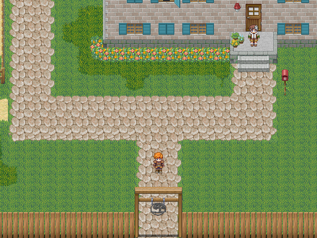
Found two tiles that might be simple enough to work as a ranch path, while not looking overly done.
Example1.png

or
Example2.png

I am not sure I did the grass right, so let me know what you guys think.
 
I'd suggest using a tile that's not so full. Pick something that looks like individual square stones with grass going through it or some similar cobble stone that has more breaks in it. If you don't want to make it look like a giant road you gotta pick out something that has more breaks and cracks in it as well as you could tile it one tile in width rather than three. Btw the grass looked better in the first screen imo... I always thought that tall grass tile was for out in the wild since by default it covers the sprite a bit.

The more saturated grass near the flowers looks kinda bad. You could just take the default and then slide color of the grass towards a bit of blue hue and then a tad darker but nothing really drastic. Grass that's lush has no yellow hue to it. If grass is yellow then its dying or cut short... like the top usual grass.

As for the picture with the open window. I like the idea but you might want to have it drop a shadow against the house because right not it looks pasted on there.
 
Good idea for the road tile, and it should probably be two wide instead of three heading to the corral. You might consider moving the gate so it's right in front of the door; that way you can have the three-wide road tile with a smaller road coming off the side without everything looking blocky or asymmetrical. If you need to draw your own road tile I'd start with the second one, it looks more natural and the colors match the rest of the map better. You could take some individual blades of grass from that grass tile and stick them in the cracks and on the edges so some blades of grass appear above the path.

Perhaps some areas should have the less detailed grass tile, like places that are well taken care of? That tile could be turned a slightly darker, less yellow shade of green as well. As long as the less tamed grass has enough randomness, even if it's just artful switching between the two different autotiles, the less detailed tile can make a noticeable, intentional contrast between kempt and unkempt.
 
Fancy sauce. Although for some reason I feel like the perspective is off a bit. It seems like the ground doesn't match with the objects. I feel like the ground might be dead on top down. But I'm really not sure how to fix it. Maybe try squishing the ground circles to more of an oval shape because if they're circles on the ground looking at that angel they'd be more obscure.... idk
 
I have to agree with Raven. The floor doesn't match the perspective of the objects. The fountain in the middle looks great, but looks odd because of that ground. Also, why are the lights different colors as well? It would seem that the pedestal where they are being held is also kinda off in that same perspective issue. Outside of that, I think it looks awesome.
 
I reluctantly agree about the perspective. I've been analyzing the 3/4 perspective used by 2D RPGs, and it seems to me that every tile isn't really square but should be drawn so that if a square if 1:1, the tile is 1:1.41. The reason the ground looks off by the perspective is because the ground tiles are perfectly square. The well-drawn circular patterns should instead be ellipses that are about 7/10 as tall as they are wide.
 
Anak.png


might be a bit off cause i had to print screen twice and cut/paste them together, but it's the general layout of the world i'm planning. Obviously, I still need to make it organic and stuff, and there's gonna be a whole bunch of misc, but how about it?
 
@Daxis: Not bad for a general layout, however do you already have in mind any environmental changes to the look? Like ice caps in the north or something?


Screens of my new Recruitment and Relationship System:

rrs1.png


rrs2.png


rrs3.png
 
@SPN: Thanks! However, where does it say "apart" I think I'm blind or something because I looked through those screen like ten times and I didn't see apart :huh:

@Juan: Looks a lot better! Did you already rip a lot of the other sprites you'll be using to map from Ragnarok?

EDIT: Never mind I'm an idiot lol, I see it now, but those were just test answers that I randomly put, so they were bound to have mistakes lol :D
 
"Of course they don't, we're apart of the Fourth Sect."

It's also a comma splice, there should be a semicolon or period/exclamation point instead.
It's also a comma splice; there should be a semicolon or period/exclamation point instead.
It's also a comma splice! There should be a semicolon or period/exclamation point instead.


The perspective makes that map look fake 3D. Not that that's a bad thing, but if you want it to look more like "normal" RPG's I guess you'd have to ignore perspective and draw the buildings from the front instead of from 3/4.
 
TheScripter":z1m39p7u said:
@Juan: Looks a lot better! Did you already rip a lot of the other sprites you'll be using to map from Ragnarok?

Thanks. I'll be ripping 99% of my sprites from RO. I'm actually drawing the maps in a 3D editor, and afterwards making them 2D using Adobe Fireworks. So, sprites ripping goes on a case by case basis: one lamp post, one chair, one wall, etc.

rey meustrus":z1m39p7u said:
The perspective makes that map look fake 3D. Not that that's a bad thing, but if you want it to look more like "normal" RPG's I guess you'd have to ignore perspective and draw the buildings from the front instead of from 3/4.

I'm going for the pseudo-3D style, as it fits more my RO ripped characters, and it compliments my movement system.
 
Status
Not open for further replies.

Thank you for viewing

HBGames is a leading amateur video game development forum and Discord server open to all ability levels. Feel free to have a nosey around!

Discord

Join our growing and active Discord server to discuss all aspects of game making in a relaxed environment. Join Us

Content

  • Our Games
  • Games in Development
  • Emoji by Twemoji.
    Top