
You are using an out of date browser. It may not display this or other websites correctly.
You should upgrade or use an alternative browser.
You should upgrade or use an alternative browser.
The Screenshot Thread
- Thread starter Ellie
- Start date
- Status
- Not open for further replies.
I've been playing around with the desert tiles and trying to get something that resembles what a desert town should look like. It's one of my best map, and I know that there might be a place or two that could have more. But it lacks people and things, so that would take up space. Anyway, it's a rather large image as it is the market place section of town! (-._.-) (^_^) Anyway, I've mixed some Mack's tilesets in there and I might have to color the trees as they kind of stick out. However, as good as I am or am getting at dealing with graphics, a massive change like the palm trees is not something I can do...


I made a script ages ago that would render a base for isometric maps for you so that you didnt have to spend a ton of time drawing maps by hand. Also, in case you are wondering, I used this picture to get a good base out of that script rather than the one that comes with it.

I use this base, then draw on top of it to ensure that I have tiling correct. I then skin it with the actual map. The only thing that original script didnt do was automatically make it a tileset for you. It was originally planned but I think it is best to draw it first, then process it into a tileset later. That or just use it as a parallax map rather.
And yeah, go for it.
MagitekElite
Member
@Perihelion:
That is amazing. I like how it looks like the water, as pointed out, is going both in and out. The style reminds me of Chrono Trigger, which is awesome xD
*I can't wait for a release. The game looks amazing. :33*
@Cait:
I like your desert map, it looks really good. I think the square water is a bit distracting? Or maybe that's not the right word... Hmm, either way I think its great lol
@Gubid:
Those look great, Gubid! :33 I really like the desert-plain map (the last one). Reminds me of something...but what? :hmm:
Thanks!
I do a draft design on paper first for general layout. I then draw a map using my draw iso frame script (Linked in my last reply) to give me a base png to start with. I then go back and layer it with my desired look etc for buildings etc. I have about 5 different pallets for things that I make, but they get a little mixed and matched.
Is it the proper way to make tilesets? That answer is probably no. My 'tiles' are not tiles but panorama's or parallax's. Hence they are not fine tuned to stay in their cell etc. All my "tilesets" are effectively painted over a base.
Something I've been working on that is really going to speed up Vengeance development. Just a shame players won't even know it exists, haha. Only I ever see this screen!

All conversations are modular. Imagine it like this.
Message 1
Message 2
Message 3 - only show if switch 9 is on
Message 4
Message 5 - only show if switch 9 is off and item 4 is held
Message 6 - only show if switch 9 is off and switch 10 is on
Message 7

All conversations are modular. Imagine it like this.
Message 1
Message 2
Message 3 - only show if switch 9 is on
Message 4
Message 5 - only show if switch 9 is off and item 4 is held
Message 6 - only show if switch 9 is off and switch 10 is on
Message 7
Pokémaniac
Awesome Bro
Pokémaniac
Awesome Bro
@Prexus- Yeah, it was a pretty random screen to put up. :P I'm gonna be changing some stuff involving text colours, so I'll change the highlighting for the character names to something different to the main text. Thanks for the suggestion!
@Gubid- Thanks! That's kind of where I think my mapping's at, haha. I'm not a fan of VX's mapping, but it doesn't matter too much for inside areas.
@Gubid- Thanks! That's kind of where I think my mapping's at, haha. I'm not a fan of VX's mapping, but it doesn't matter too much for inside areas.
Looks good to me. I can't help but think the images aren't contrasted enough, when compared with the backdrop.
- - -
Positioning for the skills and items. Items are currently working. Unfortunately the scrollbar sticks out like a sore thumb; there's little I can do about that.
Before:

After:

- - -
Positioning for the skills and items. Items are currently working. Unfortunately the scrollbar sticks out like a sore thumb; there's little I can do about that.
Before:

After:

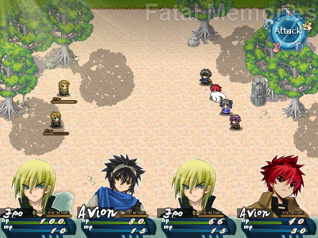
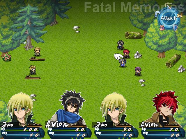
Do you have any backdrops for the battles or are you keeping them plain?
Seeing as I spent money on the license I'd really like to use RMXP graphics. I know people will scream and moan at that prospect, but they look so good in this context:

- Status
- Not open for further replies.
Thank you for viewing
HBGames is a leading amateur video game development forum and Discord server open to all ability levels. Feel free to have a nosey around!
Discord
Join our growing and active Discord server to discuss all aspects of game making in a relaxed environment.
Join Us


