
You are using an out of date browser. It may not display this or other websites correctly.
You should upgrade or use an alternative browser.
You should upgrade or use an alternative browser.
The Screenshot Thread
- Thread starter Ellie
- Start date
- Status
- Not open for further replies.
Kingdom Ablaze
Sponsor
mouse":31jz7nvb said:I made a round minimap once by just having a very chunky border. The actual minimap was square just partially hidden by the border. :x
lol i used a alpha mask, and even after optimization i was losing 5-10 frames
Ace of Spades
Member
Wow, they do look extremely similar. My HUD was scripted by PandoraShock, courtesy of the request thread: viewtopic.php?f=11&t=71209
I only made minor changes to the script, mostly cosmetic. The window skins we are using are also identical. Anyways, Mark I think the battlesystem looks awesome. My only suggestions though would be to either change the battle background, or change the character placement so they aren't standing on the side of a tree.
I only made minor changes to the script, mostly cosmetic. The window skins we are using are also identical. Anyways, Mark I think the battlesystem looks awesome. My only suggestions though would be to either change the battle background, or change the character placement so they aren't standing on the side of a tree.
I've made it with Wazakindjes, something like a friend or whatever.. x'D Maybe I'll change the windowskin.. =\Ace of Spades":2n3dbpr6 said:Wow, they do look extremely similar. My HUD was scripted by PandoraShock, courtesy of the request thread: viewtopic.php?f=11&t=71209
I only made minor changes to the script, mostly cosmetic. The window skins we are using are also identical.
In the end, I don't wanne use RTP backgrounds, so, it will be changed! :DAce of Spades":2n3dbpr6 said:Wow, they do look extremely similar. My HUD was scripted by PandoraShock, courtesy of the request thread: viewtopic.php?f=11&t=71209
IAnyways, Mark I think the battlesystem looks awesome. My only suggestions though would be to either change the battle background, or change the character placement so they aren't standing on the side of a tree.
Choose me!? :biggrin:mouse (ipod)":2n3dbpr6 said:They both look nice, ace of spades and Mark... But who came first :p
Wow, that's a cool looking system there, Ace! Musta been hellish to script. If I were to be really pedantic I'd say that the mapping in some of the screenshots you posted could be better, but they're eclipsed by that script. Looks like it doesn't have the problems Zelda had, either, where enemies would come at you at a weird 45 degree angle and get right through your defenses.
Quite an impressive ABS, Ace. I'm mighty curious, what scripts did you use, or did you code the entire thing from scratch? A tiny suggestion is to lose the animations (hit and shield), or at least make them smaller; imo, they're a bit distracting. Personally, I use a simple red flash and knockback to denote damage, but it's up to you.
regi":1cjpyjed said:I don't mean him swinging the sword, if that's what you mean; that's a pretty nice touch. I just don't like seeing a huge RTP Attack-012 blow inflicted by a tiny bee. At the very least, resize it please?
Ah sorry, I thought that's what you meant by it, I didn't actually recognise the animations in there, just the character animation, lol.
Ace of Spades
Member
Thank you everyone for the comments.
Pixelmovement script - f0tz!baerchen
Input Script - poccil
Event Spawner - SephirothSpawn
Universal Message System - Ccoa
The ABS itself was built by myself from the ground up to work with pixelmovement. It's surprisingly mostly events, with script snippets to make certain things easier. I find events just as powerful as scripts when used correctly, and they're far easier for me to work with, seeing as how I have limited scripting knowledge.
I made the animation for being hit smaller, but I personally don't find the other battle animations too large and distracting. It adds a sense of impact when you hit an enemy, and each weapon has its own hit animation. Plus, each enemy also has different animations as well; the bees will sting you, the fungus attacks with poison dust, and the snakes burrow in and out of the ground and bite you. I think it looks nicer in game than it does in video.
True, the scripts in the screenshots aren't the most scenic locations, but overall I believe my mapping and level design are above the par. The locations are large enough to reward players for a little extra exploration, but small and unique enough that hopefully the player won't lose track of where they're going.Wow, that's a cool looking system there, Ace! Musta been hellish to script. If I were to be really pedantic I'd say that the mapping in some of the screenshots you posted could be better, but they're eclipsed by that script. Looks like it doesn't have the problems Zelda had, either, where enemies would come at you at a weird 45 degree angle and get right through your defenses.
Thanks for asking. Here's a list of scripts seen:Quite an impressive ABS, Ace. I'm mighty curious, what scripts did you use, or did you code the entire thing from scratch? A tiny suggestion is to lose the animations (hit and shield), or at least make them smaller; imo, they're a bit distracting. Personally, I use a simple red flash and knockback to denote damage, but it's up to you.
Pixelmovement script - f0tz!baerchen
Input Script - poccil
Event Spawner - SephirothSpawn
Universal Message System - Ccoa
The ABS itself was built by myself from the ground up to work with pixelmovement. It's surprisingly mostly events, with script snippets to make certain things easier. I find events just as powerful as scripts when used correctly, and they're far easier for me to work with, seeing as how I have limited scripting knowledge.
I made the animation for being hit smaller, but I personally don't find the other battle animations too large and distracting. It adds a sense of impact when you hit an enemy, and each weapon has its own hit animation. Plus, each enemy also has different animations as well; the bees will sting you, the fungus attacks with poison dust, and the snakes burrow in and out of the ground and bite you. I think it looks nicer in game than it does in video.
Juan J. Sánchez
Sponsor
You know, there is only one little thing that bothers me: there is no fall back. When one receives a hit in Zelda, for a means of comparison, you get thrown back a bit. This also happens when enemies get hit. I guess this is somewhat of an optional feature, but I think it adds a special something to game physics, which shouldn't be too hard to accomplish in a pixel-based engine like yours.
hope there's no image file size limit lol

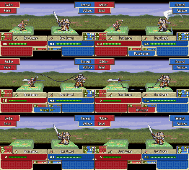
Finally got around to making a script that did screencaps of 7x since switching to RGSS2 made it easy, so I made a Fireworks script to let me load animations frames/delays based on text files. Recording, loading, and exporting this took maybe 5 minutesafter doing the programming took all day
so here have just under 1000 frames of giant animation

Finally got around to making a script that did screencaps of 7x since switching to RGSS2 made it easy, so I made a Fireworks script to let me load animations frames/delays based on text files. Recording, loading, and exporting this took maybe 5 minutes
so here have just under 1000 frames of giant animation
dude
that looks beautiful
like effing beautiful.
hell you took the freaking FE system and actually upped it a notch :x
i'm pretty sure you've still go to add faces at those two blank areas, though.
unfortunately i never played any FEs beyond gba and ds, so i unfortunately don't know too much about astra and luna, but it seems cool you were able to implement those
btw halberdier is the promote of a soldier, right?
It's been this pretty for several months now go play the demo, but now I can make gifs out of it easily. For example:

Also shows why Generals needed a new sword/attack instead of reusing the FE8 one, you can't throw that one.
Yeah faces are still missing, more will be in the next demo. .-'
Astra is 5 attacks with halved damage, Luna is double weapon mgt and half enemy def. Actually changing the numbers on the HUD helps a ton in that regard I think. ' ^'
And yeah Soldier => Halb
Juan J. Sánchez
Sponsor
So I finally finished the main menu. Everything acts exactly like in the real game. You might have noticed that the health points and magic points have gradients. I still have to add the party member flags, but this goes hand-in-hand with the Party Change screen, so that will have to wait. Finally, I'm working on a disable menu item option. Nothing fancy.

I've embedded a You Tube video for comparison.
http://www.youtube.com/watch?v=6id6s2_YAZU

I've embedded a You Tube video for comparison.
http://www.youtube.com/watch?v=6id6s2_YAZU
Ace of Spades
Member


Alright, done with the screenshots for right now. Just got a thread up for Odyssey, had to generate some buzz. Come check it out if you're interested.
Zankoku no Yami
Member
Ace of Spades":va6zmg2g said:

Alright, done with the screenshots for right now. Just got a thread up for Odyssey, had to generate some buzz. Come check it out if you're interested.
For some reason I cannot view any of your images... in this post or in your thread... I get that randomly... tried both internet explorer and firefox. For me, it just says "image" and nothing more. I get this at times; why is that? It seems to only happen on this site too. Drives me nuts when I can't view things, haha.
- Status
- Not open for further replies.
Thank you for viewing
HBGames is a leading amateur video game development forum and Discord server open to all ability levels. Feel free to have a nosey around!
Discord
Join our growing and active Discord server to discuss all aspects of game making in a relaxed environment.
Join Us