
You are using an out of date browser. It may not display this or other websites correctly.
You should upgrade or use an alternative browser.
You should upgrade or use an alternative browser.
The Screenshot Thread
- Thread starter Ellie
- Start date
- Status
- Not open for further replies.
So as you can tell already, just the plain boring menu with six characters, and a location bar (It's commonly requested, so I thought I'd throw it in), I've removed the steps since I personally think it's pointless, but meh, to each their own. You'll also notice a new tab on the list called "Statistics", you'll see what that is in this next screenshot.
This is basically taken from the Grand Theft Auto games, well, that's my "inspiration", you can put anything down here you like, and track it with a variable, I just did three as an example, the only problem I'm having is getting this to work with random encounters, because as it's set up right now, I've just been trying it on evented battles... but yeah.
This is a six man battlesystem, obviously it's just the default, but meh... I'm also working on putting the command box (The one with Attack Item Magic etc.) horizonally, but can't figure it out just yet (It's not in this screenshot anyway)... you'll also notice in the battle screenshot all the people in the background, I've removed the battleback so you can see the map in the background, it updates every frame so everyone continues moving and doing what they're doing, instead of freezing in position until the battle is over.
PS. Yep I renamed the game midway through to CoG, although I generally keep them untitled... I don't know what CoG means, probably because one of the maps has a big cog in it?
Edit: Uploaded this YouTube video too if anyone would like to see the battle background feature I was talking about... and the cog that isn't even being put anywhere in the game, just plopped it there because I could:
Ace of Spades
Member
Trying out some different eye-candy as I get closer to finishing a beta.

Very subtle sunlight shining through clouds that are lazily drifting by. The sunlight also very slowly and subtly animates, giving it a more lifelike look. My approach is less is more; I didn't want godly rays of light piercing the sky like I often see in RMXP games. Also note, I don't think bees like fire very much.

This is harder to see, but leaves are blowing through the forest now, giving the area more life and personality. And for those of you wondering what the blackness is around the spore, it's using a poisonous dust attack.
Check out my thread for more information.

Very subtle sunlight shining through clouds that are lazily drifting by. The sunlight also very slowly and subtly animates, giving it a more lifelike look. My approach is less is more; I didn't want godly rays of light piercing the sky like I often see in RMXP games. Also note, I don't think bees like fire very much.

This is harder to see, but leaves are blowing through the forest now, giving the area more life and personality. And for those of you wondering what the blackness is around the spore, it's using a poisonous dust attack.
Check out my thread for more information.
felipe_9595
Member
Hey guys, what do you think about this screens??? they are from my fangame, Resident Evil: After History


OrigamiRose
Member
LaDestitute
Member
The most recent work from my game, the Chao Stadium Cave and the Chao Karate Area. Chao Stadium Cave is based off of how it looked in SA2B, and the Chao Karate Area is original.


Ace of Spades
Member
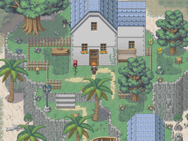
Very nice mapping Mark. Some of the finest examples of mapping available, good job. The mines are nicely detailed, and the house interior is one of the best I've seen; it actually looks lived in! My biggest complaint would be in the house exterior, with the section of the front of the house that's jutting out further than the rest. I see what you were going for, but the perspective looks a little off to me, and personally I think it'd look better if it had a foundation on the ground like the rest of the house. Also, divert your eyes a couple tiles left of that point, you'll see a shadow above the rounded tree closest to the house. That's just nitpicking though, overall great job.
I know this is nothing special but it just took HOURS to make because of cross-browser problems.
Space on the right reserved for an image.

www.vengeance-rpg.com/v/
Space on the right reserved for an image.

www.vengeance-rpg.com/v/
Ace of Spades
Member
The RTP don't really go too well with your custom graphics. The cave map in general looks extremely incomplete. Also, I'm not sure if the cave is supposed to be man-made, but if you want it to be natural try making it look that way. You wouldn't find a natural cave with perfectly boxed rooms like that in real life. However, I do like the lighting effects you pulled off, especially with the light sunbeam coming through the ceiling. Also the shuttle you made is awesome. Do you ever see the exterior when you're outside the ship, or does it only the show the interior?
That's just something I'm going to have to live with. We've tried making natural graphics (such as rock walls, grass, etc...) and they stand out even more than the RTP does. At least the lighting/shading will bring things together a bit. If you know of any natural tilesets that would go better with our custom tiles, let me know, or if you know anyone who is good at making custom natural tilesets.The RTP don't really go too well with your custom graphics.
As for the shuttle, thank you.

OrigamiRose
Member
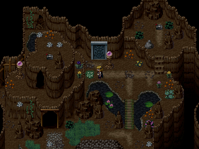
New screenshot from me:


gosh shadow you are one of my favorite mappers ever I learned so much from you
but im not digging the map
One thing I notice straight off the bat are the plants. Why are there plants in a non-lit cave?
I think the map is super busy to be quite honest with you. I mean you have like ten different types of flowers and plants going on an every single color on the map in the map.
The dirt path is super straight
and make sure not to clump the same object together like those silver crystals. You either want to vary them up of just put one in.
also if its a cave no matter man made or not using stairs isnt such a swell idea unless they are stone stairs because then it looks man-made. Pillar and cave stairs make no sense x:
OrigamiRose
Member
@Macon: There's a reason why flower grows there. They are growing because of the magic that's flows in the cave. Maybe I should have wrote that when I posted it :P
And about the stairs, Im using those because they came with the tileset. I haven't planned to use any others, but you point makes sence to me, so I might edit the tileset later.
And about the stairs, Im using those because they came with the tileset. I haven't planned to use any others, but you point makes sence to me, so I might edit the tileset later.
well at least there is an explanation so thats perfectly fine and dandy
I still think its like super busy i think it would be better if instead you took one or two colors and edit the flowers out. I mean a dark red reminds someone of blood and maybe menace while a blue can represent sadness. I mean i always use color to depict what kind of emotion i want someone to feel. But this is how i map everyone is different. Also the clump of stuff i mean all you need to do is just edit it a little bit and tweak it. Even tweaking if position a little bit totally removes the blockiness.
And with the stairs, I would just use a ramp or even just the man made stairs.
Im sorry if Im sounding pretentious oh dear x:
- Status
- Not open for further replies.
Thank you for viewing
HBGames is a leading amateur video game development forum and Discord server open to all ability levels. Feel free to have a nosey around!
Discord
Join our growing and active Discord server to discuss all aspects of game making in a relaxed environment.
Join Us


