Envision, Create, Share

Welcome to HBGames, a leading amateur game development forum and Discord server. All are welcome, and amongst our ranks you will find experts in their field from all aspects of video game design and development.

The Screenshot Thread

Status
Not open for further replies.
That's okey :)

I did some changes though:
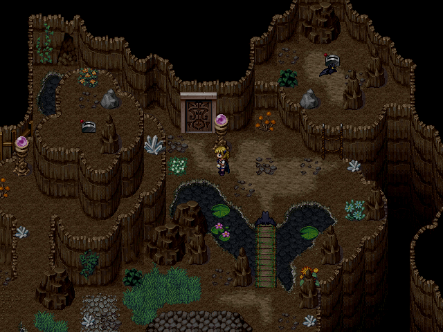
dfgdf-9.png


I tried to decrease the amount of plants to the map, and also edited other stuff.
 
yeah man that looks a lot better in my opinion its a lot more cohesive and stuff

even the colors are there and stuff

I mean there are a few places where there is some clumping but some people like that and other people dont

I think its a swell map and it definitely improved by a lot c:
 
@The_Shadow:
Even on second screen you have too many small things which look like randomly added.
They also didn't fit with walls and floor. Try desaturate them.

The dirt path is super straight
I must do a facepalm here. <facepalm>
Go outside and look at the road. See? It's straight. People always tends to make the path as straight as it's possible.
 
@shadow: that looks a LOT better.

I think the problem with RTP flowers isn't necessarily that they don't fit a cave; it's that they are designed in 32x32 squares only so when put next to each other in heavy saturation, they don't fit nicely and you can tell they tile and whatnot. As there aren't as many in the new screenshot it works - you can still notice the flowers but they fit because they are in clumps of one or two.

If you did want to go with a FLOWERS EVERYWHERE! approach, then the RTP flowers won't do unless you edit them to be closer together and arranged less in square formations. There used to be a nice tileset addon that did this, back in like 2007, but the author threw a tantrum and removed them if I remember correctly.
 

moxie

Sponsor

GameBoy":4ux2iw3s said:
I must do a facepalm here. <facepalm>
Go outside and look at the road. See? It's straight. People always tends to make the path as straight as it's possible.

the problem with the path being super straight isn't "realism", it more or less just looks unappealing to the eye when it's tiled up
 
RTP paths don't work because while they might be straight, they aren't the sort of "naturally walking" straight. A natural walker wouldn't do those 90 degree turns onto the path; it would be straight diagonally from the stairs to the other bit.
 
Good you simplify the registration method. But... the old layout was really cool, you could've just let it be.
---------------------------------------------------------

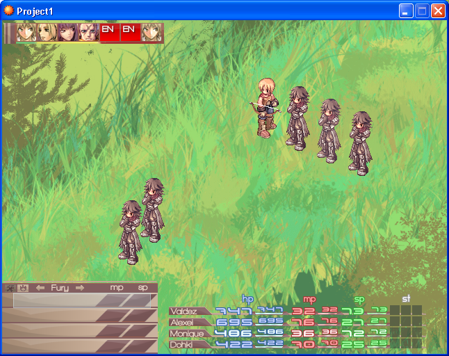
Anyways, everything on the screen is functional. I just didn't set the battle chars yet. =P

screen1-1.png
 
That looks really nice, Leonardo. Nonetheless, I'm not a fan of the background image. It doesn't really accentuate the battle. Is it a turn based battle system like Final Fantasy X. It thoroughly reminds of Charlie Fleed's amazing battle system.
 
Charlie's was the great inspiration and knowledge source.

Nevertheless, all that systems are being made out of nothing(out of the standard Scene Battles, actually). Not that Charlie's code wasn't good. It just was too many data, info and threads for me to edit; I wouldn't be able to turn that it something exactly as I want it to be.


I shall change the background, also. I just quickly made that on Photoshop cause I coudn't find any other one that had the diagonal perspective I wished.
 
I took some advice from a few friends over at another forum about editing and adding to tilesets. So I could have slightly different trees. They even told me about "clustering". Which is -- if you guys don't know but you probably do :P -- editing the tileset in a graphics program to create a tile of grouped trees, or flowers or anything. This is what I have so far:

2rqmwqt.jpg

*The piece stretching to the top left corner doesn't belong to me, but the rest does. I was wondering what you guys thought. I'm still experimenting with how to work the shadows and stuff, but just wanted to post to get some feedbackxD*
 
The edits are nice, but make sure not to make it too cluttered! Parts of the map look really busy in comparison to the rest, but I'm assuming you'll fill those in. My suggestion is to make some unique tree clusters, but that don't have too many unique flowers and bushes; that way, you can reuse them without it looking unnatural.
 
Yea, I was just testing the clusters to look for errors. :P

My suggestion is to make some unique tree clusters, but that don't have too many unique flowers and bushes; that way, you can reuse them without it looking unnatural.
Oh let me check if I fully understand; do you mean just bear tree clusters, right? :smile:
 
Just remember that mapping is also what colors you use and how cohesively you use them. If you have a bunch of different color palettes your map looks really busy and not cohesive. Try to stick to a few color palettes to create a mood. I mean if you have light blues and purples it can convey sadness while yellow can mean a journey beginning.
 
Basically what bmacon said :)

As long as you don't have a random bright purple plant sticking out in a patch of dark green trees, it shouldn't be too noticeable when you start looping them together.
 
Ah, okay. I'll keep that in mind when I start to make more tomorrow! Thanks for the help Macon and Regi! :)

Is there anything wrong with the last clusters? I saved a GIMP file to edit, so if there are any, I can remove the flowers :P
 
They're not too bad, though the middle one is a tad busy (maybe take out one of the fallen logs?) Just make sure to use them sparingly, not too close together.
 
Status
Not open for further replies.

Thank you for viewing

HBGames is a leading amateur video game development forum and Discord server open to all ability levels. Feel free to have a nosey around!

Discord

Join our growing and active Discord server to discuss all aspects of game making in a relaxed environment. Join Us

Content

  • Our Games
  • Games in Development
  • Emoji by Twemoji.
    Top