Envision, Create, Share

Welcome to HBGames, a leading amateur game development forum and Discord server. All are welcome, and amongst our ranks you will find experts in their field from all aspects of video game design and development.

The Screenshot Thread

Status
Not open for further replies.

fbu

Member

Nice, reminds me a lot of FF. I think it's perfect, at least, I wouldn't change nothing. Oh, maybe I would, hey, you buy skills with money in that game? Cause if you do, I would add a small box with the money of the hero on the corner of the screen.

Very nice. ^^

---

So, this is a screenshot of my game, Infected. It's a intro scene, wich takes place in St. Louis, USA, 1980.
Hope you like it.

tumblr_le5joxooxb1qdcakxo1_1280.png
 
The house doors seem to be a little lower than the house itself, and the lamp/sign shadows are a little off (I would imagine them very small if the light source is coming from directly above it).

I also think the perspective on the police car is off (seems almost like a sideview than from bird's-eye view) but that might be me. Otherwise, rest of the tiles and atmosphere look pretty solid, good job!
 
The doors are protruding. It should be the opposite way around. They should actually be a little bit inside the building, or at the same level as the walls. Otherwise, I really like the lighting effects.
 
@fbu
The structure is great. But I see a little problem with the different graphics your're using. It'd be great do change their palletes to make them fit smoothly.

I can say the shadows there in the lamp posts are a little bigger than they should. The inclination is ok, but the shadow can't be seen like the screen using the rpg maker perspective, they need to be smaller.

Well, just a random screen, testing night effects or something.
don__t_bother_the_soldiers____by_megalukes-d35xcn3.png
 
^Very Nice^ It makes me want to work on my traditional rpg game again.

This topic seems to be lively so why not?

Screenie18.png


From my game, SMRPG: Starlite Worlds
Mushroom Plains. When you walk in the spore grass stuff, those little particles fly around. It's the particle script. The map isn't done yet but whatever.

Tell me what you think.
 
I dont know if you saved it as a jpg or if the sprites are just blurry but, well, its blurry. Not only that, some of the stuff is really jagged.

The aqua patch of dirt looks wierd, it seem as if it is sticking up from the ground. I think the grass is supposed to be above it, not the other way around.

The flowers are very monotonous, change them up in terms of sprites.

Marios feet and the shadow block have that weird long grass look. It looks really odd seeing marios legs cut off. I would just dump it all together.

I appreciate the cool fangame ideas and I dont want to sound rude but you need to put more time in your graphics. Dont just rip, rip and edit. Make them better than the original. The whole point of a fangame is to improve the original product. Ther is so much more you can do. For example, why dont you make it so that the mushrooms look attached to the ground. You could add long grass around them or something.
 
screenshot006field01.png

A map done by Mark1707. Just testing out the font, original sprites, and animated faces.

screenshot007opening.png

Just the next direction I am taking the 'opening' sequence. Will be using battlers since they are the most animated; as they are finished, naturally.
 
It's looking great Zankoku. The only thing that i can think about is the font: It's not bad, but because rpg's have a lot of text in them, it's important that the font is easily readable. this font might be just a little bit too... "creative" ;)
 
gRaViJa":1hx3vpi5 said:
It's looking great Zankoku. The only thing that i can think about is the font: It's not bad, but because rpg's have a lot of text in them, it's important that the font is easily readable. this font might be just a little bit too... "creative" ;)

I was thinking about that too, myself. But luckily, the player has the chance to change the font to one of a number of different fonts. Just have to go to options in the menu. I just happen to love how the font looks. So that is why I made it the main font; but I know what you mean, and if the player feels the same way, they have a number of fonts to choose from at any time~
 
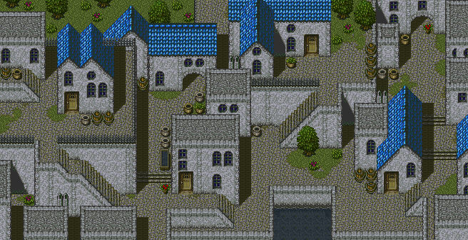
Awesome! It looks like a real town I could step into (in comparison to the normal, one level towns with houses linearly placed)
Great job
 
Feldschlacht IV":88x0i6eg said:
Hey dudes. This isn't quite finished, but here's what I have.

Map0004.png


That's beautiful. A+. Cannot wait to see the finished map :)

I've updated my interior of Sam's house for my game, Samuel. Figured out how to get walls and such :)

nytfv6.png


s4m0w8.png


im72qe.png


C&C would be nice.
 
@Feldschlacht IV: love it. Too often have I seen plain maps full of the same boring houses, but you really brought it to a new.. level. Watch out for the railing in the upper left, though, it seems to appear over one of the roofs.

@sattainon: let me direct you to Tindy's Mapping Guidelines. It's decent for starters, but waaay too huge and empty, even for a gigantic mansion. Her tutorial, mainly "Section 3: Inside", should help you out a fair bit.
 
regi":37mgtfjg said:
@Feldschlacht IV: love it. Too often have I seen plain maps full of the same boring houses, but you really brought it to a new.. level. Watch out for the railing in the upper left, though, it seems to appear over one of the roofs.

@sattainon: let me direct you to Tindy's Mapping Guidelines. It's decent for starters, but waaay too huge and empty, even for a gigantic mansion. Her tutorial, mainly "Section 3: Inside", should help you out a fair bit.


Sweet :) Thanks a ton, I'll take a look at it. I didn't notice the vastness of the house until you pointed it out. I'll update shortly..:)
 
@sattainon
Try putting the floor on a different layer than the walls and the cieling. That way you can put the floor behind the walls so it looks more realistic and the depth doesnt get all screwed up
 
The carpet looks better, yes, but some of the lower rooms could still use downscaling or filling with objects. Take the lower-right-most: sleeping in a room with a desk, mirror, and clock is about the bare minimum. Try filling with more pottery, decorations, and you can always shrink it if there's still too much empty space.
 
Status
Not open for further replies.

Thank you for viewing

HBGames is a leading amateur video game development forum and Discord server open to all ability levels. Feel free to have a nosey around!

Discord

Join our growing and active Discord server to discuss all aspects of game making in a relaxed environment. Join Us

Content

  • Our Games
  • Games in Development
  • Emoji by Twemoji.
    Top