

You are using an out of date browser. It may not display this or other websites correctly.
You should upgrade or use an alternative browser.
You should upgrade or use an alternative browser.
The Screenshot Thread
- Thread starter Ellie
- Start date
- Status
- Not open for further replies.
Just out of curiousity, why is everything blue?
Aside from that (or maybe even related to), it's difficult to tell recognize certain heights, or recognize specific terrain because of the lack of shadows and monocromatic color scheme. It has some real potential, and if you need any help with making things 'pop' out properly, let me know and I'll help you out.

New picture from my game. I need to adjust a few lights in this image, but otherwise I think it's alright. (Specifically the entrance/exit lighting).
Aside from that (or maybe even related to), it's difficult to tell recognize certain heights, or recognize specific terrain because of the lack of shadows and monocromatic color scheme. It has some real potential, and if you need any help with making things 'pop' out properly, let me know and I'll help you out.

New picture from my game. I need to adjust a few lights in this image, but otherwise I think it's alright. (Specifically the entrance/exit lighting).
CircleDrain
Member
@ Kiwi: Geh weg >.<
@Norton: Wow amazing ^^
@Holder:
ähm nothing for me...tooo much blue ^^
@Norton: Wow amazing ^^
@Holder:
ähm nothing for me...tooo much blue ^^
@Norton: Keep up the good work, dude. You've really captured the Mass Effect look in 2D. I can't wait to see some stuff with gameplay and dialogue. Oh, and out of curiosity, you aren't planning on releasing those graphics are you? I'd love to take a crack at an ME game in XP, just for shits and giggles.
While I would have no problem with releasing the graphics to the RMXP community, it would be up to all the artists in the end. I've done a few tiles, sprites, etc for the game, but the art team is responsible for a majority of the visuals. After the project is completed we'll have a meeting about whether or not to release all the artwork or not in a "ME:2D Toolkit".
Rekiem":2dbylcay said:@Norton: Epic Pic is epic... Btw, picture lighting can be used with larger maps too... just use MapLock Picture Script... Dunno who made it.. D: ... I know i found it around here...
You....are my hero.
XxRukiriXx
Member
Looks like namek :shades:Holder":1tki6tgx said:A new WIP tileset for my project, it's meant to blue not green so not dodgy colouring :P

Any C&C are welcomed. Sorry for quality I resized to fit everything in, though the overall look isn't altered.
There's rough grass (Darkest), long grass and short grass.
Norton":30mxwuh5 said:Just out of curiousity, why is everything blue?
Aside from that (or maybe even related to), it's difficult to tell recognize certain heights, or recognize specific terrain because of the lack of shadows and monocromatic color scheme. It has some real potential, and if you need any help with making things 'pop' out properly, let me know and I'll help you out.
I usually get the 'why's it blue' quite a bit :smile: , basically to save a load of text it's not earth. So I went for a colour scheme that was different to show this.
The types of grass wouldn't normally be this crammed in, I actually had to resize the image down aswel. So it would be rare to see them all together. Plus I know the screen shot is all blue but it's like posting a picture of a standard grass field.
I've tried doing shadows from the trees, though the ended up quite bad. What area's from that would you say needed to be popped out? I'm always up for receiving advice on how to do things.
EDIT: This has yellow/orange water though so sorry Rukiri, not DBZ this time.
Norton":2n1ii4d2 said:While I would have no problem with releasing the graphics to the RMXP community, it would be up to all the artists in the end. I've done a few tiles, sprites, etc for the game, but the art team is responsible for a majority of the visuals. After the project is completed we'll have a meeting about whether or not to release all the artwork or not in a "ME:2D Toolkit".
Yeah, it'd be interesting to see what the community could do with it. Whatever your decision, keep up the good work.
Norton, those maps are just epic. Although in that, I guess that's a restaurant or something, I'd add more tables. Looks kinda bare...
Been a while since I posted some screens. Been kinda busy, and this puzzle has been a bit of a bitch to code.
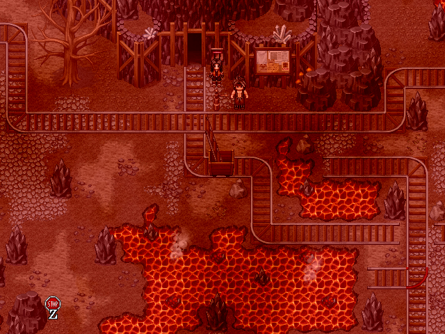
http://i51.photobucket.com/albums/f359/brunotherhino/LoZ%20Stuff/FuergoDungeon29.png
At the bottom of the shaft, you find this mine which has been abandoned halfway through construction due to eroding lava. (Oop, nostalgia. Anyone know where from?)
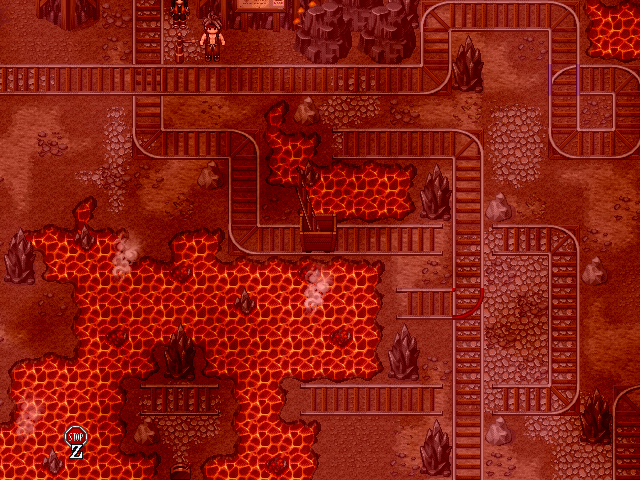
http://i51.photobucket.com/albums/f359/brunotherhino/LoZ%20Stuff/FuergoDungeon32.png
You find these mine carts that are carrying mine cart tracks in them.
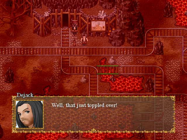
http://i51.photobucket.com/albums/f359/brunotherhino/LoZ%20Stuff/FuergoDungeon30.png
Pulling the brake on them causes them to topple over and form new bridges that both you can use on foot and creates new paths for the cart to use.
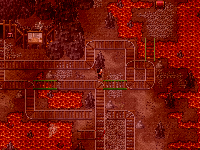
http://i51.photobucket.com/albums/f359/brunotherhino/LoZ%20Stuff/FuergoDungeon31.png
You get three carts, use them all together to form a string of bridges to reach new parts of the map!
Been a while since I posted some screens. Been kinda busy, and this puzzle has been a bit of a bitch to code.

http://i51.photobucket.com/albums/f359/brunotherhino/LoZ%20Stuff/FuergoDungeon29.png
At the bottom of the shaft, you find this mine which has been abandoned halfway through construction due to eroding lava. (Oop, nostalgia. Anyone know where from?)

http://i51.photobucket.com/albums/f359/brunotherhino/LoZ%20Stuff/FuergoDungeon32.png
You find these mine carts that are carrying mine cart tracks in them.

http://i51.photobucket.com/albums/f359/brunotherhino/LoZ%20Stuff/FuergoDungeon30.png
Pulling the brake on them causes them to topple over and form new bridges that both you can use on foot and creates new paths for the cart to use.

http://i51.photobucket.com/albums/f359/brunotherhino/LoZ%20Stuff/FuergoDungeon31.png
You get three carts, use them all together to form a string of bridges to reach new parts of the map!
silver wind
Member
I bet it took a lot of work, is there a demo yet?
Move the chairs closer to the desk and rotate the computer screen to face away more towards the window?Fallen-Griever":h9m37m90 said:
Still not happy with this one. Something about the desk/computer doesn't sit right with me...
Necrile":1zork7zy said:Why does that perspective grid look like a daft punk light show? O_o
Office party?
- Status
- Not open for further replies.
Thank you for viewing
HBGames is a leading amateur video game development forum and Discord server open to all ability levels. Feel free to have a nosey around!
Discord
Join our growing and active Discord server to discuss all aspects of game making in a relaxed environment.
Join Us


