
You are using an out of date browser. It may not display this or other websites correctly.
You should upgrade or use an alternative browser.
You should upgrade or use an alternative browser.
The Screenshot Thread
- Thread starter Ellie
- Start date
- Status
- Not open for further replies.
@Circle:
Unless that's a helicopter out there shining a searchlight through the window (and awesome if that is), the light shouldn't come close to how intense that looks. When the light hits the floor and walls, it reflects everywhere, so the contrast between the direct light and the rest of the room should never be too much. Should be an easy fix. Cool style for the tileset/charsets though!
Unless that's a helicopter out there shining a searchlight through the window (and awesome if that is), the light shouldn't come close to how intense that looks. When the light hits the floor and walls, it reflects everywhere, so the contrast between the direct light and the rest of the room should never be too much. Should be an easy fix. Cool style for the tileset/charsets though!
@ Circle: The thing that bugs me most about that screenshot is the anti-aliasing around the top edge of those red couch-like things. See if you can't make those edges look sharper.
---


Tessir Village is the first actual location in the game I'm working on. Since it's pretty deep within a forest, I thought adding that one treetop fog would help it look like it actually was located deep within a forest, and not getting a buttload of sunlight. But apparently there's some mixed feelings about that fog. :crazy: Does it really look that bad, or is it subtle enough in my screen to overlook?
---


Tessir Village is the first actual location in the game I'm working on. Since it's pretty deep within a forest, I thought adding that one treetop fog would help it look like it actually was located deep within a forest, and not getting a buttload of sunlight. But apparently there's some mixed feelings about that fog. :crazy: Does it really look that bad, or is it subtle enough in my screen to overlook?
luv_kitty12
Member
@Sekai: I think it's so good looking! ^^ I personally see no trouble with the fog myself, since it blends well with the trees. Although I have a suggestion if you may. I don't know whether this is the full village, but if so then I think you should probably add some more houses, since I don't think four only are enough. That's just a thought, though. :3
And this could be a personal preference but I don't really think putting the tree over the flowers autotile is a good idea. ^^;
And this could be a personal preference but I don't really think putting the tree over the flowers autotile is a good idea. ^^;
luv_kitty12
Member
@LegSicon: It's nice, but the hill is just too straight. You should randomize it a bit and add some more levels. ^^ Although, the text window is too large for the text itself, and it just eats up the map for nothing.
But I have to say, I like the sprite. :3
But I have to say, I like the sprite. :3
@Sekai: wow, impressive! You must have really worked on those trees, and I like all the animals you added. A few things stick out, though. The bird nests don't look very good over leaves, I think they're meant to go on the branches of the forest tree. The middle and lower left houses aren't tiled correctly... their roof tiles should be more like the rightmost house. Finally, imo the brick road looks off over grass, especially by the well.
A few small suggestions would be to add bushes and shrubbery (you could find some from other tilesets too), and maybe some undulations? (yes, there's elevation in forests too!)
@LegSicon: like luv_kitty said, the hill needs more work. Is there a reason everything is off-centered? The asymmetrical mapping is fine, but I would definitely center the textbox and move up the icon. As for the text itself, I'm not liking the windowskin (clashes with tileset, maybe tone down the saturation); and a less cliche, more subtle intro would be much nicer-- instead of "It all started like this......................." try something like "It began on a starry, cloudless night" (yeah still cliche, but better nonetheless).
@ luv_kitty: Ah. Glad you think the fog looks okay to use. I was a little worried.  The village itself is kind of intended to be fairly small, though. As for the trees on top of the flower autotile, do you think it'd look better if I used grass on top of the roots?

@ Jbrist: Oh, whoops. I thought I fixed that. :shock: I'll move the tree a couple of tiles down.
@ Regicida: *cough*Ikindacheatedwiththetrees*cough* I see what you mean about the nests. I'll go ahead and fix that. The houses.. I was trying to add a little more variety, but from an architectural standpoint you're right, they should be connected to make more sense. xP Do you think I should get rid of the brick road entirely and just use dirt path? And I'll see what I can do about adding some bushes/shrubs and a few undulations without throwing things a little off. :crazy:
Thanks for the suggestions, guys!
---
@ LegSicon: Everything looks waaay too straight/linear. Including the trees you covered up with that message window. Like luv_kitty said, try to randomize it. Btw, what's with the random white diamonds on top of the tree and the ground near where the sprite is standing? Are those misplaced evented "stars"?
luv_kitty12
Member
Ahh yup, I think it would look a lot better, Sekai. <3 The first version looked like it was floating on them, but this one definitely blends in!
Well ive been working with the map as many said, and had alot of questions as to why it was the way it was, i have worked in like 15 minutes reading the criticism you all gave, and i want to thank you all, ofcourse this isn't the finished product but, it is a part of it, the changes was, the weather effects was changed, more curlier mountain, abit more randomized trees, and more decoration ofcourse, and i actually changed the line too :D, aswell as i changed the menu looks to abit stiffer less saturated, and more boxy looking, i also added Faceset, so in the end my biggest problem would be making the perfect message menu
Please tell me more changes i can make

Please tell me more changes i can make

luv_kitty12
Member
It looks better but some stuff needs improving still. The hills look a lot improved but still not random enough and there are still some straight parts.
As for the textbox, I think you still need to darken it a bit or de-saturate it a bit cause right now, it clashes badly with the rest of the map. ^^; I also suggest just putting three dots "..." instead of all these dots since they don't look so good. <3
As for the textbox, I think you still need to darken it a bit or de-saturate it a bit cause right now, it clashes badly with the rest of the map. ^^; I also suggest just putting three dots "..." instead of all these dots since they don't look so good. <3
@LegSicon:
Well, first of all, too many periods. Really, all you need is 3. Also, the face graphic is horribly resized, and transformed too thin. If you plan on using faces of that size, you should really fix your scripts to fit it without resizing, or you should crop it down a bit. Also, try not to use the emboss\satin effect on your message window. It looks too cheap and... well, newby-ish :\ You should just try a solid coloured rectangle, with rounded edges, and a thin stroke. Not too hard. I know you're going for the fancy-edged message window with all those lines comin out of it, but the fact is, it's very hard to do that, and still have it look good. Especially if you are going to resize the window. It won't look to good...
Well, first of all, too many periods. Really, all you need is 3. Also, the face graphic is horribly resized, and transformed too thin. If you plan on using faces of that size, you should really fix your scripts to fit it without resizing, or you should crop it down a bit. Also, try not to use the emboss\satin effect on your message window. It looks too cheap and... well, newby-ish :\ You should just try a solid coloured rectangle, with rounded edges, and a thin stroke. Not too hard. I know you're going for the fancy-edged message window with all those lines comin out of it, but the fact is, it's very hard to do that, and still have it look good. Especially if you are going to resize the window. It won't look to good...
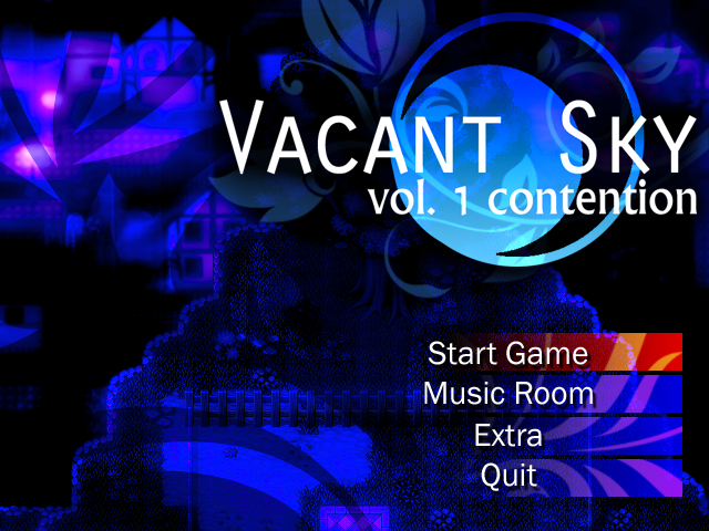
I like it Sail! My only qualm is that it feels a little bit too contrasted, but that just might be my eyes. I'm not a fan of really dark contrasts. The logo and menu selections are great though, and it's great to see just really simple things working together well instead of somebody trying to put together this great big piece of eye candy that just mashes together and looks like crap.
- Status
- Not open for further replies.
Thank you for viewing
HBGames is a leading amateur video game development forum and Discord server open to all ability levels. Feel free to have a nosey around!
Discord
Join our growing and active Discord server to discuss all aspects of game making in a relaxed environment.
Join Us


