

You are using an out of date browser. It may not display this or other websites correctly.
You should upgrade or use an alternative browser.
You should upgrade or use an alternative browser.
The Screenshot Thread
- Thread starter Ellie
- Start date
- Status
- Not open for further replies.
Hey guys ive been working on my game for quite some time, with the help of some of my team, here is a map created by a member of my team (stripe103) and edited with weather effects and screencolor tones by (me), weather script wasn't by me, but you get my drift.

also ive been working on a menu, using moghunters menu script here is the current result still a WIP, cause you might notice some bent lines, and some lines which arent currently well setup, well its all still WIP
yea dont ask about the "jutsu" stuff, cause its a part of my game, you would understand if you had the story hahahaha!

benos":1owgrnuo said:Green blocks? It's called a bed, you haven't heard of those beds in japan?. :tongue: I'll work on the room now. Just hard time trying to figure out the decorations. :thumb: Mostly to do them with the charsets.
http://www.google.co.uk/images?hl=en&q= ... a=N&tab=wi
http://juiced.files.wordpress.com/2007/02/grass-rug.jpg
Look at those pictures of beds, okay? Now look at that grass rug, yours does NOT look like a bed, but just two patches of grass, aka. two of those rugs put together.
And what about Japan, are you saying those beds are in Japan, or assuming I'm in Japan? o.O
Here's a couple from a game i've just started, which is currently unnamed. These images are from the prologue (of sorts) taking place before the main storyline, giving a bit of history as to whats going on
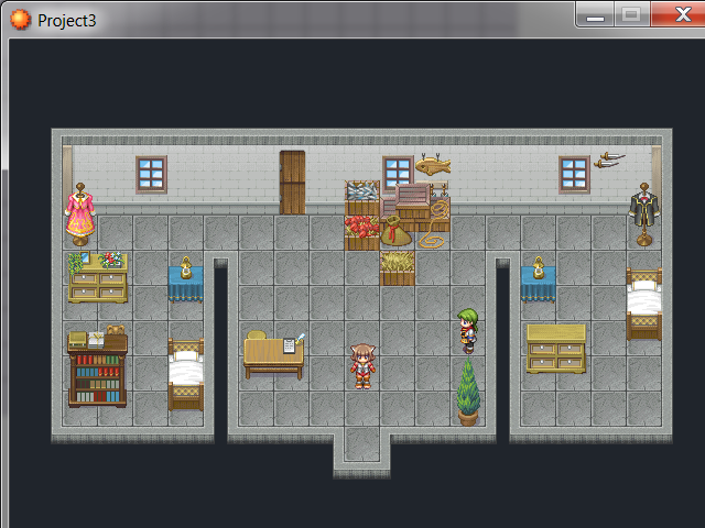
The above is from the Heros house early in the game. The girl is the playable character, the boy is her brother
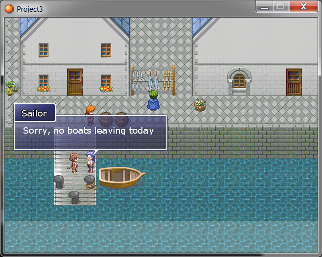
This one is from the town they live in. At this stage of the game its still under construction so isn't a big town. 2 Main buildings plus a bar. The area behind the houses is where the town expands to

The above is from the Heros house early in the game. The girl is the playable character, the boy is her brother

This one is from the town they live in. At this stage of the game its still under construction so isn't a big town. 2 Main buildings plus a bar. The area behind the houses is where the town expands to
luv_kitty12
Member
Nice screens. ^^ But I think you should improve your mapping a bit. I have some stuff I should point out for you~3
~ In the first map, things are a little...messy. I think you should have more rooms and close things up a little, add doors and such so you can have a real house. So far, there is so much emptiness and it needs to be filled up. You could add a kitchen, a living room and still have the two rooms. ^^
~ In the second map, at the port you have there, the white woods float on water. What I mean is, there is nothing under them to keep them steady to the port and steady to make people stand on it. In the town itself, I think it is also a bit empty. You could add more stuff.
That's all! I hope it was helpful. :smile: ^^ You perhaps ought to post a bit on Mapping Improvement Thread before posting here. <3
As for me, I have a little screenie~ :wink:

This is my game's menu, done completely from scratch. It's using Mog's script. I was aiming for a nice mystical, desert feeling. I wonder what everyone thinks. ^^ (The faceset is a placeholder, btw~)
~ In the first map, things are a little...messy. I think you should have more rooms and close things up a little, add doors and such so you can have a real house. So far, there is so much emptiness and it needs to be filled up. You could add a kitchen, a living room and still have the two rooms. ^^
~ In the second map, at the port you have there, the white woods float on water. What I mean is, there is nothing under them to keep them steady to the port and steady to make people stand on it. In the town itself, I think it is also a bit empty. You could add more stuff.
That's all! I hope it was helpful. :smile: ^^ You perhaps ought to post a bit on Mapping Improvement Thread before posting here. <3
As for me, I have a little screenie~ :wink:

This is my game's menu, done completely from scratch. It's using Mog's script. I was aiming for a nice mystical, desert feeling. I wonder what everyone thinks. ^^ (The faceset is a placeholder, btw~)
luv_kitty
were using the same script hahaha!.
but time to give some feedback:
- The background is perfect, really brings out the desert thought, as for the mystical stuff, it shows really nicely with the background, as for the menu itself, it is a nice menu, which reseblems desert very well, but maybe to add a better desert feeling to it, you could make the letters transparent with strokes, so that the desert in the background is the color for the letters, thereby bringing a more desert feel to the whole menu.
- The letters are fairly nice, not to fancy, not to dull, the colors are nice, but as said above the letters really (for my part that is) doesn't cover the desert theme, but it covers the mystical theme nice.
so basic explanation you do have what you are looking for, but it kinda reminds me of the default mog menu, just with a different BG, and different colors
that is all
- Good luck
@Xilef That's FFFFFFFFFUUUUUING AWESOME!
You've really outdone yourself there.
@luv_kitty12 I see your using Moghuntermenus and facemaker very popular stuff there. very.
@LegScion those red lightsaber lines make my eyes scream like scream forest.
@benos did you make that tileset? I've never seen it before. If you did, bravo on creativity. They are right about the room space tho, only games make rooms as big as gyms with nothing in them.
@gameboy HOLY SHIT That's awesome
@jbrist reminds me of RAMPAGE the NES game
I didn't make it, It's called chip07_a. Pretty sure it's a original chipset from some japanese website I found in a sozai section.
Just so you know, I forget to put the pillow tile on the end. Which is why you think it isn't a bed. :sad:
Guess she wasn't sleeping comfortable enough. :haha:
There, now Caroline can a good night's rest. :thumb: Still working on filling the room with junk.

Edit: Uploading that tileset if you must have it, for rpg2003.
No need to credit me.

Just so you know, I forget to put the pillow tile on the end. Which is why you think it isn't a bed. :sad:
Guess she wasn't sleeping comfortable enough. :haha:
There, now Caroline can a good night's rest. :thumb: Still working on filling the room with junk.

Edit: Uploading that tileset if you must have it, for rpg2003.
No need to credit me.

luv_kitty12
Member
@LegSicon: Thanks! I tried out your suggestion but it didn't look very good since it looked a bit overdone, but I appreciate your suggestion of course!
@Star: Well, the face is a placeholder for now, you know. :wink: And I was hoping to make a good original menu to avoid that. ^^
@Star: Well, the face is a placeholder for now, you know. :wink: And I was hoping to make a good original menu to avoid that. ^^
If you know how to script, that would be great! It would definitely improve the menu and would make it look unique. If you don't you can always put in a script request and some kind of mock up. I'm sure someone will likely help : )luv_kitty12":udfw4jdu said:@Star: Well, the face is a placeholder for now, you know. :wink: And I was hoping to make a good original menu to avoid that. ^^
Why is it my pc crashes right at the worst time. Corrupted the whole project, every data file. Luckily i had a backup form yesterday. 
Anyway, redone Hero's Home
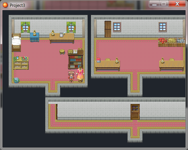
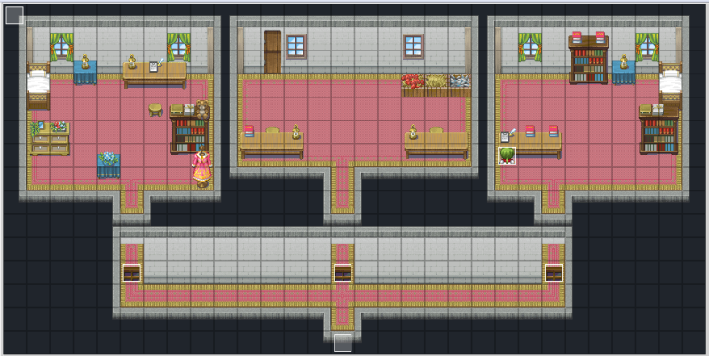
The middle room will have a kitchen in it once i find one from another tileset. Port Town doesn't seem to have a kitchen
Anyway, redone Hero's Home


The middle room will have a kitchen in it once i find one from another tileset. Port Town doesn't seem to have a kitchen
i just wanted to ask something, which was, whats the best
a simple menu, yet attractive, and with many features or
a stylish menu, catchy to the eye, and awesome to look at, with fewer features.
cause i am actually thinking of getting rid of all that overflashy stuff and stick to the simplicity, and also add more features, i am very graphic-insane, but usually a good intruging story beats them all
so whats your saying?
So I'm doing my usual experimenting again, where I think of a few ideas, but they don't ever turn into a game (Just like the screenshot above, I don't have a strong enough story to support my ideas)
Anyways, here's a try with VX, what do you think of the style, if I made all of the maps in that manner? It'd help me with the mapping because I wouldn't need to do huge areas, and could have the maps all connected via transfer events, which means making cities etc. could be easier too, and I could add more detail to the maps without getting bored (I've used like 6 floor tiles in this one)

PS. If you can guess what the last sentance is from, you'll win... something.
Edit~
Okay, so I reworked the mapping a little to add a background layer to it, personally I think it looks better, although it limits player movement a little more than before...

Which looks the best, the original, or the new?
Anyways, here's a try with VX, what do you think of the style, if I made all of the maps in that manner? It'd help me with the mapping because I wouldn't need to do huge areas, and could have the maps all connected via transfer events, which means making cities etc. could be easier too, and I could add more detail to the maps without getting bored (I've used like 6 floor tiles in this one)
PS. If you can guess what the last sentance is from, you'll win... something.
Edit~
Okay, so I reworked the mapping a little to add a background layer to it, personally I think it looks better, although it limits player movement a little more than before...
Which looks the best, the original, or the new?
- Status
- Not open for further replies.
Thank you for viewing
HBGames is a leading amateur video game development forum and Discord server open to all ability levels. Feel free to have a nosey around!
Discord
Join our growing and active Discord server to discuss all aspects of game making in a relaxed environment.
Join Us

