
You are using an out of date browser. It may not display this or other websites correctly.
You should upgrade or use an alternative browser.
You should upgrade or use an alternative browser.
The Screenshot Thread
- Thread starter Ellie
- Start date
- Status
- Not open for further replies.
@Azor:
Lol, love the crabs. Those and the starfish seem inconsistent with the rest of the graphics though; I think adding a couple more layers of shading on the crabs and desaturating the starfish would fix it. The sun overlay seems to be a bit too flaring, but it does seem to fit the setting. Looks nice, I wanna be there.
@Bwd:
Very nice, the poses are awesome. Interface seems quite clean and intuitive. I'm downloading that demo, will probably try it tomorrow or so.
---

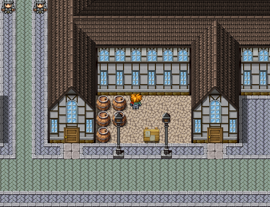
Hello, I've been working with graphics these last few weeks, and I created a look I liked from one particular screenshot. :sad: It wasn't easy either because it was an interesting technique, and mine doesn't look exactly like his as his screen was dark. here it is. There are some problems with it, that I will have to take care of like the roof isn't the same color. I'm thinking if I can do it and find it, might replace the roof all together. The map, itself is not complete as it is just to show off the buildings. And the road color, should be yellowish kind of stone and is a work in progress as well. Not entirely satisfied with the colors.

(Credits: I don't know if I need to do this, but in case, Mack and the rest is RTP.)
(Credits: I don't know if I need to do this, but in case, Mack and the rest is RTP.)
luv_kitty12
Member
@Cait: I don't really know very much about VX, but I hope I can tell you my little opinion. ^^ I think overall it's very good, but like you said, you need to have the roof's color the same. This is very dark and the other is very light. Also, I don't know if this is supposed to be, but at the roof's end (above the windows), it's not shaded very well. I think there should be slight shadows.
That's all! I hope this can be helpful, even though it is not really much. :smile:
That's all! I hope this can be helpful, even though it is not really much. :smile:
silver wind
Member
I never used VX, so I don't know what is RTP in that screen..
The roof looks great. one thing though, the front (the triangle) makes it look paper-thin.
I guess the round windows are yours too. The small round window is not divided symmetrically. and its arc should be more round/smooth. Just a suggestion, I think colorful windows will look better, maybe blue like the roof or brown like those lower bricks.
The walls are edited from rtp, not much just added the bottom part. The roof I got from RTP, got that piece from Junkhunt, and I didn't like the color changed it to the Mack roof (going to change it to a brown color). The window is an rtp edit, made with the Mack window. Hmm, hadn't thought about changing the window color. I'll think I'll look into that. Thanks.  : Not always the best with pixels, just really starting, but I've been changing color of things and just decided to take a more of a chance.
I've handled the shading issue, by putting a shadow where under the wood where there would natural be a shadow.
UPDATE: I did the windows in a blue color and changed the roof, fixing some of the windows. I have to say it looks a lot better than it did, and have to remember about scale. (o_o) Let me know if anything else could be fixed.

Jbrist, that tileset will be only monochromatic? Awesome!

This is my WIP dialogue choosing system similar to Fahrenheit one.
Those words are written in Polish language (because this is my first language) and can be translate "I can choose dialogues :D" ;p
The clock in upper-left shows amount of time left to automatic choose default dialogue - it will be almost always the worst for player. ;p
The clock will be also used in gameplay, for example: NPC leaves room for a while and then we can look around for useful items. The clock will be showing us when npc will return.
Argh, I smell bad grammar here, but I don't know how to fix it, lol. Sorry for mistakes.
Oh, and yes, this is a horror game.
Tomas can you tell more about your project? It looks quite weird.
BTW I'm under control of the grid. This sentence reminds me a Portal, I don't know why.
BTW I'm under control of the grid. This sentence reminds me a Portal, I don't know why.
I'm doing my best to finish this game in this summer/year.GameBoy, wow! I love such climate.
Waiting impatiently ^^
- Status
- Not open for further replies.
Thank you for viewing
HBGames is a leading amateur video game development forum and Discord server open to all ability levels. Feel free to have a nosey around!
Discord
Join our growing and active Discord server to discuss all aspects of game making in a relaxed environment.
Join Us
