
You are using an out of date browser. It may not display this or other websites correctly.
You should upgrade or use an alternative browser.
You should upgrade or use an alternative browser.
The Screenshot Thread
- Thread starter Ellie
- Start date
- Status
- Not open for further replies.
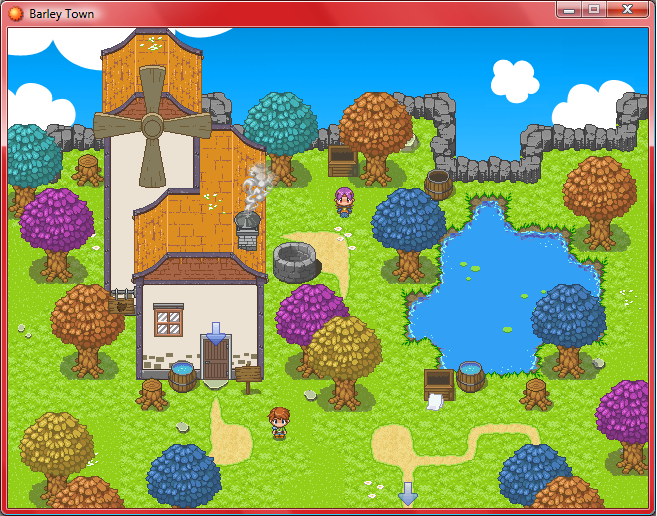
Looks very nifty and promising, Como. My only worry is that in the case of that first screenshot the sprites and background don't match up at all. It needs a consistant art style, otherwise it looks amateurish, and I know you're better than that, I've seen many of your screens and projects before.
@Regi: Seven Chapters. Got it all planned out, see? Still not the end though. CoG is on my mind so much that I've already got two sequels and one prequel planned. Although, don't count on any of those coming out any time soon in the current millenium.
@Regi: Seven Chapters. Got it all planned out, see? Still not the end though. CoG is on my mind so much that I've already got two sequels and one prequel planned. Although, don't count on any of those coming out any time soon in the current millenium.
You know I could shoot myself for making this topic
what the hell was I thinking influencing people into making another FF7 fan game :crazy: Although the screenies did make me laugh Wyatt.
@Bruno: That's some pretty impressive mine work you got there. Is this whole game gonna take place underground? Do you have a thread? You're a pretty good mapper too, cause it reminds me of mines in other RPGs like Tales series and stuff.
No, the whole game doesn't take place underground. This is just one part of the game where you enter some mines to hunt for someone called 'Jacob Smith'.Star":35n6548n said:@Bruno: That's some pretty impressive mine work you got there. Is this whole game gonna take place underground? Do you have a thread? You're a pretty good mapper too, cause it reminds me of mines in other RPGs like Tales series and stuff.
Thanks for the mapping comment! I've really just been adding stuff to the walls in a few places, giving them a less predictable pattern. I do have a thread, it's in the sig. Although, you might not wanna download the game straight away, just wait until Chapter 2 comes out. There's some flaws in chapter 1 that I fix in the chapter 2 release.
Glitchfinder
Staff
Ynlraey":3b1nsyn8 said:@Peri, oh man that reminds me of Earthbound/Yume Nikki, that looks great :D
@Bloodrage, whoa.

I see you're making a game based on Alice of Human Sacrifice. Hopefully, it turns out well. I never did see that concept as one that would go well with a game. At least, not without a lot of tweaking. Daughter of Evil would probably have ended up a much better fit, assuming you switched characters occasionally.
united washcloth express
Sponsor


A module. The town is Tethyr, which hopefully looks a little like Tethyr from Alazander's Crimson Tides of Tethyr
Glitchfinder":p3rqqmwd said:Ynlraey":p3rqqmwd said:@Peri, oh man that reminds me of Earthbound/Yume Nikki, that looks great :D
@Bloodrage, whoa.

I see you're making a game based on Alice of Human Sacrifice. Hopefully, it turns out well. I never did see that concept as one that would go well with a game. At least, not without a lot of tweaking. Daughter of Evil would probably have ended up a much better fit, assuming you switched characters occasionally.
I don't follow things literally, It's more on the Alice in Wonderland Side and an original story I have and some historical figures.

rey meustrus
Sponsor
Yniraey, looks really nice. I like the perspective, though the top of the stairs seems too small to be easy to get through as a player. It reminds me a little of Earthbound.
Delmaschio
Member
Delmaschio
Member
@Regashi
It's The Inquisitor's tileset. Thank you for the kind words!
I really dig your battle system, looks pretty cool... I hope you get to finish it. :biggrin:
It's The Inquisitor's tileset. Thank you for the kind words!
I really dig your battle system, looks pretty cool... I hope you get to finish it. :biggrin:
@Regashi: Wow, I really like it! The HUD is clean and easy to read, and visually pleasing too. I can see you've got some boxes to fit multiple status effects, which is also a great idea. The command window doesn't show what the selected command will look like in that screen, so I can't say much there but that it goes well with the HUD.
Great job!
Great job!
@Delmaschio: I'm guessing you're yet to add npcs/other events? Becuase at the moment it doesn't look very busy. It's a good use of Inq's tileset though.
@Regashi: Looks nice. The only thing I'd say is that theres probably a bit more room to push the different character bars in the bottom right closer together, because I think the HUD would look even better if it was a bit tighter. But whatever, good work.
Just thought I better post something, here's a menu from the LMS Demo that's coming out soon.

Obviously its a map selection screen, because as this is a demo, there's only two areas to play through. Comments?
@Regashi: Looks nice. The only thing I'd say is that theres probably a bit more room to push the different character bars in the bottom right closer together, because I think the HUD would look even better if it was a bit tighter. But whatever, good work.
Just thought I better post something, here's a menu from the LMS Demo that's coming out soon.

Obviously its a map selection screen, because as this is a demo, there's only two areas to play through. Comments?
Star, those are nice screen, although you may want to reconsider your colour style. It's a bit too bright at the moment. Try to stay away from those MSPaint primary colours...
Fox, that's a pretty nifty lookin' menu screen. Haven't got aynthing to add, to be honest. Looks nice.
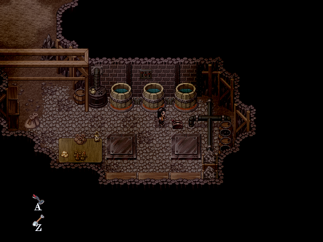
More screens from the depths of the earth in my game.
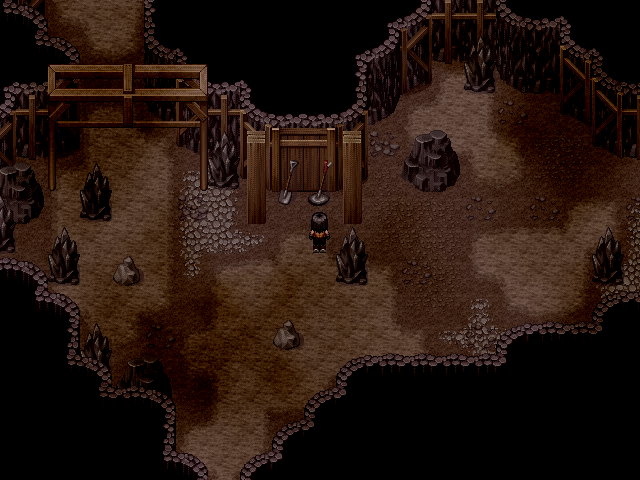
You come across this metal detector and spade.
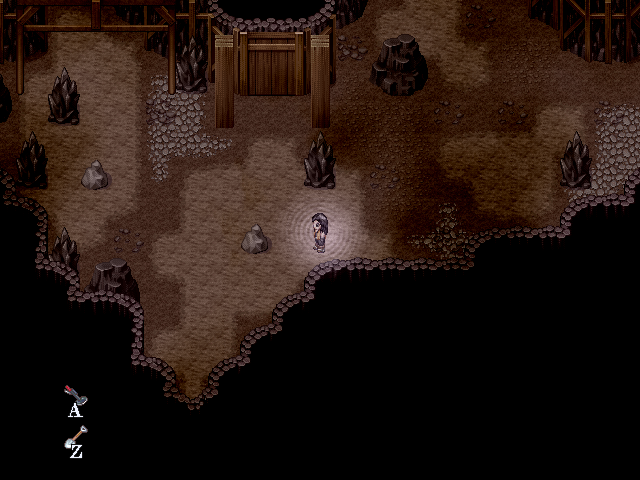
When you use it, you press and hold the 'A' button to use the metal detector. The more frequent the pulses from it are, the closer you are to something buried.
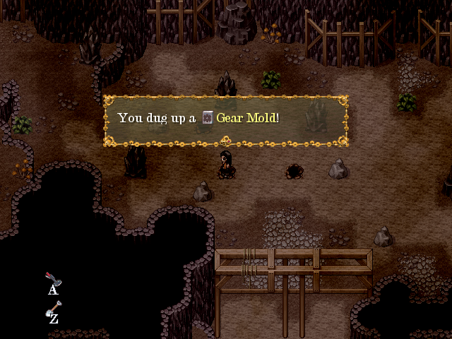
Press 'Z' to dig up goodies.
One of the things you dig up is a lever for this starter mechanism.
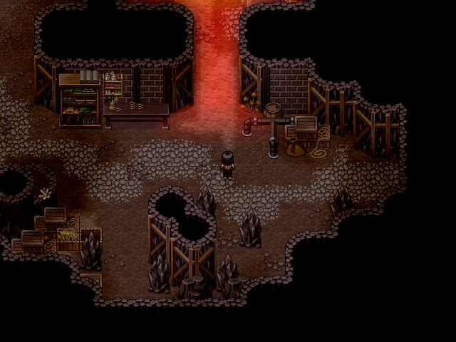
It starts the furnace in the previous section.
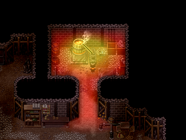
You use the furnace for smelting to make various fun things. First you place a mold on the anvil.
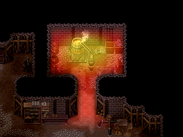
Then place the metal you want to make it with (dug up from the metal detecting section).
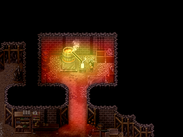
A quick smelting and one cooldown later...
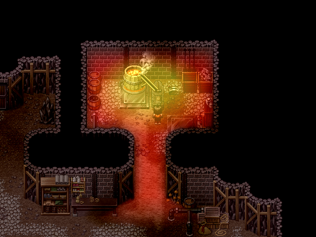
And your brand new item is ready to take away!
Fox, that's a pretty nifty lookin' menu screen. Haven't got aynthing to add, to be honest. Looks nice.
More screens from the depths of the earth in my game.

You come across this metal detector and spade.

When you use it, you press and hold the 'A' button to use the metal detector. The more frequent the pulses from it are, the closer you are to something buried.

Press 'Z' to dig up goodies.

One of the things you dig up is a lever for this starter mechanism.

It starts the furnace in the previous section.

You use the furnace for smelting to make various fun things. First you place a mold on the anvil.

Then place the metal you want to make it with (dug up from the metal detecting section).

A quick smelting and one cooldown later...

And your brand new item is ready to take away!
- Status
- Not open for further replies.
Thank you for viewing
HBGames is a leading amateur video game development forum and Discord server open to all ability levels. Feel free to have a nosey around!
Discord
Join our growing and active Discord server to discuss all aspects of game making in a relaxed environment.
Join Us

