Envision, Create, Share

Welcome to HBGames, a leading amateur game development forum and Discord server. All are welcome, and amongst our ranks you will find experts in their field from all aspects of video game design and development.

The Screenshot Thread

Status
Not open for further replies.
@Devi: yay text-based games :) Just a thought, I wonder if the right side of the screen might be better as plain text, to keep everything consistent.

@Sailerius: Interesting. The one path's edge on the far right looks too linear and I'm not sure I like the tiny patches of grass or flowers growing on rock (grass is too noticeable, don't you think?), but otherwise, pretty cool.


Finding the best screen tone is difficult, so tell me how things look so far. (I'm kinda iffy with the lights, and once I add that lantern tool it'll just get messier, but eh.) Anyhow, these screens are from the beginning of the first dungeon, retouched. I'm still working on adding cooler puzzles, so stay tuned!

Golmar%20Mines%202.png

Golmar%20Mines%203.png
 
From what I can see Regi, I'd say theres a bit too much blue in the tone, but it depends what you're going for. You could use a fog overlay for the lights like I do for my maps, but that would get quite messed up as well if your lantern's a picture.

I posted this in the Last Man's Stand thread a few days ago, but I thought I'd post it here as well for comments. This is part of a begining cutscene for LMS, showing the message system as well:

lms%20message%20system.png
 
@Sailerius: pretty sure we're using Java's built-in swing thing. I'd have no idea how to code the GUI without it ;-;

@Regi: inside the text fields will be text showing how much HP you have. (ex. 67/100, 22/100) So yeah, it'll be just plain text in there. Unless you meant something else.
 
I layered down the blue and messed around with some gradient effects. It looks slightly dark here, but ingame it should be easier to navigate. Hopefully it shouldn't be too constricting for puzzles. Once you find the lantern though, the visibility will increase.

GolmarMines2.png
 
Looks good! I know how hard it is to find the right screen tone, it' takes way to much time for me as well.
Some screenshots I should've posted earlier. I'm working like a year on this project, I have about 10 hours of gameplay now but I don't want to post more about it untill... Well untill I manage to reach a certain point in the game's creation :p


Peri, I think I'm on shrooms looking at your one lol! Looks great though.

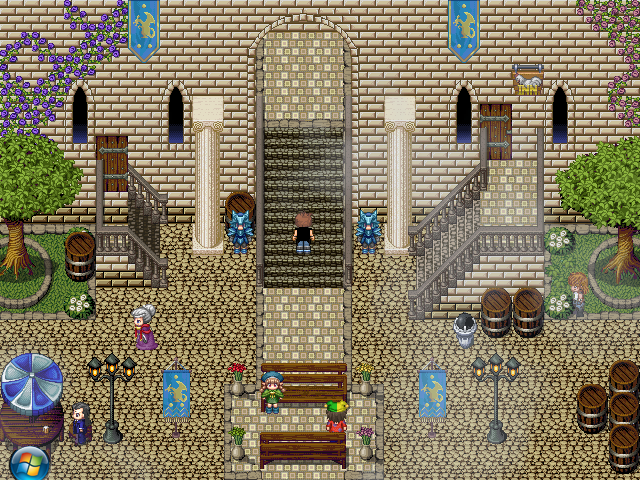
Okay, so now that I'm alive again, I've gotten back to work on my game and I'm posting an updated image from years ago. Inq, created a tileset of a wall for me, but I could never seem to get it to look or work the way I wanted it. So I created my own. This is the end result, using one of Inq's grounds too.

LangaraScreen.png
 
Lol, i still remember this map from years ago!
It certainly looks better now. However there's a mapping error on the left stairs that really messes up the perspective ;)
 
I think the doors need some editing, just moving across a few pixels so as not to get blocked by the barriers. Other than that it looks nice.
 

Jason

Awesome Bro

asteroiddefensescreenshot1.PNG
 
@Tomas, yes, it's called the Alice Domain. It serves as a marker on what "door" and it "changes" in a way whenever you're near an Alice to be cautious.
As for the sprite, it's three frames :) Some poses have more though. I might be adding more frames but I have to see.
 
kay, yeah i like a lot of frames, and your game looks a bit goldensun-ish, so thats why i asked
i really liked the move animation in golden sun

also jbrist i really like the look of that
only thing that jumps out on me is the score number, which looks a bit shit imo
but that changes all the time i guess? so it won't be a big bother
is it animated in some way (like after images or something)? or just static changes?
 

Jason

Awesome Bro

Lol yeah the score isn't exactly amazing, I mean, the rest of my text is made up of pictures, so it has the black outline, sadly, I can't get that effect using an imported font, lol... but yeah, it does change all the time, like, extremely fast change, lol...

And what dy'a mean with the last sentance? is what animated?
 
Status
Not open for further replies.

Thank you for viewing

HBGames is a leading amateur video game development forum and Discord server open to all ability levels. Feel free to have a nosey around!

Discord

Join our growing and active Discord server to discuss all aspects of game making in a relaxed environment. Join Us

Content

  • Our Games
  • Games in Development
  • Emoji by Twemoji.
    Top