
You are using an out of date browser. It may not display this or other websites correctly.
You should upgrade or use an alternative browser.
You should upgrade or use an alternative browser.
The Screenshot Thread
- Thread starter Ellie
- Start date
- Status
- Not open for further replies.
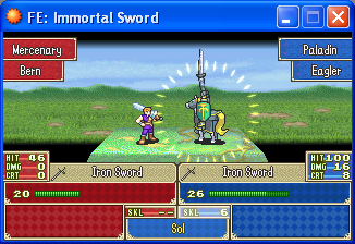
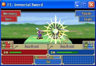
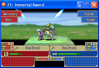
Whoa, man... you're actually making a game like this!
All I can say is wow. Very nice visuals. Seeing their weapons where I thought the name should be mixed me up a bit, though...
Oh, and the background for the weapon is lighter than the other windows. That may have been what mixed me up. Maybe make the name and class with this window background.
All I can say is wow. Very nice visuals. Seeing their weapons where I thought the name should be mixed me up a bit, though...
Oh, and the background for the weapon is lighter than the other windows. That may have been what mixed me up. Maybe make the name and class with this window background.
StrawberrySmiles
Sponsor
Okies, this is my first time posting in this thread, but I though I'd post some screens from mine and Star's game. We're trying to go for custom graphics... ^_^;
Our first town, Astra:


Ilana Forest:


Ilana Forest:

Dunno how that would have happened, I made the whole tileset at the same timeframe as well. Maybe it's the color choices are different? I'm glad you would still play the game though, that must mean its not worth fretting over.No ID":3gez26qn said:This looks very nice. Although the graphics for the houses and everything else seems different, but If I were playing the game I wouldn't care.
rey meustrus
Sponsor
Those trees are amazing. I'd like to see them with a normal screen tone, though.
StrawberrySmiles
Sponsor
You mean without any screen tones or anything, like below? O.oa

I hope this is what you meant. :D

I hope this is what you meant. :D
Well, thought I'd post a picture of the project I'm working on for the Triweekly Challenge here. The game is called The Underworld: Through the Door. As I want to get this project finished by the deadline, I'm not going for flashy graphics or anything, just enough so it look good enough to play. What really matters in the game is the puzzles the character's put through and how they solve them, hence the Zelda-like HUD. You can just about see a glimpst of the first 'puzzle' in this screen - getting across the lava.

Comments?

Comments?

Testing my raycast engine.
This was the first test, deleted all the code and started again with a slighting better way to render (This took up a lot of CPU when sending out over 20 rays due of over lapping and high error count).
Differential shade the pillars at the bottom, they tile in with the wall "behind" it too well.fox5":20siyn33 said:
Firgof Umbra
Member
It's called Star Ruler; it's a realtime grand strategy game with a big focus on modability; it also has a strong multiplayer component -- which is something I don't often see in the genre. The whole list of stuff that you'll see in the game is just too big to post here but I'll toss you a link to our ModDB page if you're interested.firgof what the hell is that space game you are working on. it looks pretty interesting
http://www.moddb.com/games/star-ruler
We also have a thread right here on HBGames -- I'll add it to my signature.
Xilef":3rr7jztv said:Differential shade the pillars at the bottom, they tile in with the wall "behind" it too well.
Good point, I hadn't noticed that.
Pokémaniac
Awesome Bro
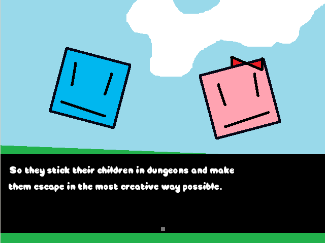
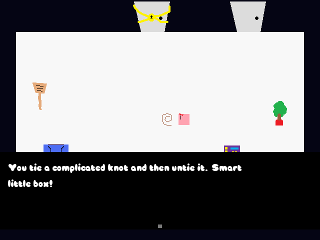
Also, in the second one, everything but the floor, the message box, and the stuff around the edge is bobbing up and down. It is quite hypnotic.
silver wind
Member
Pokemaniac, I love the simplicity.
I'd suggest you to change the MS Paint default colors/ pure white floor and add some shadows.
Something like:
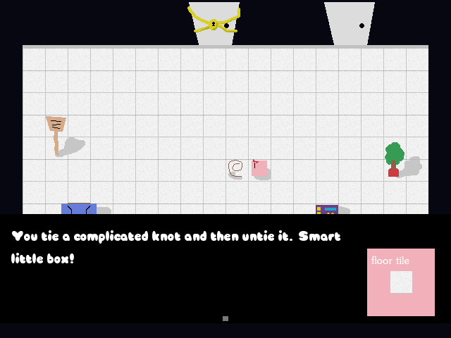
I'd suggest you to change the MS Paint default colors/ pure white floor and add some shadows.
Something like:

dadevvtsvre
Sponsor
It's for the triweekly challenge, I don't blame him for having simplistic graphics.Regi":1ma3nqgr said:Looks interesting, Pokemaniac. Is this some kind of puzzle/escape game? Though it's nice you're going for original graphics, I would work on spriting a bit more; it looks quite rushed, MSPaint quality.
It looks really interesting, actually. I never thought the triweekly challenge would spawn creativity like this, but I'm really impressed by all the progress so far! Great work guys! :toot:
- Status
- Not open for further replies.
Thank you for viewing
HBGames is a leading amateur video game development forum and Discord server open to all ability levels. Feel free to have a nosey around!
Discord
Join our growing and active Discord server to discuss all aspects of game making in a relaxed environment.
Join Us
