Envision, Create, Share

Welcome to HBGames, a leading amateur game development forum and Discord server. All are welcome, and amongst our ranks you will find experts in their field from all aspects of video game design and development.

The Screenshot Thread

Status
Not open for further replies.
What I've been up to recently.

SEB-31.png

SEB-32.png

SEB-29.png

SEB-35.png
 
Bea-u-tiful tilesets and graphics! The simpler colors are so much easier on the eyes than the rtp for some reason, looks like a straight up gba title to me, however did you notice the fireplace stands out as much as it does? whats the name of this game Skie?
 
dsoulja85":s0efu356 said:
Bea-u-tiful tilesets and graphics! The simpler colors are so much easier on the eyes than the rtp for some reason, looks like a straight up gba title to me, however did you notice the fireplace stands out as much as it does? whats the name of this game Skie?

Ah, the fireplace, I'll have a look at that. See if I can get a different color to it. As for the game itself, it's called Sacred Earth: Memory(SEM for short). I blog about it here: http://sacredearthbonds.blogspot.com/

If you're interested. :3
 
The sun... The sun... It burns my eyes... Tone that down, you really don't need it to be that strong.

Add more overgrowth, though. Add more details here and there to the ground, make it look less empty.
 
Thanks, I lowered the opacity on the sun. It should be fine now.

What I was really looking for crit on was the idea of the two little icons at the bottom.
And is it worth it putting an HP bar in, if it's not an action rpg?
 
abreaction":22zwsf5w said:
Thanks, I lowered the opacity on the sun. It should be fine now.

What I was really looking for crit on was the idea of the two little icons at the bottom.
And is it worth it putting an HP bar in, if it's not an action rpg?

No HP Bar.

I would reposition it so the icons are displayed Horizontally along the bottom, rather than climb vertically up the side of the screen.

There's no real problem with the icons, perhaps they are a little too large seeing as they only seem to serve the purpose of a reminder for which button opens which. If you are going to add more maybe you could make the icons more uniform - like put them all in tidy squares.

You could also try making them a little less opaque so they don't stick out as much.
 
I would totally eliminate and traces of fog and custom lighting effects. Its not needed. Instead, use them in more innovative and better situations. Having a custom fog in every map takes away the effect. In a map like this, it really isn't need, therefore it should be eliminated along with the fog1 as well.

Your map could be mapped better as well. Get rid of those patched of road, they make no sense in the situation and are illogical to the mapping overall. I would expect those things in ruins. Add some more scenery such as trees and bushes and stuff. Also, add more curves to your long grass.
 
Looks quite nice, but your long grass seems rather blocky and square. Try breaking up the edges with the other grass tiles, just as natural grass is. By the way, the bottom chair in your last screen seems to be facing away from the table :S

Since no one's replied to any of the new stuff I've posted in the Last Man's Stand thread, I thought I'd post two new screens here (well, the title screen and a game screen)

newscreen3.png


newscreen1.png


Comments? (the last shot was hard to take because I had zombies chasing me, so I'm afraid it's not that good)
 

Numb

Member

The_Shadow":1qwtjted said:
I suppose the first one is the title screen? I think it looks pretty cool. Same with your second sceen.

Haven't posted a screen for awhile:
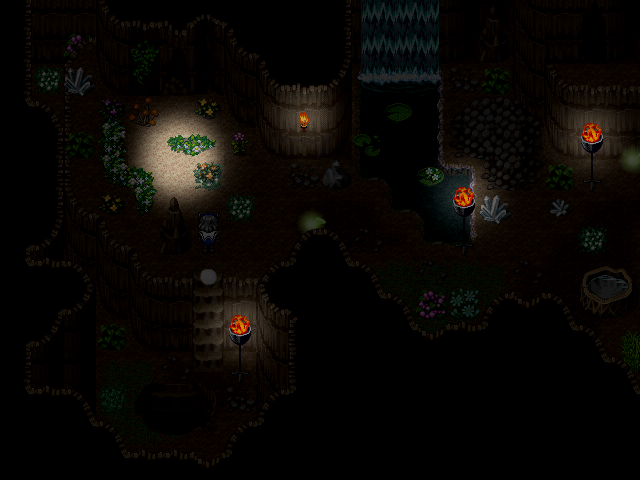
dfgdf-2.png


That's extremely hard to see ._<

&Fox5:.
Shet, just jizzed on my computer D:
 
how about a light circle around the character too?
otherwise it's difficult to find the sprite in the dark.

other than that, it does have a cave-y sort of feel to it, the mapping.
 
That's quite a bit better. It wasn't Numbs monitor.

The area of light surrounding the flames is well... kind of wrong. The area of light would be quite abit wider and gradual, it would need a tint. I remember a member here named Kraft made some light characterset to have above toches and it actually looked pretty good.

The area of the light in the upper left, I assume that's like a hole above ground letting in light, if thats the case then from our perspective you should be able to see some light beaming all the way up and off screen.
 
Just a small thing, it looks odd to me to have a 3 tile wide waterfall falling into a tiny pool that size. A waterfall a single tile wide would make more sense.
 
Status
Not open for further replies.

Thank you for viewing

HBGames is a leading amateur video game development forum and Discord server open to all ability levels. Feel free to have a nosey around!

Discord

Join our growing and active Discord server to discuss all aspects of game making in a relaxed environment. Join Us

Content

  • Our Games
  • Games in Development
  • Emoji by Twemoji.
    Top