Envision, Create, Share

Welcome to HBGames, a leading amateur game development forum and Discord server. All are welcome, and amongst our ranks you will find experts in their field from all aspects of video game design and development.

The Screenshot Thread

Status
Not open for further replies.
Regi":3uwxgdpx said:
Looks interesting, Pokemaniac. Is this some kind of puzzle/escape game?

I think I'd class it as an adventure game. You have to escape the room, but you have to then go in again and escape in a different way, and a different way again. There are going to be at least 5 ways for this room alone. (2 of them are usable as well!) One of them is the unlocked door at the top - obviously they get a bit more complicated then that.

it looks quite rushed, MSPaint quality.

Why thank you!

Pokemaniac, I love the simplicity.
I'd suggest you to change the MS Paint default colors/ pure white floor and add some shadows.
Something like:

Hmm... to be honest, I really don't like the shadows in that one... But I love the lines on the floor. Here's what it's like now.
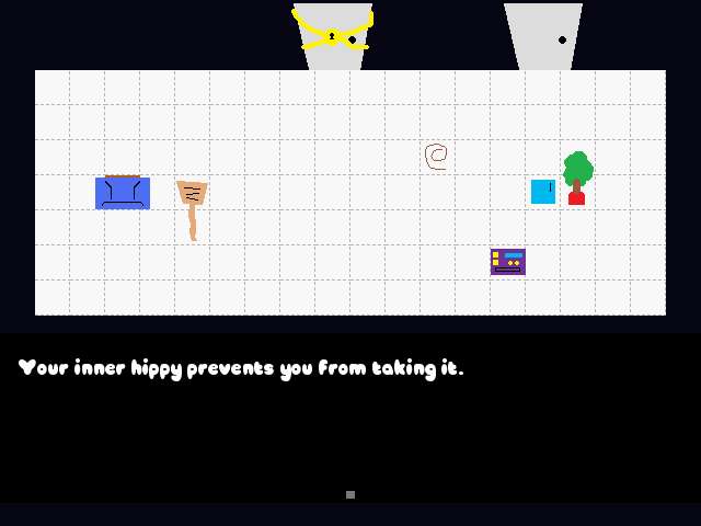
dottyfloor-1.png

thoughts? Better? Worse?

It's for the triweekly challenge, I don't blame him for having simplistic graphics.

It looks really interesting, actually. I never thought the triweekly challenge would spawn creativity like this, but I'm really impressed by all the progress so far! Great work guys! :toot:

Yeah, this contest was really inspiring! I wanted to do a sort of non linear adventure game, and when trying to draw the main character, at some point I ended up with a square(god knows how) and though, "How would that square look with eyes?" Well at least it went something like that, I can't really remember, it was a full two days ago. =P

EDIT- And after further consideration, I've made the dotted ground an autotile. That's right, now everything but the black is moving.
 
They're really nice maps. The second map's better than the first, because everything looks tighter and better spaced. I love the tileset. But, as I've said before to someone else, you can't submit something that you've already worked on for the challenge. It has to be something new. You can use graphics and systems from previous stuff, but the game itself has to be new.
 

Numb

Member

&Kqurmiz:.
---> Those maps look really good. Are those tiles custom made? If you can find a character set that can fit with them well, you should definitely enter the contest. Also, is English your native language?
 
@Numb: my native language is Lithaunian ;D character set I got this is catacombs I started the project in 2 days.I got storyline but storyline is for long game.And tileset details riped from games and edited my own. :)
 

Rare

Member

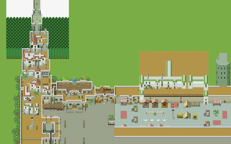
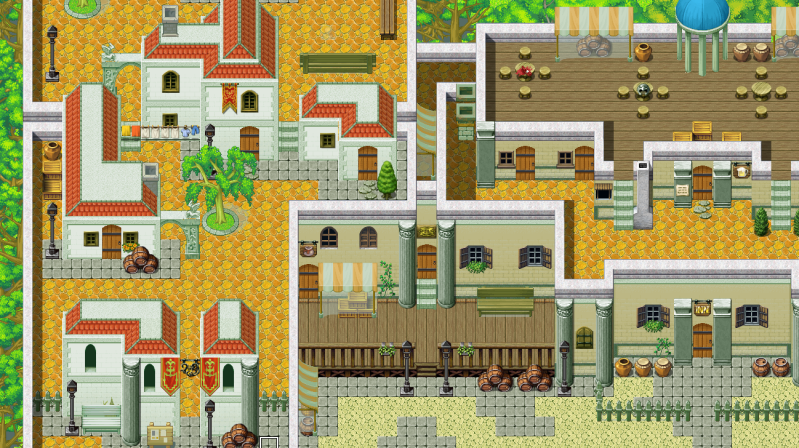
castle town WIP. there's going to be 3 of the "villages" on the map, the red one is almost complete (the one that leads to the sky), the green one is nowhere near done (it's going to lead to a forest behind the castle), and there's going to be a blue one somewhere below the marketplace I think...lots of detailing finishing to be done obviously but comments so far?
castletownWIP-1.png
 
@Rare: Well, yeah it's good. Think you could post some close-ups so we can see the detail a bit better. Something about the art style is nagging me, but it might be for nothing once I see it up close.
 

Jason

Awesome Bro

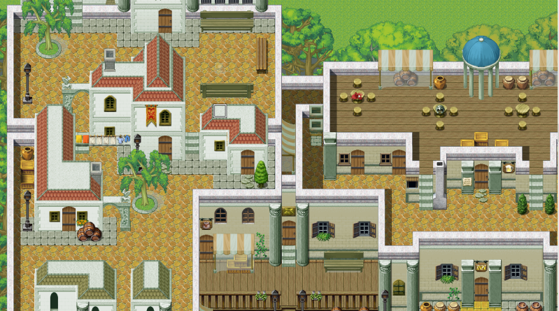
Am I right in thinking those houses on the left, are built on the roof of another house? That's just bad design D:

And how come with those stalls, are the contents underneath lighter and not darker, wouldn't the canopy act as a shade rather than some sort of light?
 

Rare

Member

Jbrist":949618hq said:
Am I right in thinking those houses on the left, are built on the roof of another house? That's just bad design D:

And how come with those stalls, are the contents underneath lighter and not darker, wouldn't the canopy act as a shade rather than some sort of light?
the only places where people reside are in the red-colored houses
what they are built on are not houses, but storage areas and sewage

and it's because i haven't fixed the shadowing yet for that tile.

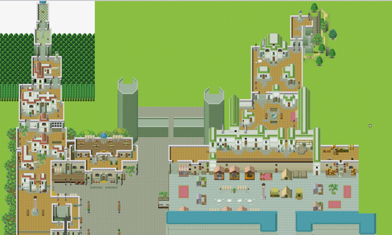
edit: a bit of an update

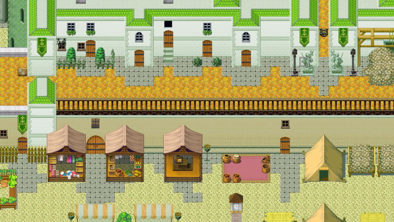
anything about the overall layout that doesn't seem to fit right? (remembering this is a WIP) thanks :)

castlevillagewip3.png
 
Right, yeah. That close up pretty much confirmed my problem with your map. You're mixing art styles, quite badly. You've taken bits from VX and XP and mashed them together. Although it seems like a good idea to take the best from both worlds and use them both, it does look very bad. You need to decide on one single art style and go with that, otherwise your game will just have a very poor presentation.
 
@ Rare
I'd suggest you increase the contrast in the RMXP tiles. Your map has too many colors/styles, there's no conformity. You can mix tiles from both games, if you fix the colors/shadows and use less tiles in each map.
 

Rare

Member

okay, I'm going to try that and see how it works out, thank you :D

edit:

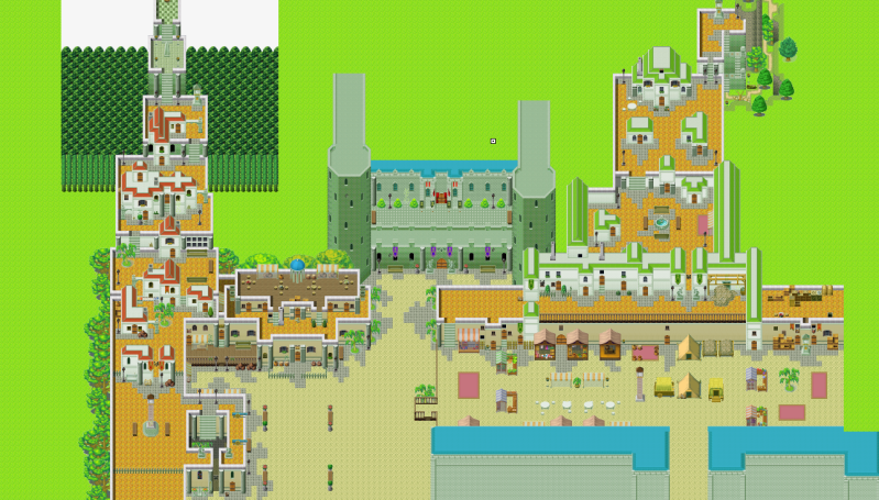
so I really don't want to give up all the tiles i'm using (mostly because i've come so far on this map :() but I took the contrast suggestion and I think it looks a hell of a lot better / more unified...

some more WIP's...

CVWIP4.png
CVWIP5.png
CVWIP6.png
 
Sot sure about that orange tile - looks too much like lava :P
Sou might want to find a more saturated orange for it. Something that would make sense, since the people of that town probably don't scrub the tiles every night :P

But I would definitely play a game with that map ;)
 
@Rare - I'm not too familiar with VX but the map layout itself is very wonderful, just like they said the orange can be a bit rough, when used too much, perhaps a color edit ? otherwise you did a great job!

Thought I'd give a shot at creating a custom main menu! Everything has been replaced except for the hp,sp,xp, lvl text icons and bars. the robot on the right is the defender drone sent from space to aid David, and since he displays hp sp, etc. in battle, I figured it'd only make sense if he keeps track of all the party data. well anyway heres what I got so far >>>>>>>

CustomMainMenu.png
 
Nice, I guess the text is actually pictures?
2 things stop this from being a great menu: 1.The text outline needs to be more smooth. 2.The bg is too busy.
 
Hey guys! Loving these screenshots...

I'm working on a city for my game, I'm new to mapping, tell me what you think - be as brutally honest as you have to!

PS: Hold down control and scroll forward to see it closer up! And the questions / comments in yellow on the side!

10hlp9t.jpg
 
Status
Not open for further replies.

Thank you for viewing

HBGames is a leading amateur video game development forum and Discord server open to all ability levels. Feel free to have a nosey around!

Discord

Join our growing and active Discord server to discuss all aspects of game making in a relaxed environment. Join Us

Content

  • Our Games
  • Games in Development
  • Emoji by Twemoji.
    Top