Envision, Create, Share

Welcome to HBGames, a leading amateur game development forum and Discord server. All are welcome, and amongst our ranks you will find experts in their field from all aspects of video game design and development.

The Screenshot Thread

Status
Not open for further replies.

zchin

Sponsor

It looks really nice, but I'm having a hard time believing it's an in game battle system, it's very well done.

This is mine, but I have no idea if the persons too small, or not.
screenshotcritique.png


Hmmm, a bit bland, but i have no idea what to fill it in with, might add some more dirt later, I'll put another one in so this doesn't make people think I always map like this.

screenshotcritique.png

This is the starting of the first forest dungeon, your not that deep in the woods so there isn't fog there yet.

Thank you and have a nice day!
 
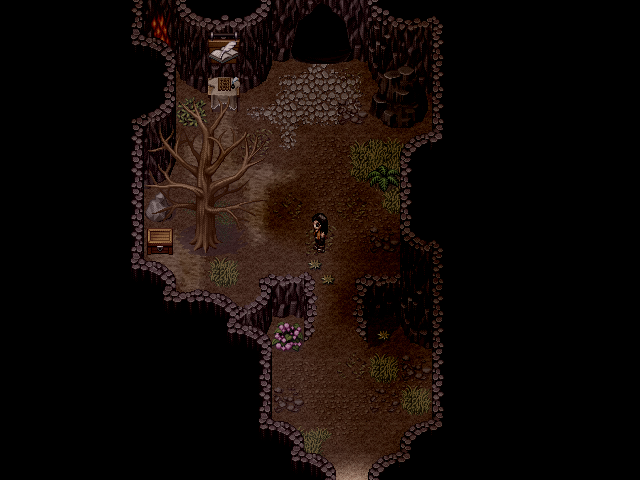
The second Dungeon of the Second chapter of LoZ, the Fuergo Mines! Well, the first bit of it, anyway...

FuergoMines1.png

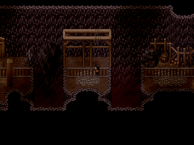
The Entrance area, right behind that opening as seen in the Falls post above.

FuergoMines2.png

The idea of this bit is to jump the gap when it's clear, when there are no falling rocks.

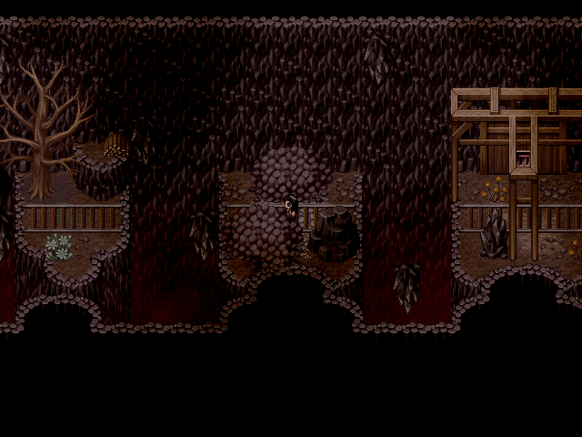
FuergoMines3.png

It begins to get a lot harder with more rocks.

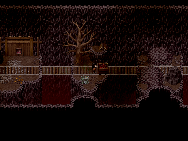
FuergoMines4.png

The idea is to get that cart of dynamite back to the start by extending those bridges. But they dissappear after not too long, so be quick!


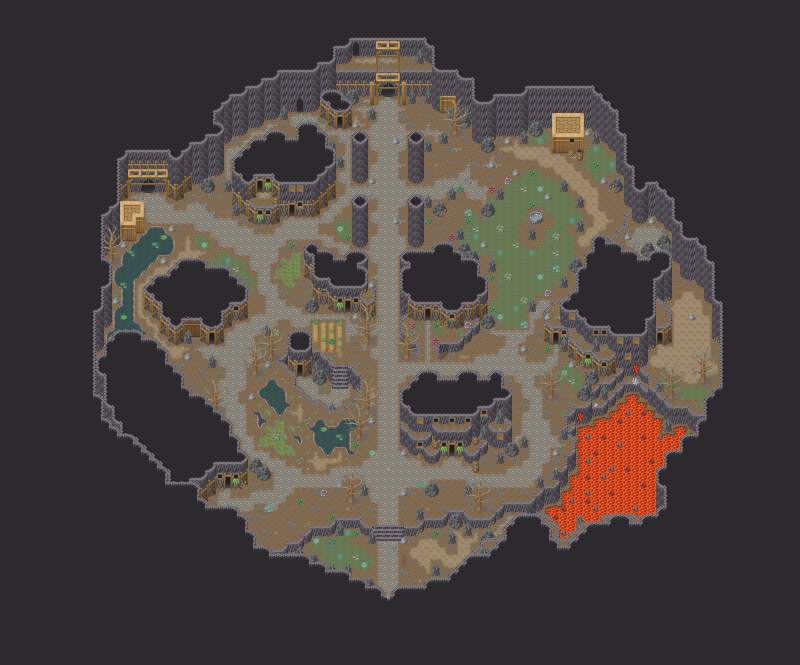
Eventually you find your way to an underground village populated by Earth Elves.

UndergroundMines.png


Haven't got any screens of that, though, cause I've only got one charset of an Earth Elf, and I'm no good at spriting new clothes and stuff... Might need a bit of help with that. Game's basically stuck until I can get some more...
 
Looking good, Bruno. I like the red tint the farther down wall tiles extend, nice touch. If I might offer some advice, though, just use some placeholders and proceed on with the game and get back to sprites at the end.
 
I like the screentones in your screenshot a lot, they feel just right, and original, for some reason. However, even if that tree is dead in the first one, I can't think of how it managed to grow in the first place. Plus, it's taller than the cave's wall. I think it doesn't have its place there.
 
Hrmm... That was just an attempt to show that it's not a completely desolate cave, that there is still some life in there. I should probably also say that that map in particular is right behind the cave behind the huge waterfall that I posted a couple of pages back... Here

Thanks for you other comments, though! :D
 

mawk

Sponsor

too saturated and green. a more subtle tint would be more effective. in particular, notice how some of the zombies just blend right into the background.
 
Was bored and kept messing around with RMXP, coming up with this,

screenie.png

Credits to SithJester (for the phoenix and the girl which I only recolored) and to Mark for the tileset as well as Reives for the panorama. <3
 
Tone down or remove the overlay fog, it's rather bright. The waterfall should also start one tile lower. Otherwise, apart from a few minor symmetrical issues, it looks great. That (edited) space tileset is pretty and definitely not seen enough.
 
I'm seeing some weird perspective issues with that waterfall. The way you have it in that picture, it's physically impossible for it to fall straight down without hitting anything on the way down. If it's supposed to be falling straight down, then the area circled in red:
waterfall.png
has to go. The waterfall would have to be falling outwards and horizontally to not hit them.
 
Love":14ae7dja said:
Ahh I see your points everyone. Fixed it up now, is it better?

screenie-1.png
Yeah, much better.

No ID: Those last two screenshots clash badly with the RTP, I won't lie. The blue on those bedsheets is killing my eyes @_@

Maybe consider modifying the tileset a bit for less contrast? The rest isn't so bad but the really bright colours don't look good. The folks over in the pixel forums could probably help you out more than I can.
 

No ID

Sponsor

Yea piggman said something like that before, but I'm no good with editing or creating tile graphics. Pixel art, best I can do those little character set sprites.

But I'll check out the pixel forums, thanks.
 
I make a lots of test maps, because I want to become a better mapper. Here are two of my maps. Responses are always welcome! :smile:

mapjp.png
hoegoedisjoumap.png

By the way: don't look at the civilian in the mountains in the first screen, I forgot to erase the hero. I'm Dutch, so it's possible that my English is not correct, I'm working on that. :wink:

~, Thijs
 
Status
Not open for further replies.

Thank you for viewing

HBGames is a leading amateur video game development forum and Discord server open to all ability levels. Feel free to have a nosey around!

Discord

Join our growing and active Discord server to discuss all aspects of game making in a relaxed environment. Join Us

Content

  • Our Games
  • Games in Development
  • Emoji by Twemoji.
    Top