
You are using an out of date browser. It may not display this or other websites correctly.
You should upgrade or use an alternative browser.
You should upgrade or use an alternative browser.
The Screenshot Thread
- Thread starter Ellie
- Start date
- Status
- Not open for further replies.
No ID, you get an error with the branch on the tree on the top left of the bottom row, the right hand branch, the map itself is dull, generic, like maps from newbies, add items, critters, doodads and stuff, light effects maybe.
Also, that random water tile, I don't know what you were doing, maybe thinking of a puddle or something, but jsut don't have that.
Your battle back is incredibly low-resolution as you obviously will know, get a different one.
Also, that random water tile, I don't know what you were doing, maybe thinking of a puddle or something, but jsut don't have that.
Your battle back is incredibly low-resolution as you obviously will know, get a different one.
Incognitus
Member
Jaberwoky":1ae8qkti said:
Really, anything I say will only detract from the image.
Makes me think of Kyte's CAT ATTACK! move in Ephemeral Fantasia.
Can you make a gif or recording or something?
Any game in which you use the awesome power of cat to defeat your enemies with is one I want to play.
Incognitus":249fdccs said:Can you make a gif or recording or something?
http://www.youtube.com/watch?v=RG_uvADD1_I
There you go? I guess?
Alexis Hiemis
Member
It has been a while since i postet to this community... *sigh* here we go with new screens :D
At first... its work in progress >__< the next days i will have to put tons of snow onto this temple...

An something different - redone snow maps, not inagme because i deleted all the needed saves... stupid me >__<:

@Jaberwoky
I will tell greenpeace what you have done with these cats :D
@BrunoTR well, it is not bad at all, but there are many free spaces in the maps, you should fill them with ground textures or small things, maybee small plants.
At first... its work in progress >__< the next days i will have to put tons of snow onto this temple...

An something different - redone snow maps, not inagme because i deleted all the needed saves... stupid me >__<:

@Jaberwoky
I will tell greenpeace what you have done with these cats :D
@BrunoTR well, it is not bad at all, but there are many free spaces in the maps, you should fill them with ground textures or small things, maybee small plants.
Skyla Doragono
Sponsor
There's a lot that looks unfinished, besides lack of snow on the temple. You have the heads and the walls, which look really good (although the heads look a little too much like you just cut the head off a sprite and recolored it gray; it's kind of creepy), but the arch leading up to the temple and the rock relief on the temple looks improperly shaded. And the roof looks... wrong; the corners of the part that's vertical look really bad, like you used the wrong tiles.Alexis Hiemis":2rham9bf said:It has been a while since i postet to this community... *sigh* here we go with new screens :D
At first... its work in progress >__< the next days i will have to put tons of snow onto this temple...

rey meustrus
Sponsor
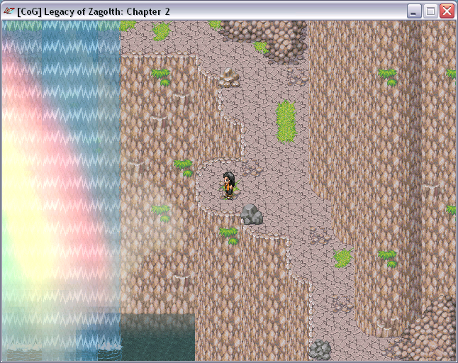
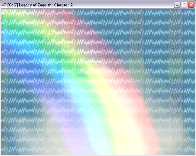
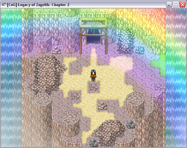
@BrunoTR: It's pretty, but the cliffs need to be broken up so they're not big solid walls (make multiple tiers that may not be accessible, they're just decorative). If the player is supposed to be able to walk behind the waterfall, it's way to hard to see behind it. Look at this video of Donkey Kong Country 3 to see how transparent the waterfall needs to be for playability.
Alexis Hiemis
Member
Wrm... it will be really difficult to give the head (exactly Sanadorae - in real he looks that way) a beard O.o (everyone who looks kind of androgynous is emo? Well, thats news to me...) He was designed the way he is and I cannot give him a beard just because it would look better on a damn wall XD. Well, maybee the one who sculpted the heads for the arches in the game world was very unskilled (erm, kinda like me :D). I must confess i more or less painted them in photoshop because I'm bad in working with single pixels >__< But its all by mee, nothing recolored.
Are there any other ideas how I could fix the head-problem? The problem is - the people who build this cathedral for their god do not worship ANY kind of angels or gods helpers, so there is just the god Sanadorae I can refer to and some ornaments. *sigh*
The roof - gah, thats another point. But I dont know what exactly is wrong with it (maybee i should just hide everything under snow...). Any idea what exactly doesn't fit? ;_;
These are some shots from my work in progress game, Circadian:

A prototype dialogue which introduces our main characters' maid, Mrs. Watson.

Howard's basement, which shows the cursor functions in action(top of the stairs). That cue tells the player that a scene transition takes place by moving to that location. The player, and everything the player does, is controlled by the cursor.

Howard's personal study, where a fine collection of resources aids him in his writing.
I hope to get a project thread up, as soon as I have enough information to share and entice you guys with.

A prototype dialogue which introduces our main characters' maid, Mrs. Watson.

Howard's basement, which shows the cursor functions in action(top of the stairs). That cue tells the player that a scene transition takes place by moving to that location. The player, and everything the player does, is controlled by the cursor.

Howard's personal study, where a fine collection of resources aids him in his writing.
I hope to get a project thread up, as soon as I have enough information to share and entice you guys with.
Perihelion
Sponsor
Mundane, that is pretty slick, but I recommend making it less dark.
Skyla Doragono
Sponsor
Holy shit I'm posting here. 


Going for an old school game feel with new graphics. And yes, despite the lack of NPCs, they're finished at the moment; the village is going to be abandoned the first time you get to it. More can be seen in my blog.
Let me know if they don't show up; first time posting anything from my new webhost.


Going for an old school game feel with new graphics. And yes, despite the lack of NPCs, they're finished at the moment; the village is going to be abandoned the first time you get to it. More can be seen in my blog.
Let me know if they don't show up; first time posting anything from my new webhost.
Yes Asch finally, a screenshot that isn't cluttered to hell and is navigate-able (Personal Preference). I think once you put some npc in there and they fill the place up a bit, it will feel just right. Though the name is weird, Headspace O_o.
My brother is working on a game and asked if I could do the graphics. He is making it in Game Maker. I'm not to sure he will finish it though. :fap:
Note the the spider man is ripped, I have yet to be able to make a good looking 3 colour spider man.

PS I hate the building as much as you! :wink:
My brother is working on a game and asked if I could do the graphics. He is making it in Game Maker. I'm not to sure he will finish it though. :fap:
Note the the spider man is ripped, I have yet to be able to make a good looking 3 colour spider man.

PS I hate the building as much as you! :wink:
Skyla Doragono
Sponsor
Yeah, I know the name is weird. Unfortunately, I won't be able to get some decent in game screens and give out some more information until I get my request filled (*hinthint*).
And that is sweet. Always wonderful to see older-style graphics used well.
And that is sweet. Always wonderful to see older-style graphics used well.
Mundane: Wow, that is really pretty mundane. Your maps are extremely well done and classy to say the least. I agree with Peri, lighten up the maps a tad bit. You can still create that dark effect that I think you are looking for and still lighten it up. :3
Asch: Asch, I'll be straight up with you, the mapping isn't very good. I understand its VX, but the maps you have a extremely plain and boring. The forest's paths are straight for the most part and there is nothing going on with your map. The trees are what kills it though. Having the same trees repeating over and over looks terrible. Try variating the tree location and add randomness to your map. Your houses in your town are extrememly rectangular and unlogical. And curves and make your houses smaller overall. Then work on filling in your maps with plants, trees, and other scenery. Even with NPC's, the lack of objects will still show. Your inside is confusing as well. I do not understand the effect you are going for? Other than that, the shop is incrediably boring and dull. Add weapon, objects, ect.
(And yes, I would delete that odd piece of connecting land and make a bridge)
006: That honestly is the shit 006. That brings back some old memories of the old school gameboy. I honestly want to see more of this, as this looks really cool. :D
Skyla Doragono
Sponsor
That was... pretty much the point. I'm not going for fancy. Just straight up, here it is.Bacon":3i5w9ryt said:I understand its VX, but the maps you have a extremely plain and boring. The forest's paths are straight for the most part and there is nothing going on with your map.
Besides, you go for fancy in VX, and it either looks like shit, or over-cluttered shit.
Ace of Spades
Member
- Status
- Not open for further replies.
Thank you for viewing
HBGames is a leading amateur video game development forum and Discord server open to all ability levels. Feel free to have a nosey around!
Discord
Join our growing and active Discord server to discuss all aspects of game making in a relaxed environment.
Join Us


