Envision, Create, Share

Welcome to HBGames, a leading amateur game development forum and Discord server. All are welcome, and amongst our ranks you will find experts in their field from all aspects of video game design and development.

The Screenshot Thread

Status
Not open for further replies.
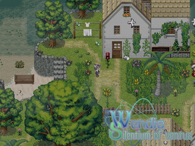
New Screenshot from me:
WendiaScreenshot.png
 
@The_Shadow - it looks great, but there are a few things you could fix. First of all, that flower that's hanging off the left cliff is bothering me. I don't think a flower would usually grow like that (although I may be wrong). Also, the shadow of the topmost tree is overlapping into the blank area of the water above it. That vine on the window on the right portion of the house seems a little awkward, as well. I haven't seen a vine grow diagonally like that before, so I think it would look better if you moved the portion on the left over to the right. It looks like you have something underneath it, though, so I'm assuming the objective was to conceal that? If that's the case you could always make the vine extend further horizontally so you could still keep it covered while keeping the natural upward growth of the vines. :)
 
A agree that it's real nice lookin'. The screen tone is perfect for overcast by the sea.

I would suggest possibly doing something about the straight lines in the water. Also, the palm tree doesn't look right in the tall grass. It's probably because the grass does not come up the bottom of the tree as you'd expect, so if you want to have the palm tree there with tall grass under it, I'd suggest adding a tile which is the bottom of the tree with tall grass coming up around it.
 
Petros":34c84eud said:
Alright contrast lowered, I think I'm getting it to a stage where it will look better now, hopefully this is okay now. I'm sort of flying blind here because I'm not sure what exactly constitutes as "eye bleeding" material. I think the columns need some adjustments but aside from that, anything else? Lower still?
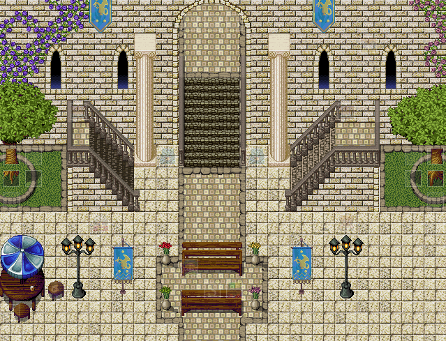
LangaraTesting.png

Periwinkle":34c84eud said:
Petros, PM me the tileset and I'll make some instructive edits. Maybe. If I get around to it.

Stand aside, Periwinkle, this is a job for a man. :box:


Here's my christmas gift to you, Petros. I've made you a wall and floor tile to match the other assets of mine you've used. The top of the wall tiles will tesselate and the bottom to steadily shade downwards for the effect of depth. It should do the trick. I've only used a (reasonably) small amount of colours, whereas you have used over 2000, which is ridiculous for small resolution pixel art like this. You should keep that in mind when working on your tilesets.

Use the colours I've used here to create the rest of your tileset assets. The palette can be a bit intimidating as it involves a lot of colour mixing, but if Peri wants to help you through those bits, she's more than welcome to try out the palette I've whipped up and used in this wall/floor pic.

Nice to see my tilesets are still used. :thumb:
 
screenshot0094.png
"New Year's Celebration"
Due to a persistent lack of fireworks, inhabitants of the Mazza system got creative in celebrating New Year's Day by literally 'lighting up the heavens' by superheating the crust of a planet to celebrate the birth of a new year.

EDIT: Spoiler'd for size.
 
TheInquisitor":2mts589o said:
Stand aside, Periwinkle, this is a job for a man. :box:


Here's my christmas gift to you, Petros. I've made you a wall and floor tile to match the other assets of mine you've used. The top of the wall tiles will tesselate and the bottom to steadily shade downwards for the effect of depth. It should do the trick. I've only used a (reasonably) small amount of colours, whereas you have used over 2000, which is ridiculous for small resolution pixel art like this. You should keep that in mind when working on your tilesets.

Use the colours I've used here to create the rest of your tileset assets. The palette can be a bit intimidating as it involves a lot of colour mixing, but if Peri wants to help you through those bits, she's more than welcome to try out the palette I've whipped up and used in this wall/floor pic.

Nice to see my tilesets are still used. :thumb:

Okay, I didn't expect this to happen haha! I thought you'd vanished into oblivion Inq! Thanks for this Merry Christmas to you too. This will go a long way to adapting the helping create a new set of tiles for the game in general. I've been taking your advice to heart from both Peri and yourself, perhaps someday I might actually be able to create... a tile. Yep, a single tile.

I think I may try and make some adjustments though, it's just this nagging feeling, and don't get me wrong I am VERY appreciative that you took the time to make this, but the yellow bricks just stand out as a little off to me. It seems to make the whole scenery look a little dirtier. I'm attempting to perhaps recolour them a little and experiment using the palette given.

Thanks again.
 
Looks nice sailerius, but I think the character order ( to the right) takes too much space, I don't think it's important enough to use that much, although I don't know how you could reduce it because enemy names would look to small...

Here's the first screen of a new project I'm doing, secret of mana style, I've always wanted to make such a game and I started editing a script that plays more or less like I want so I'll try to keep you guys informed :)
 
@Sailerius: Are the enemy character order pictures eventually going to change, or are they going to stay as text? They look out of place compared to the ally ones.

This is what happens when you replace the party with characters with questionable moral standards for the tech demo.
learntofight.png

Graphics are still wip, thus why some are shaded and some are not.
 
Can't wait to see it finished and shaded Rachael :)
Some more pics of my new project, now from real maps (the screen before was just a test map)
A small vilage in the woods.

Still have to add npc's. (BTW I fixed the map errors you see in there)
somewhere inside the forest

I had to use shadows for text instead of outline because for some reason when using outlining the game lagged a bit when fighting enemies...
Now I just need to think of a story XD
 
Racheal":1oy8fntg said:
This is what happens when you replace the party with characters with questionable moral standards for the tech demo.
learntofight.png

Graphics are still wip, thus why some are shaded and some are not.

- i <3 it! i'm gonna wait for this game!
 
Some of the nicest RTP mapping I've seen, TS.

@Rachael: Game looks sweet, I really want to play that! I take it it's all original graphics, right?
 
Shadow, one of the cave entrance tiles looks like its meant for grass, and it cuts off weird with the tile next to it. Also the long diagonal section (northeast of the girl in the water) bugs me for some reason, maybe if it were a little less linear?
 
Status
Not open for further replies.

Thank you for viewing

HBGames is a leading amateur video game development forum and Discord server open to all ability levels. Feel free to have a nosey around!

Discord

Join our growing and active Discord server to discuss all aspects of game making in a relaxed environment. Join Us

Content

  • Our Games
  • Games in Development
  • Emoji by Twemoji.
    Top